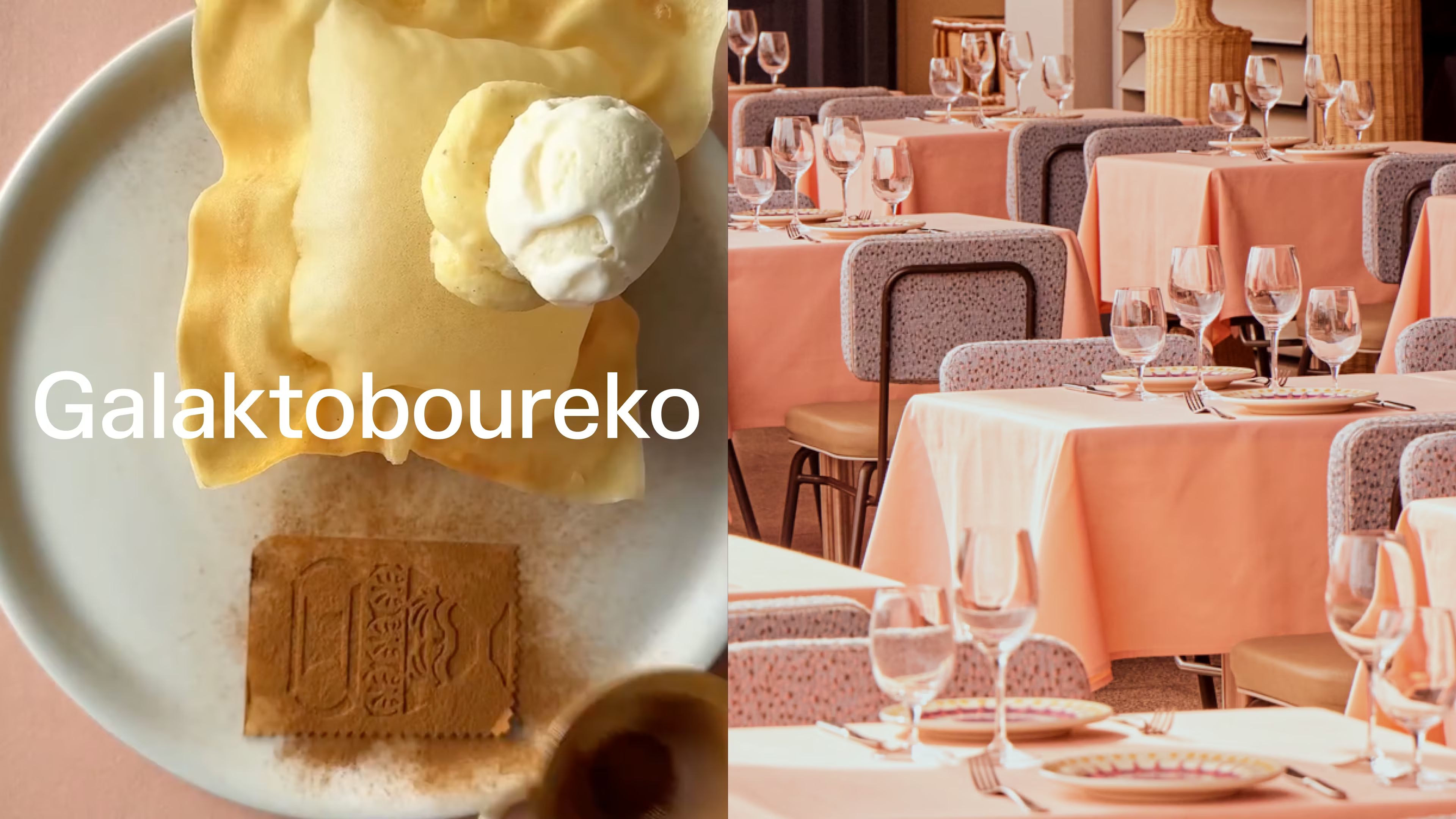
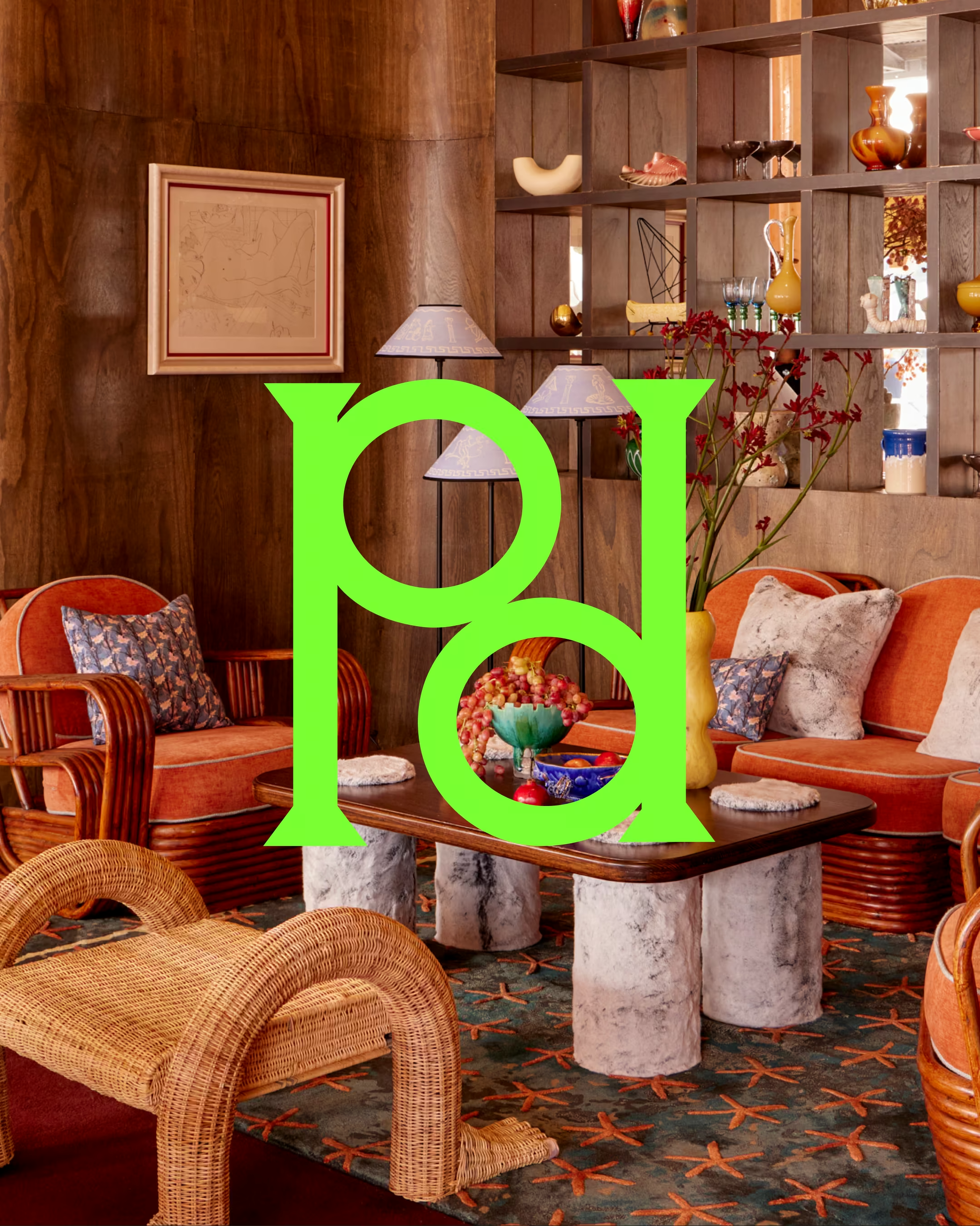
Woolloomooloo Wharf had been home to Manta for years, a well-regarded seafood restaurant with a loyal following of corporate lunchers and expense accounts. Solid. Established. And increasingly, a little stale.
When Sydney Restaurant Group decided to reimagine the venue, they didn't want a refresh. They wanted a reinvention. Perry Drakopoulos,whose interiors had already transformed the group's venues from the inside out, would lead the space. The brief was to build a brand worthy of what he was creating.
The category play was deliberate: bring women in. Make it the kind of place people dress up for, photograph, and talk about. The kind of venue that fills a Sunday afternoon and keeps it going into the night.
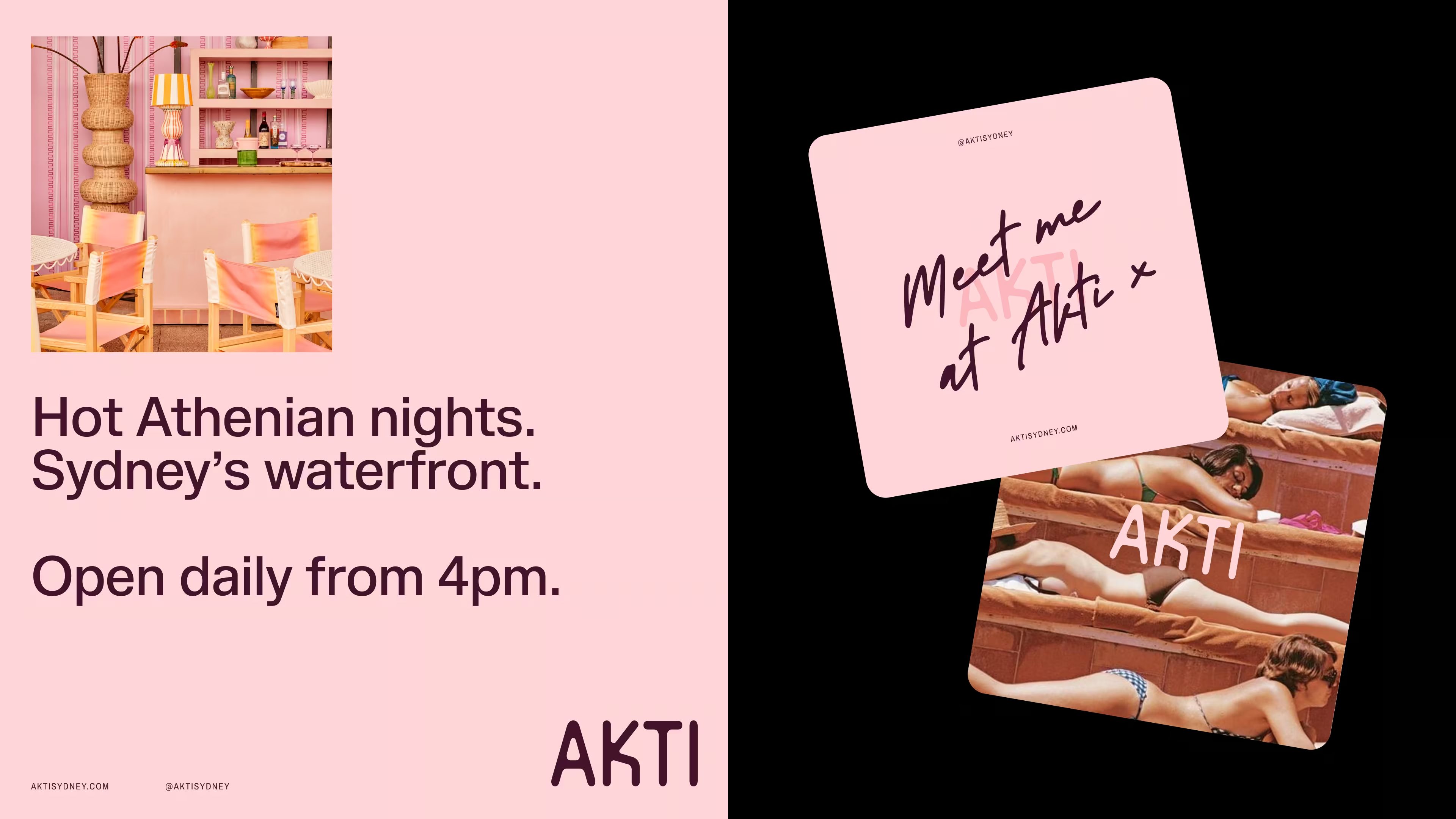
Blue and white Greek was off the table immediately. That visual language belongs to tavernas and tourism brochures. Akti needed to feel like modern Greece: the version that exists after dark. Hot Athenian nights. Ouzo on a rooftop. The sun finally setting at ten and no one going home.
The strategic and creative decision was the same: make it sexy.

THE IDENTITY
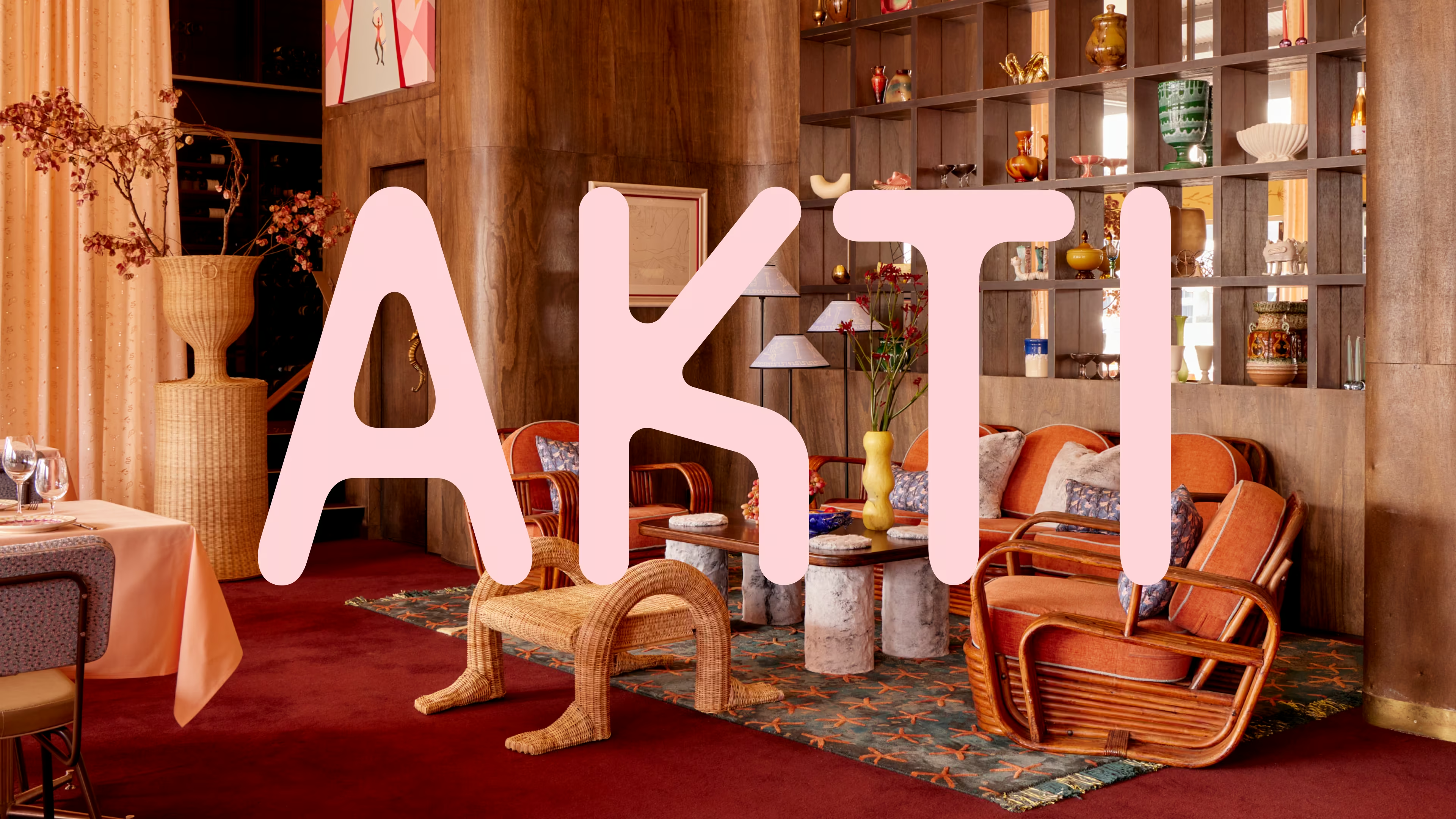
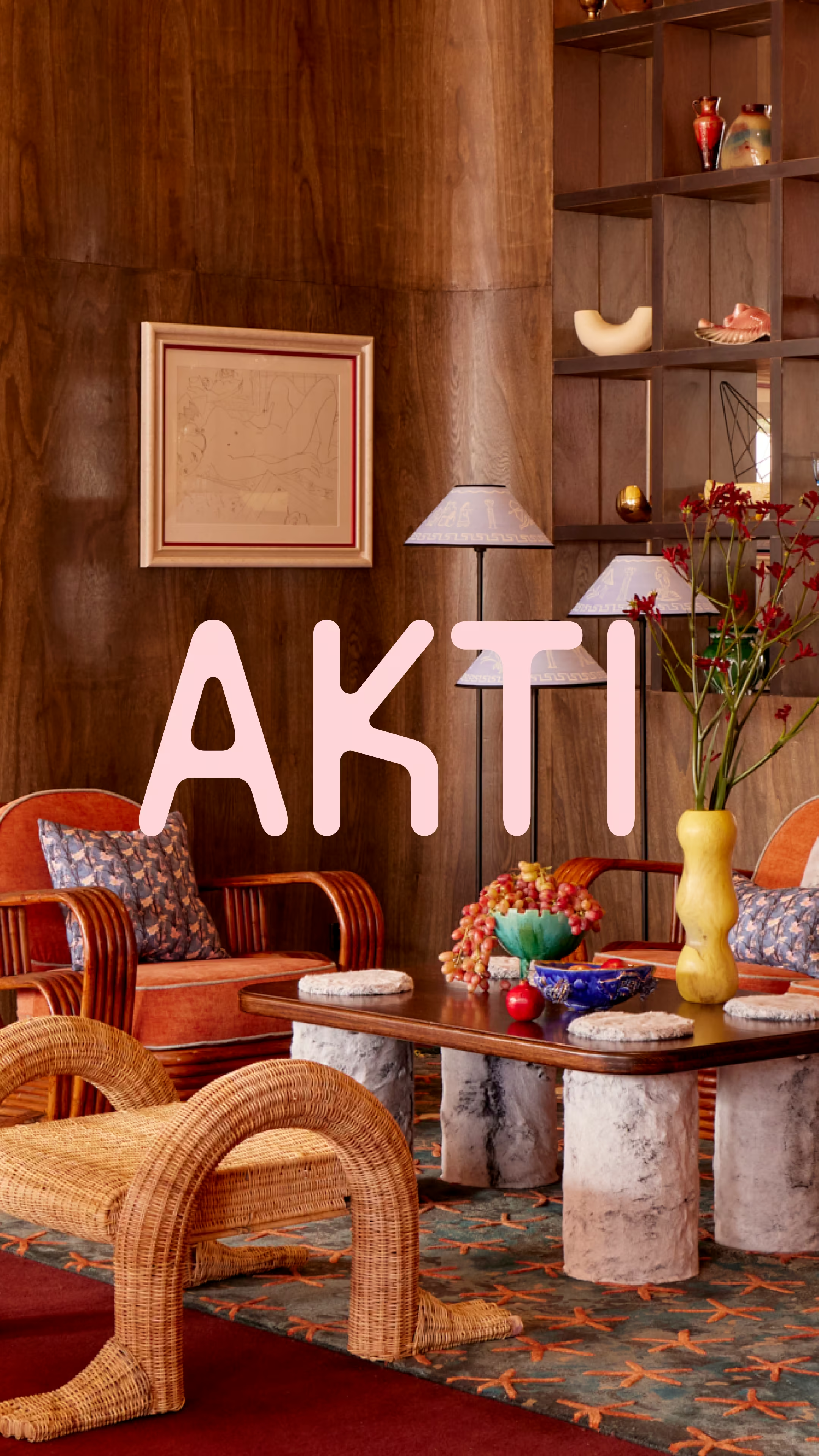
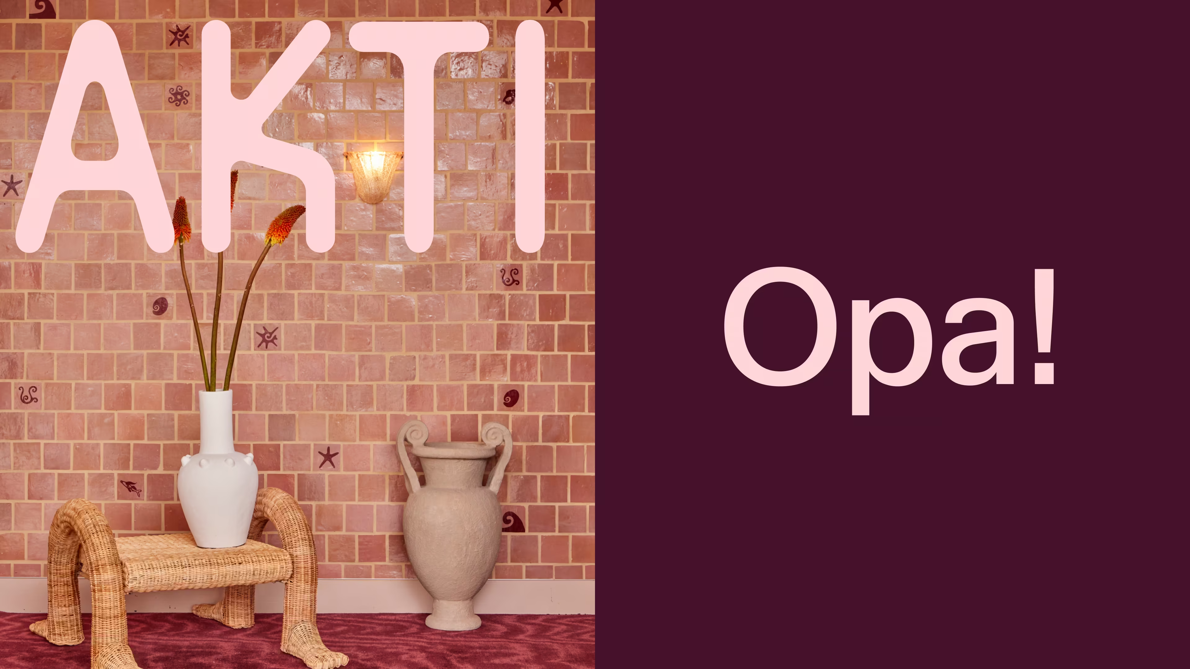
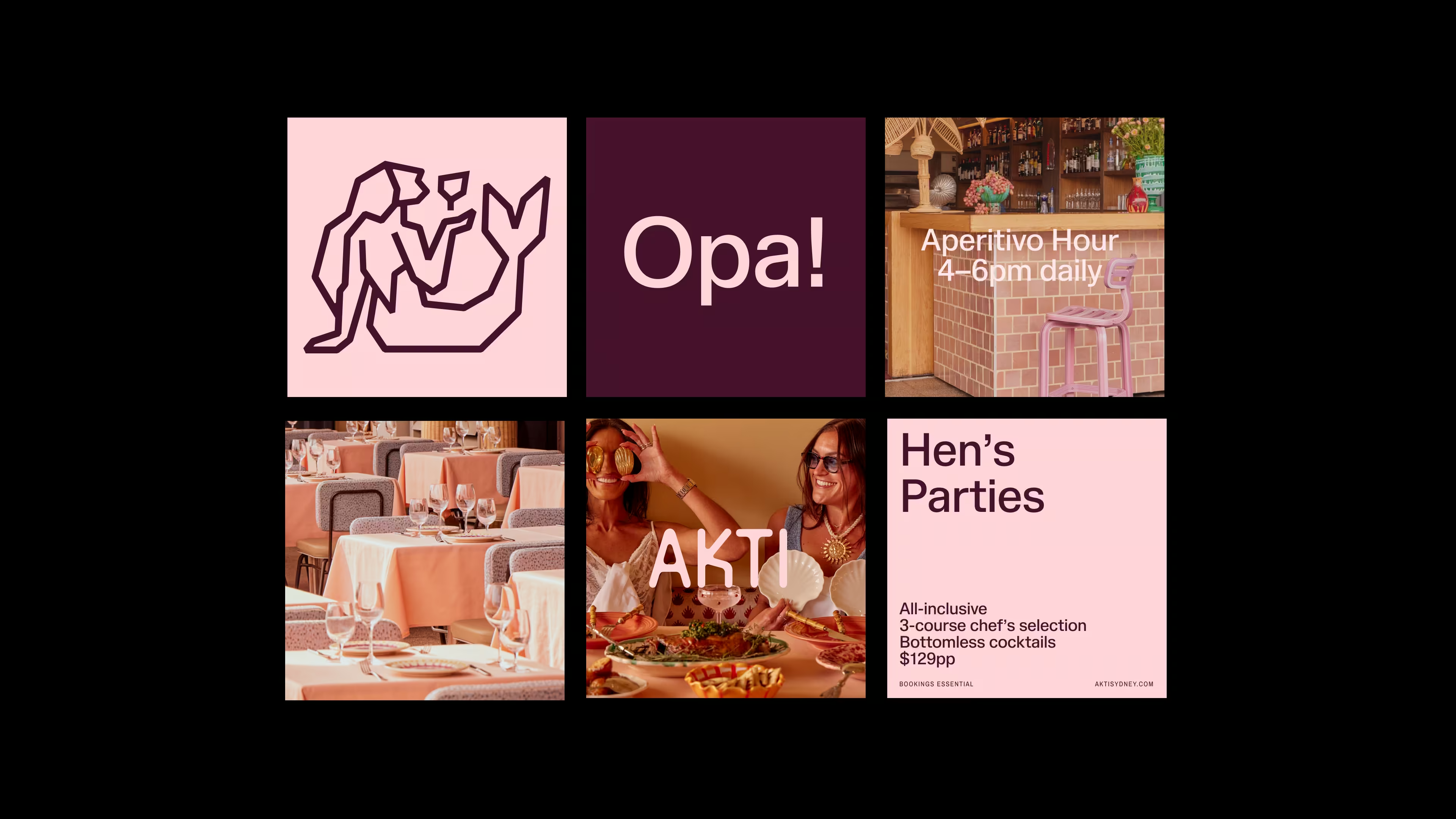
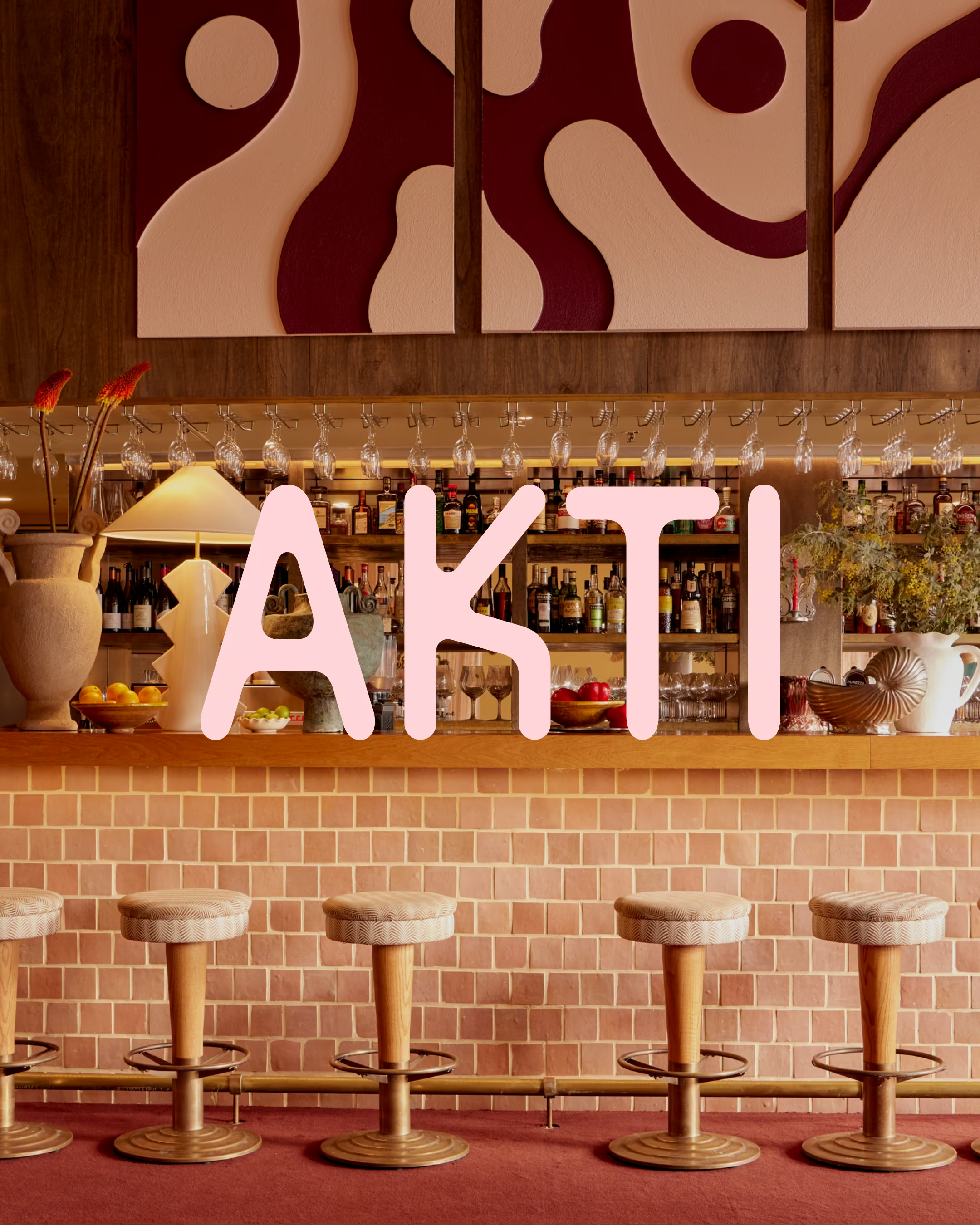
The palette is hot-Athenian pink. Unapologetically. This decision built the whole palette of the restaurant – from the tableware to the furnishings to the tiling.
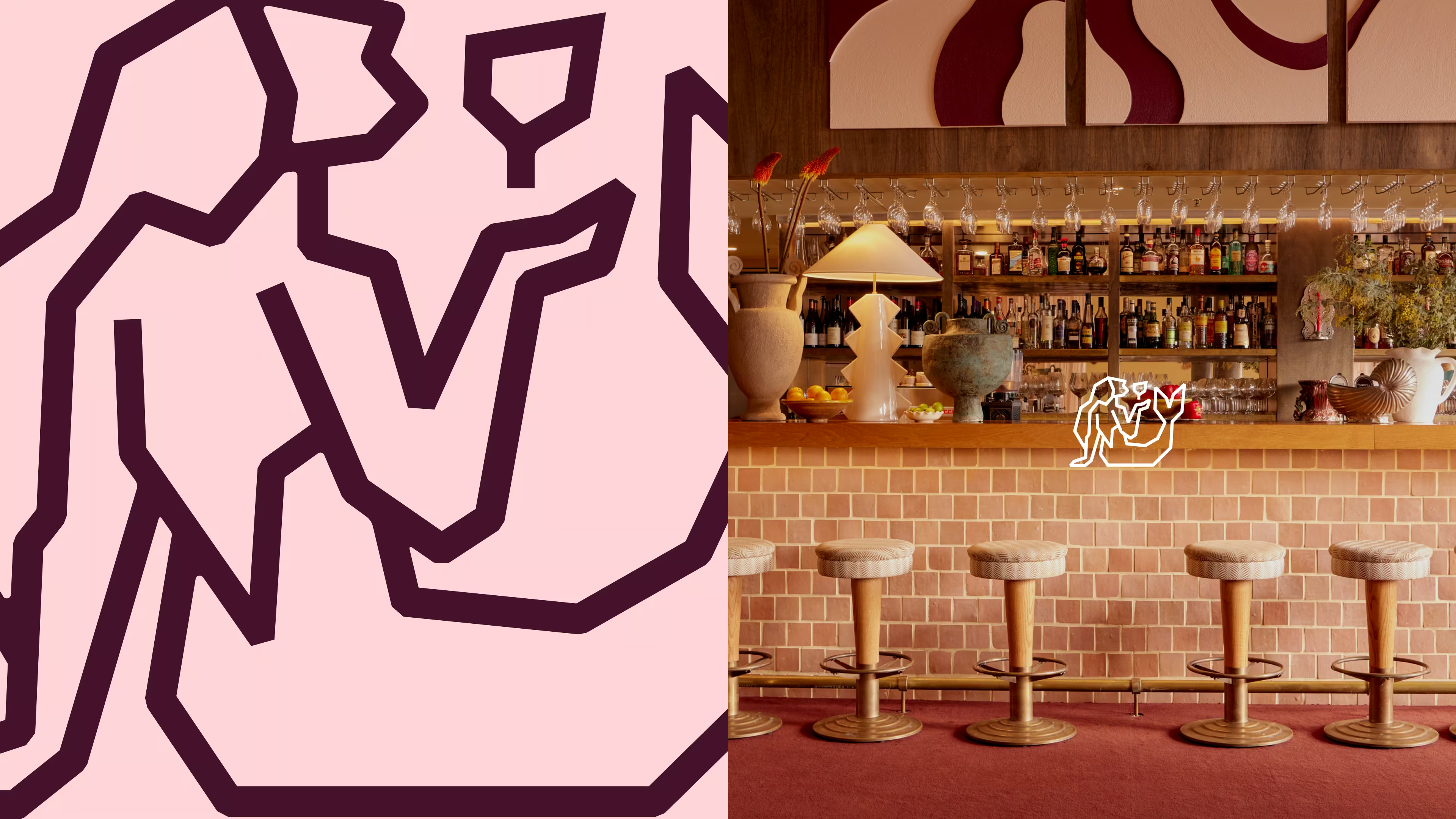
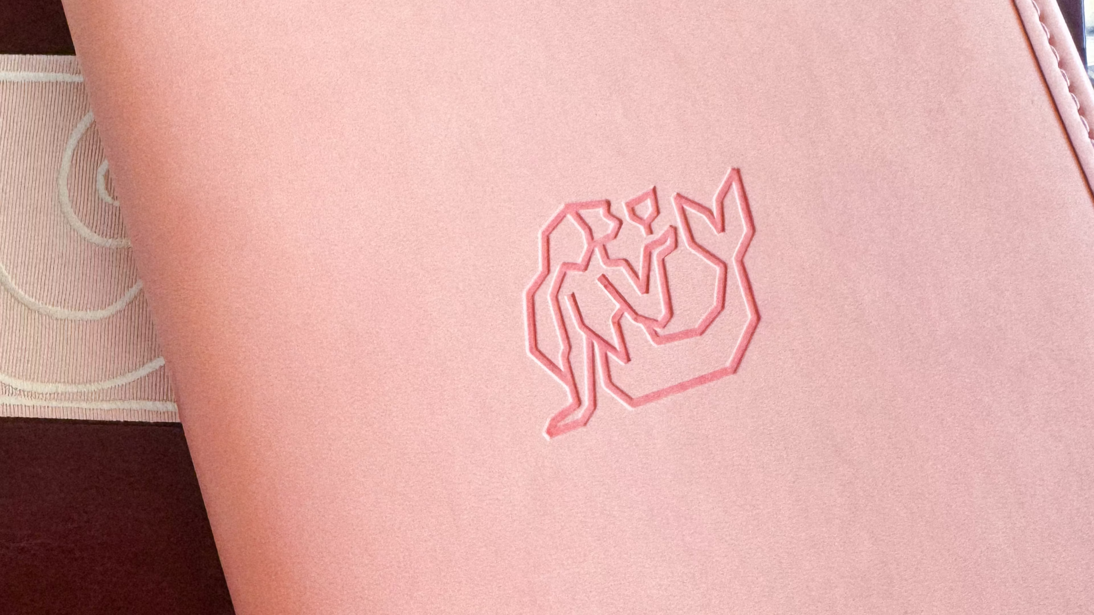
At the heart of the identity is a hand-illustrated mermaid. Drawn in the style of linocut printmaking, depicted mid-sip, glass of wine in hand. She's Akti's mascot and its spirit: feminine, playful and completely at home by the water.
The wordmark carries its own quiet detail: a custom kick in the K that reads as a chair being pulled out to seat you. An invitation built into the letterform itself.
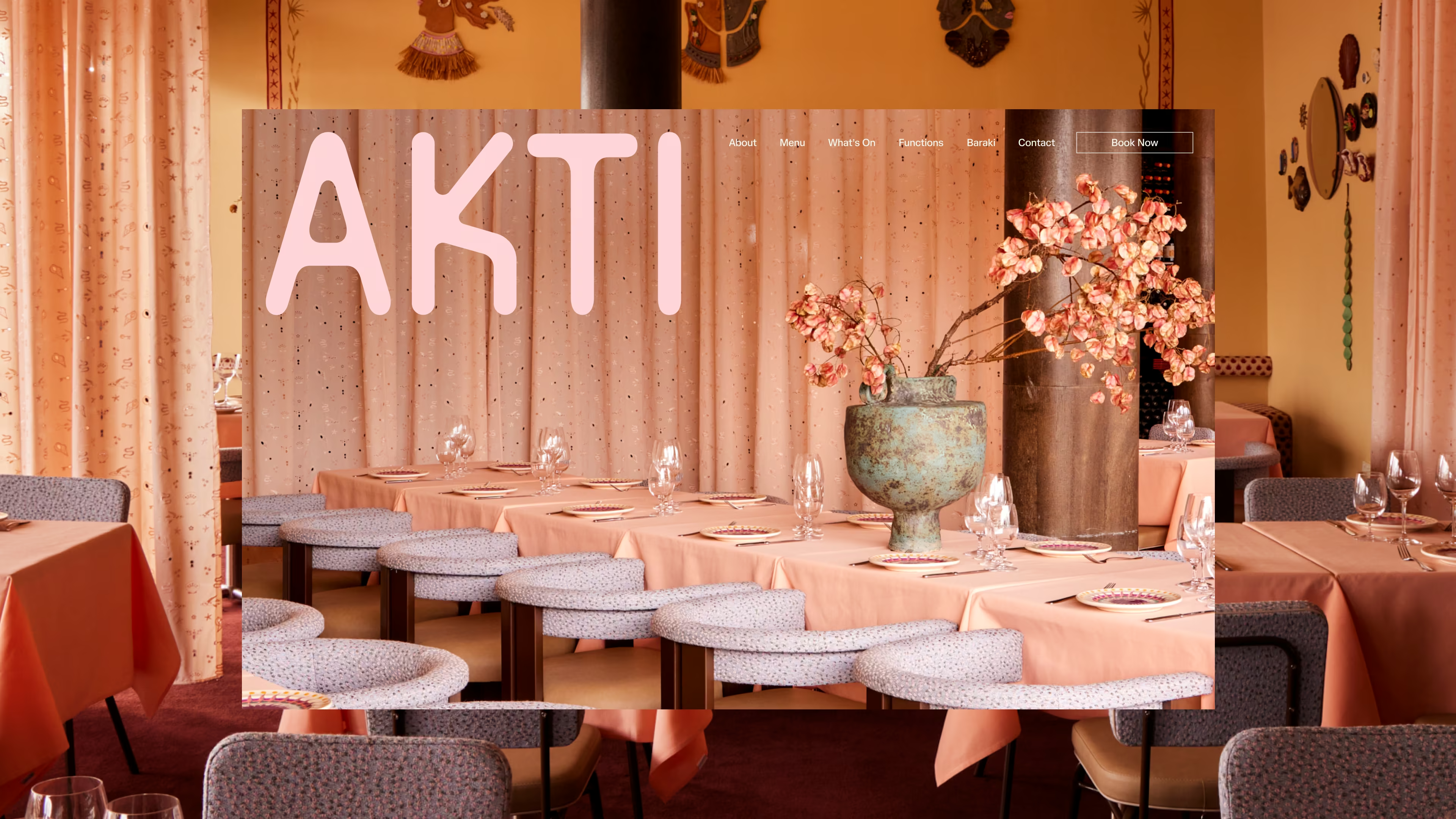
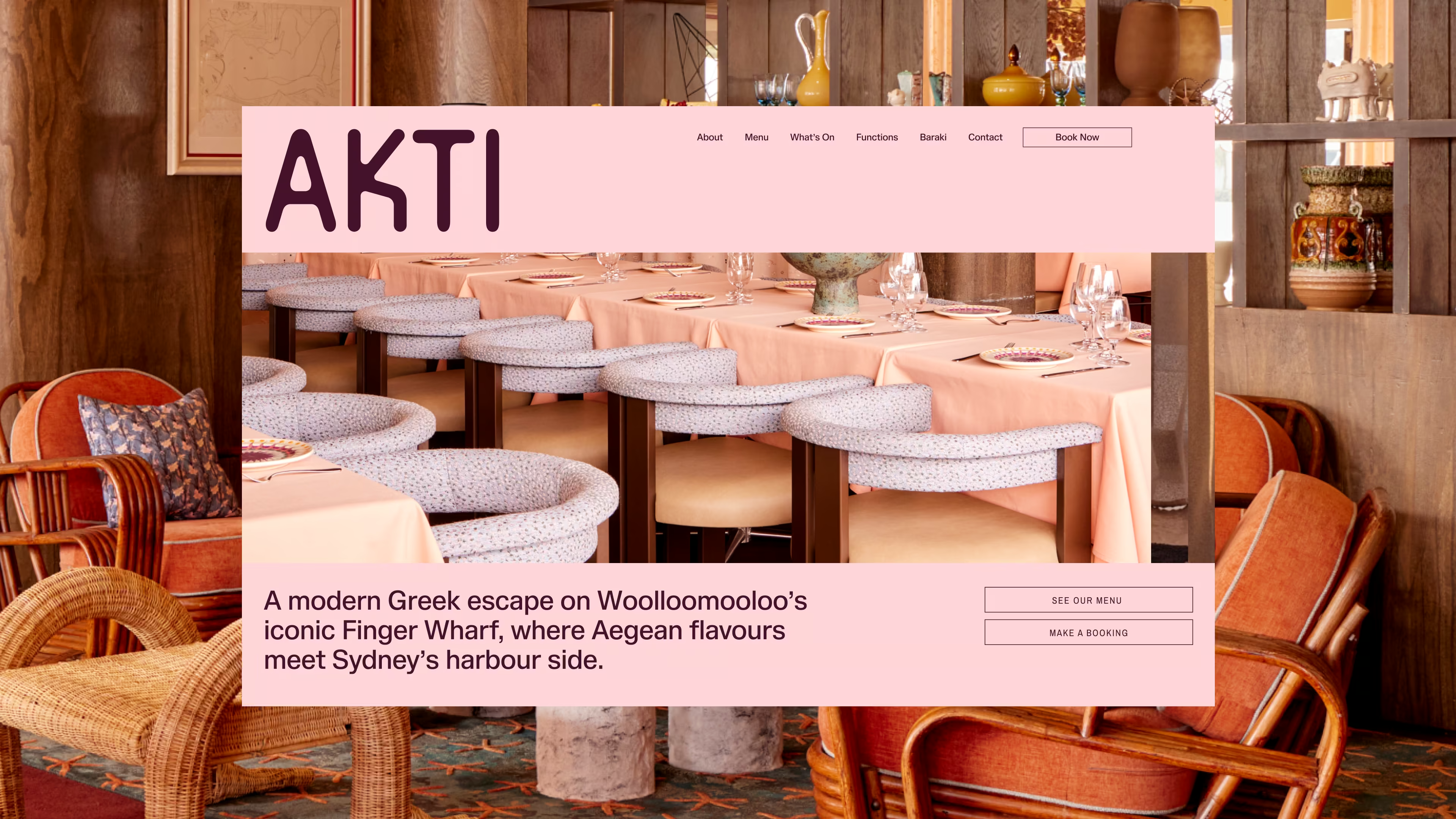
THE WEBSITE
The site was built to seduce from the first scroll.Ffull-bleed imagery, all-pink, designed to feel like stepping inside the venue before you've even made a reservation.
Two deliberate decisions set it apart from every other restaurant website. First: the logo. Convention puts a small, polite mark in the top corner of the navigation. Akti's sits large and stays that way. On scroll, sitting over full-bleed imagery the way a magazine nameplate commands a cover. Second: a custom starfish cursor. A detail most visitors couldn't name but everyone feels. The kind of thing that makes a website feel considered rather than constructed.
THE EFFECT
Akti's opening weekend was fully booked.
Perry opens the website daily. Calls it his favourite he's ever seen. From a client whose aesthetic bar is as high as his, that's not a small thing.
Akti didn't just replace Manta. It made the room feel like somewhere entirely new. It gave Sydney exactly the kind of place worth getting dressed up for.

.avif)
.avif)
.avif)
.avif)
.avif)
.avif)