.avif)
Seven years ago, Jess and Mel took over as co-owners of Sydney florist atelier White House Flowers. What started as a small shop in Manly (the little white house on Pittwater Road) has grown into its own – an expansive retail space in Brookvale, a close-knit team working across events, weddings and large-scale installations all over Sydney.
They were already successful. They were already a trusted name in the Northern Beaches. But the brand that Jess and Mel inherited wasn't theirs, and it didn't reflect the years of dedication and love they've put into the business that saw it bloom. So they came to see me.
To them, what they did was never just floristry. The work they produced was closer to art, taking whatever the season gave them and transforming it into a living sculpture. And everyone noticed: clients from all over Sydney seeking them out for their artful expertise.
The challenge was to position White House Flowers as the elite florist they've grown to become, and to tell the story of artistry that they've built their successful business upon.
THE IDENTITY
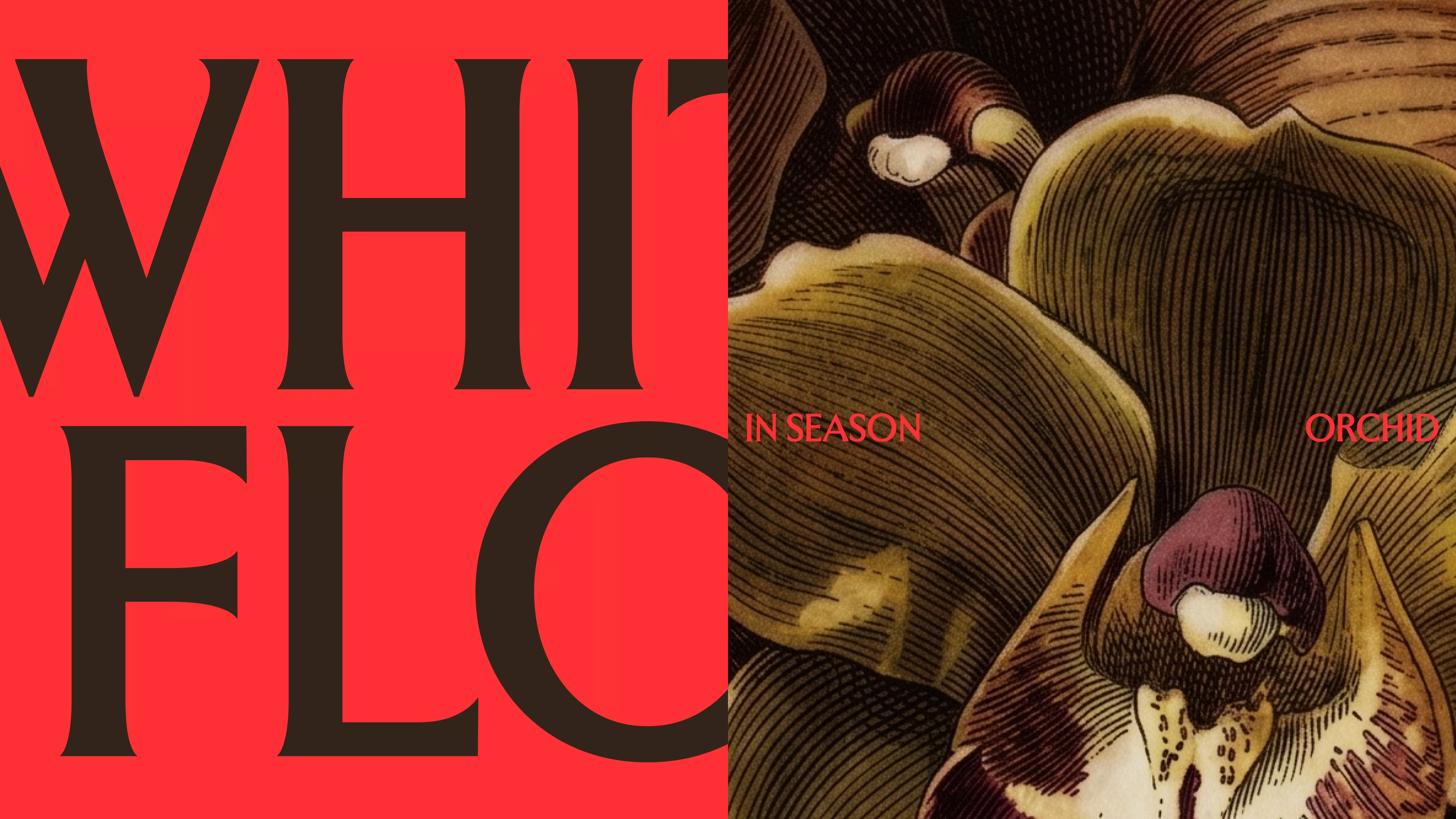
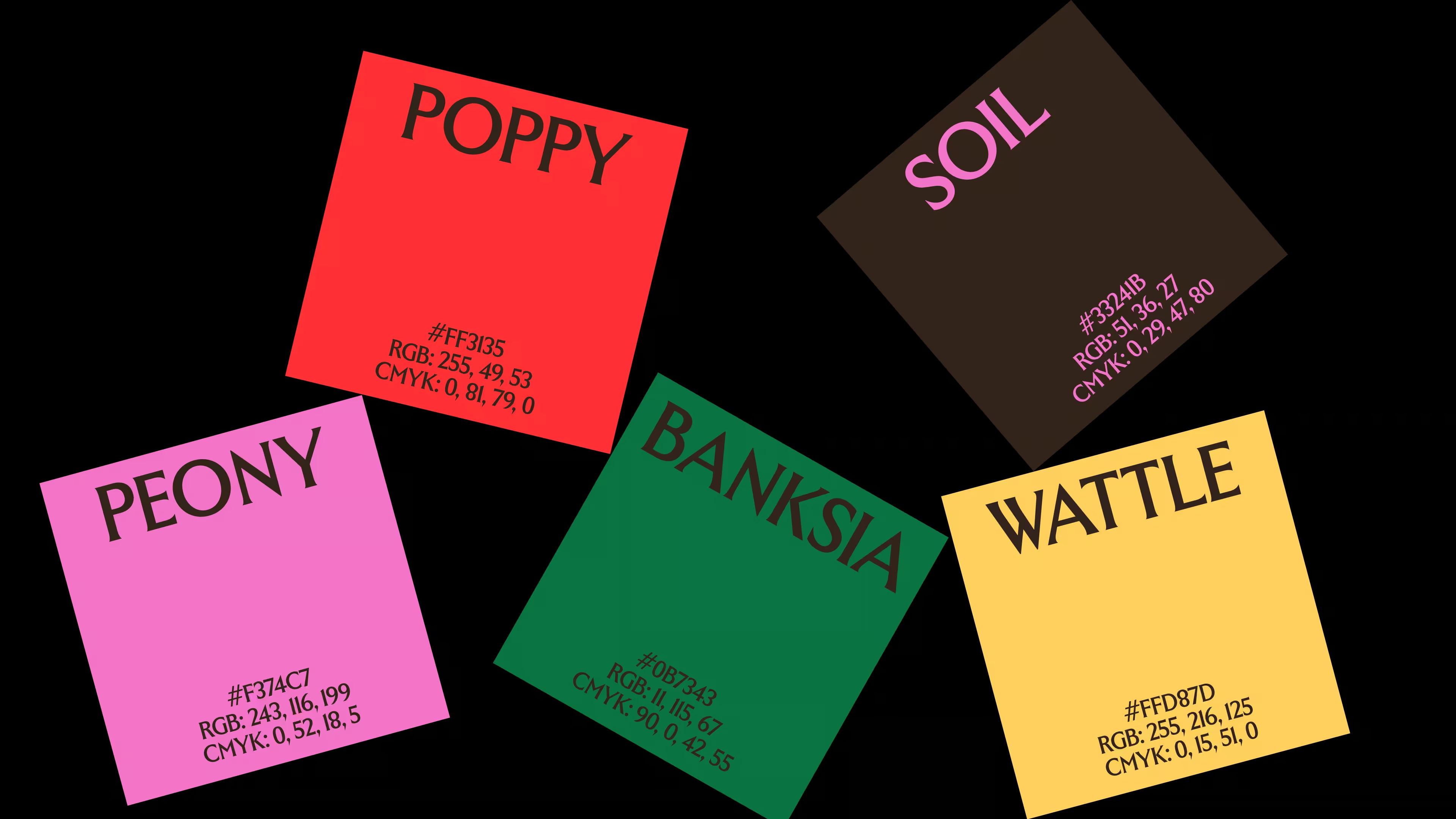
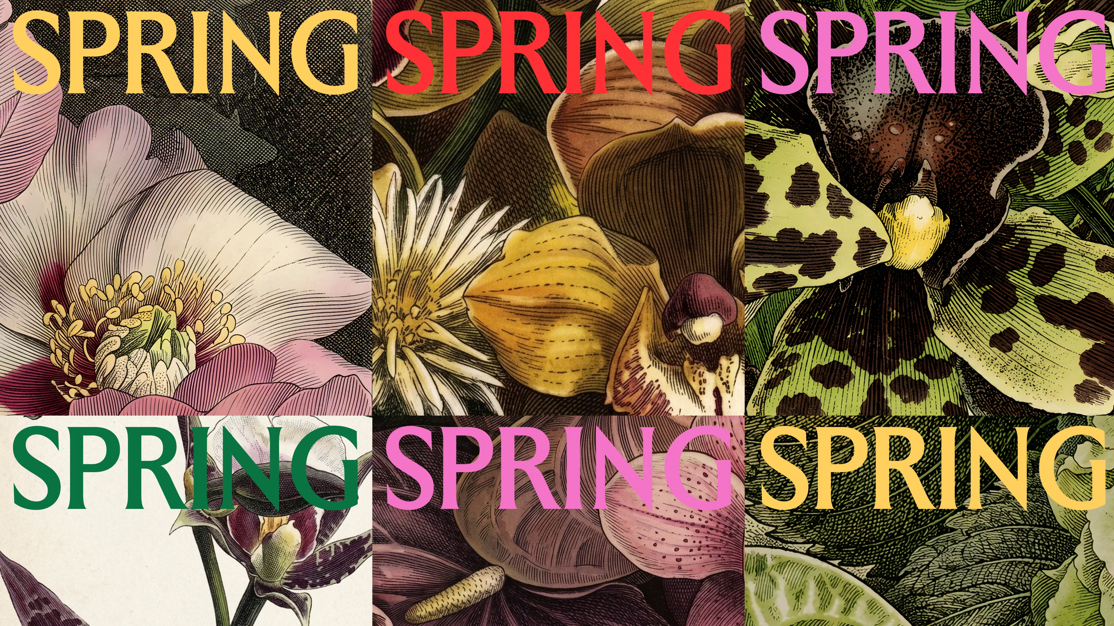
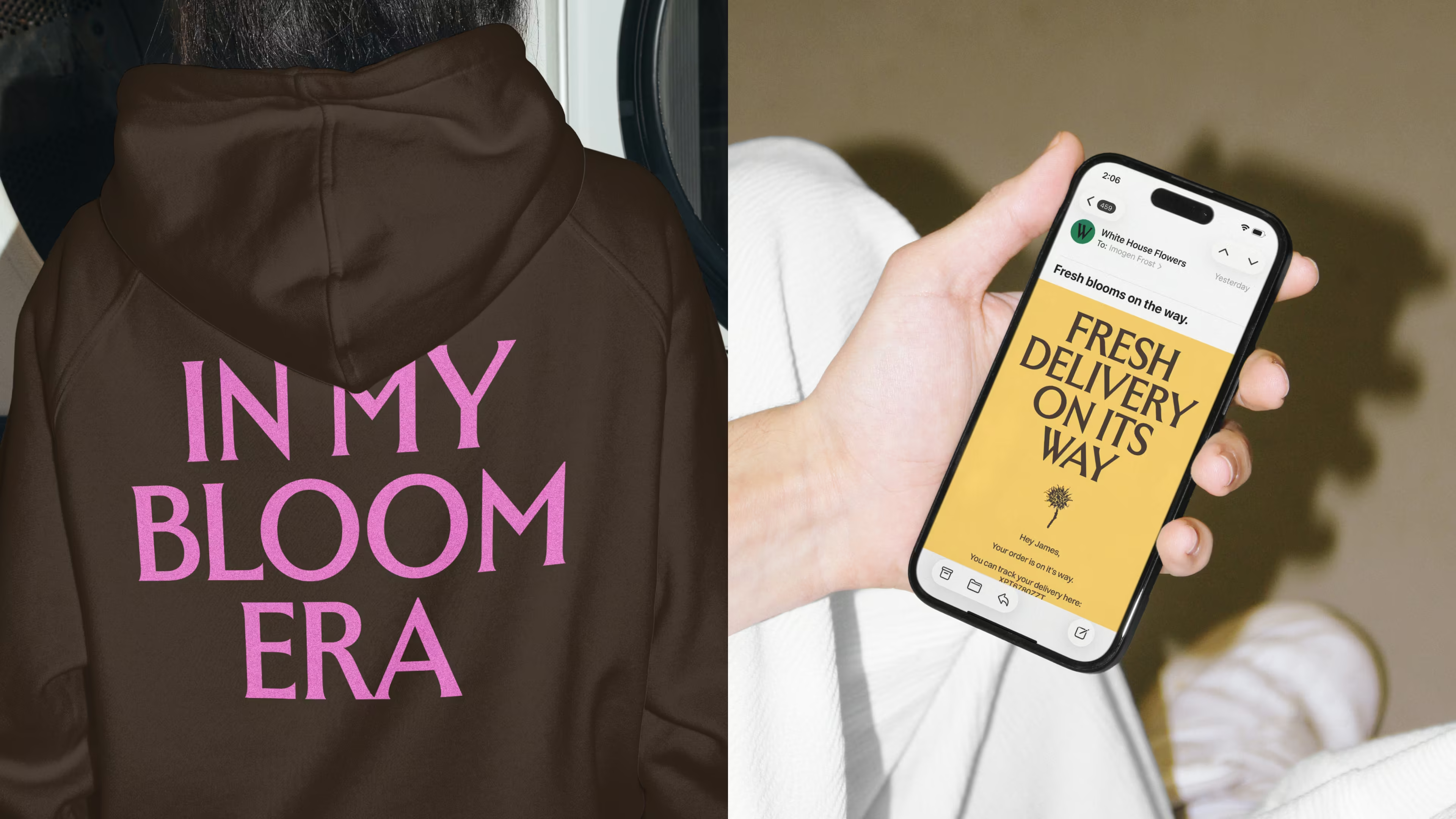
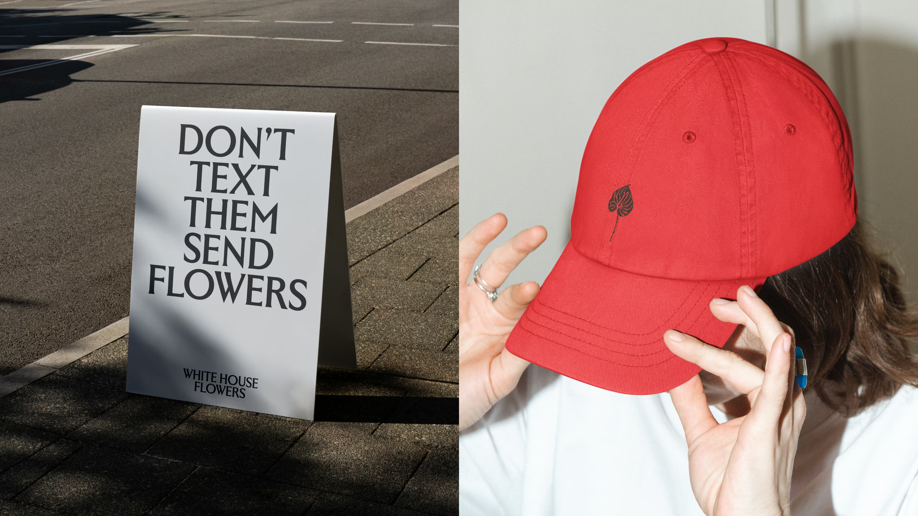
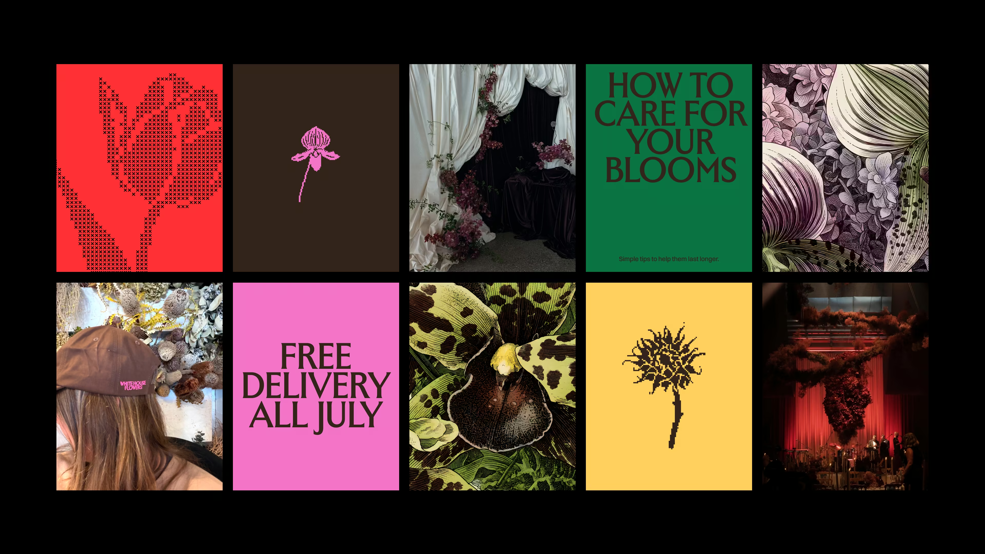
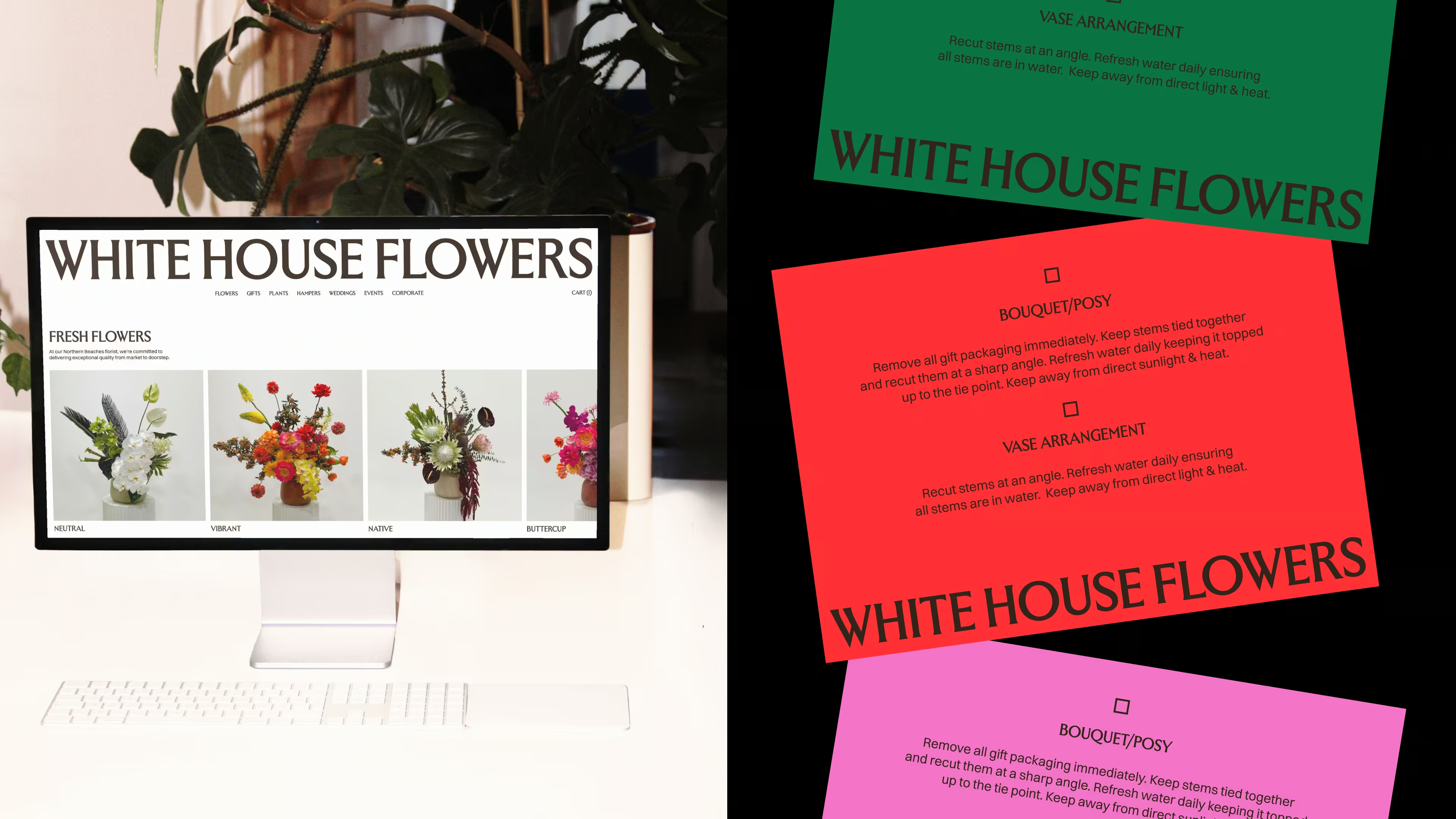
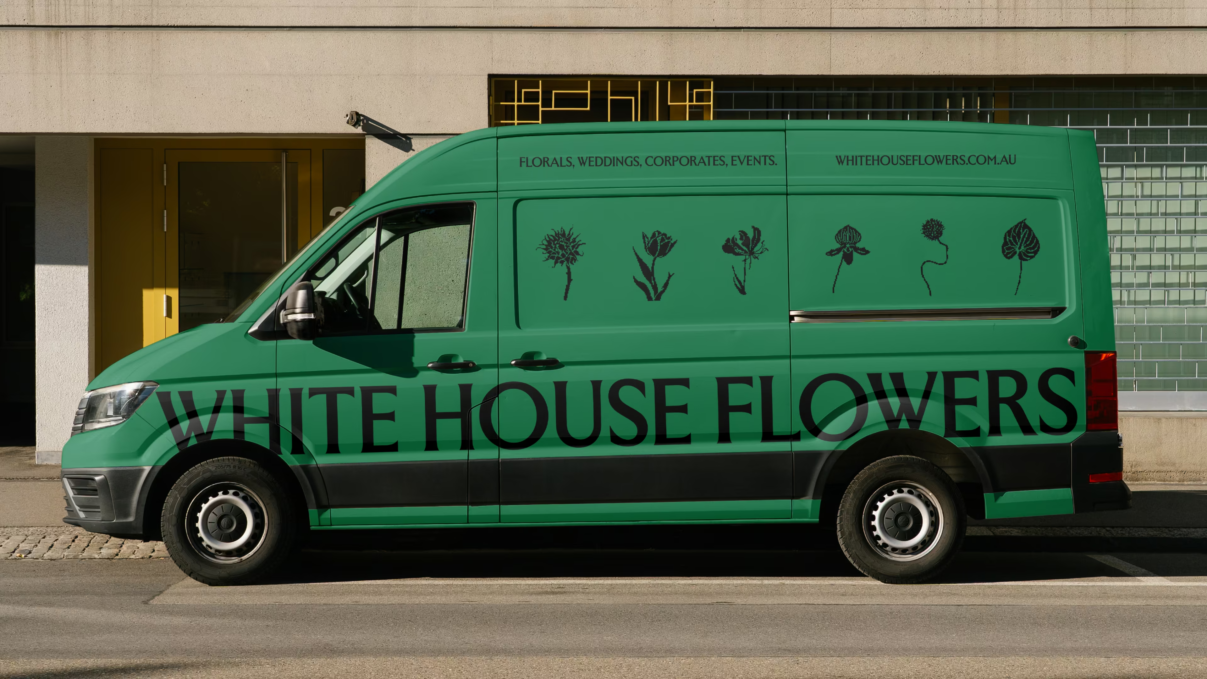
Originally, I was asked to keep the black and white to maintain the brand recognition. If you know me, naturally I pushed back. For a business working with the seasons, making the most of whatever is in bloom, I felt the identity shouldn't be locked into a static, monochromatic colour palette. We ran with four accent colours, one for each season, and a grounding brown. It's a system built to move as they do: shifting their online presence as the seasons do, a thank-you card custom-matched to every floral delivery. While it's tempting to keep the identity clean to not impede on the florals, there was a certain magic when you combined them with colour (complementary or not) that made it so much more impactful and memorable.
THE VISUAL LANGUAGE
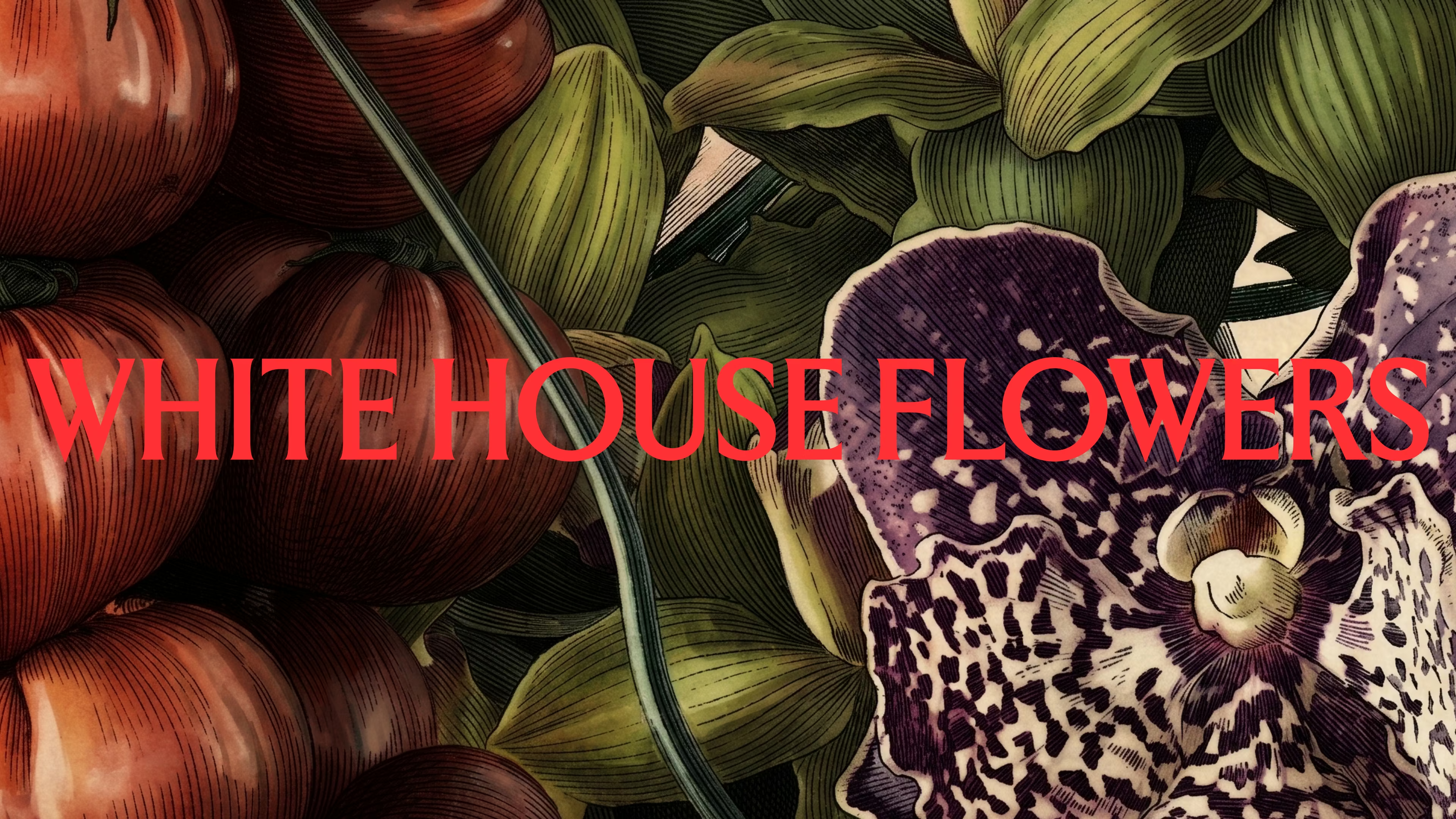
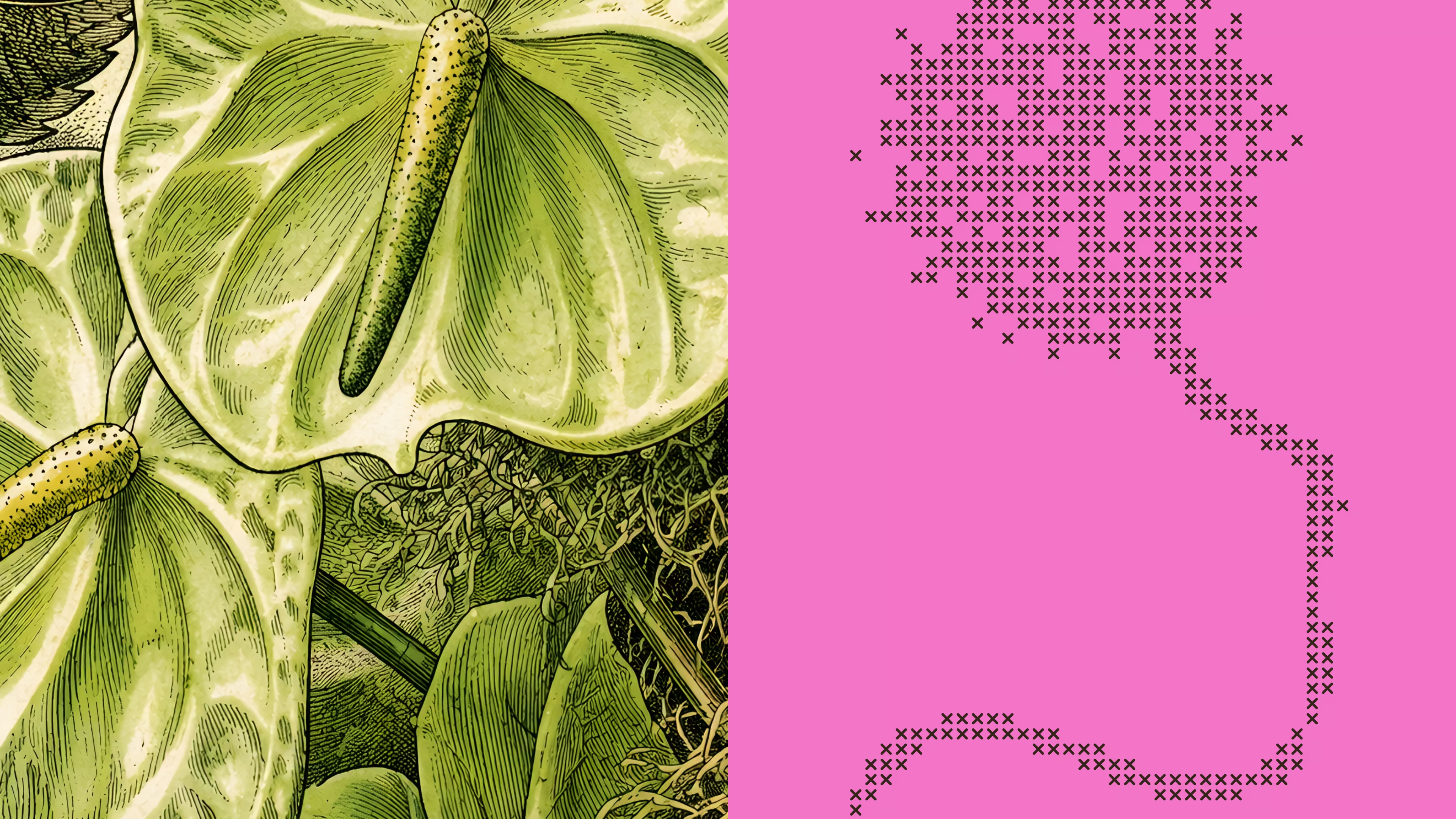
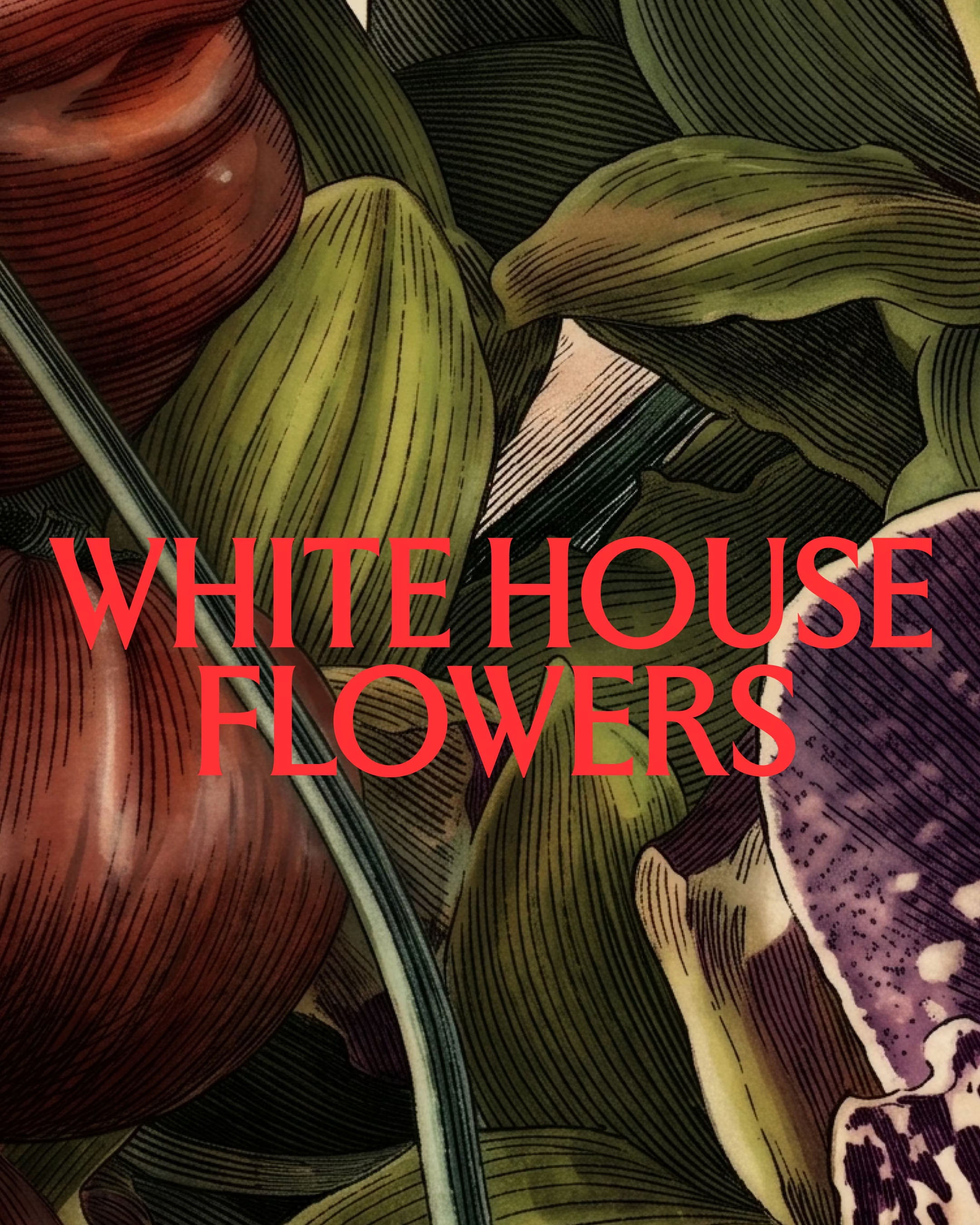
We built a rich, evolving visual language to sit alongside the brand identity. While every other florist stops at a nice photo, we wanted to take it one step further and really position them as real artists in the field. I created a custom prompt to transform their finished arrangements into vintage botanical illustrations. What was a fleeting moment is transformed into a delicate archive – built to live beyond the lives of the blooms.
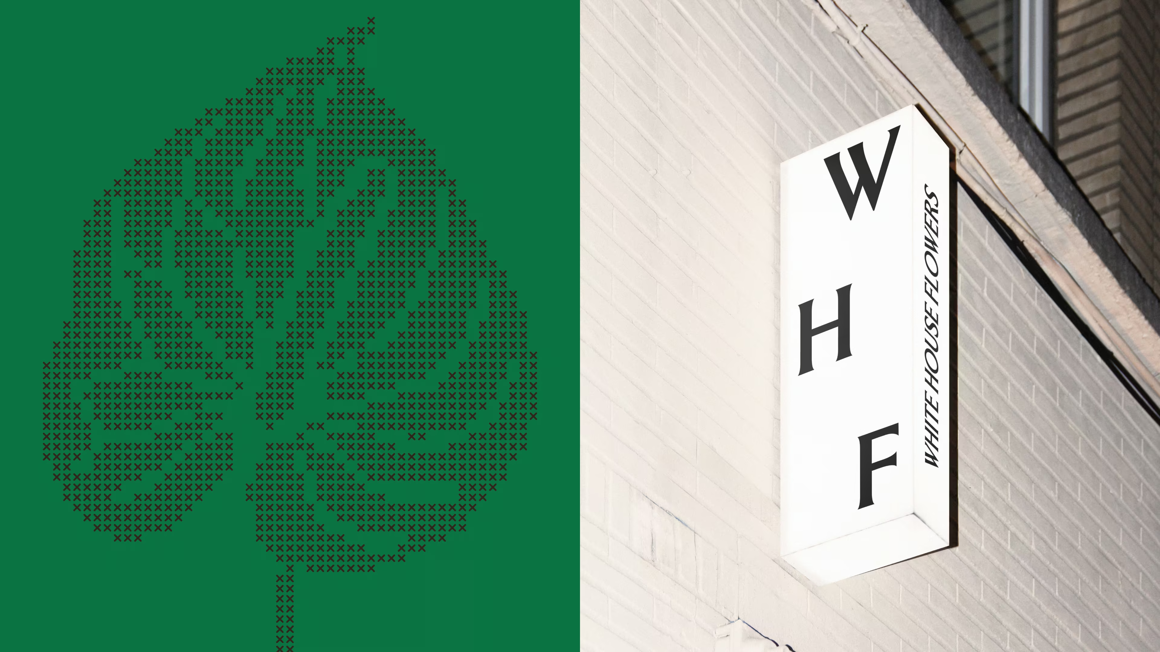
In addition, I created a suite of custom illustrations of florals. These were created in both a pixelated and cross-stitch style, to be used at different scales where the application needed it. This in itself was another expression of art: proof that it doesn't just exist in paintings but in pixels, in tapestry, and built to exist between our natural and digital worlds.
This identity wasn't a task of decoration. It was propagating an already successful brand to springboard them into the future: into a world where they can decide what projects they take on, and earn the trust of full creative control with each client. It was positioning them as floral artists, rather than florists, and letting their truest, best story impossible to resist for those who sought them.

.avif)
.avif)
.avif)
.avif)
.avif)
.avif)