Postpartum recovery is one of the most physically demanding experiences a woman will go through. The products that exist to help with healing look like they belong in a hospital supply cupboard. Clinical white. Functional. Hidden.
New mothers are expected to move on quickly, direct attention to the baby and not dwell on what their body just did. The result is a category that not only looks like an afterthought, but actively reflects the way postpartum women are treated: invisible.
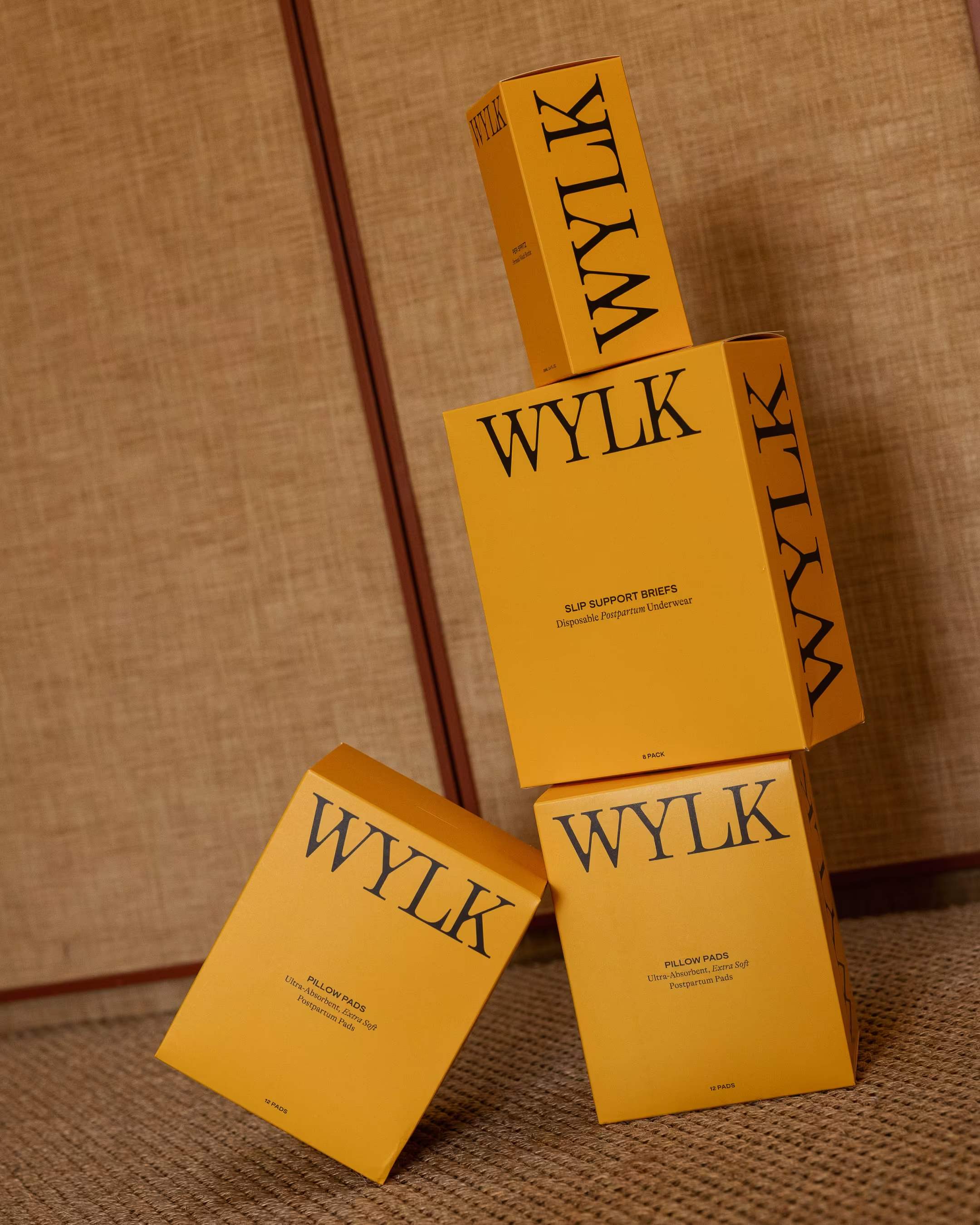
WYLK was founded to change that. As the name says it plainly: Wouldn't You Like to Know.
The opportunity wasn't just to make better-looking products. It was to reframe the category entirely. To treat postpartum recovery not as something to manage discreetly, but as something worth celebrating openly.
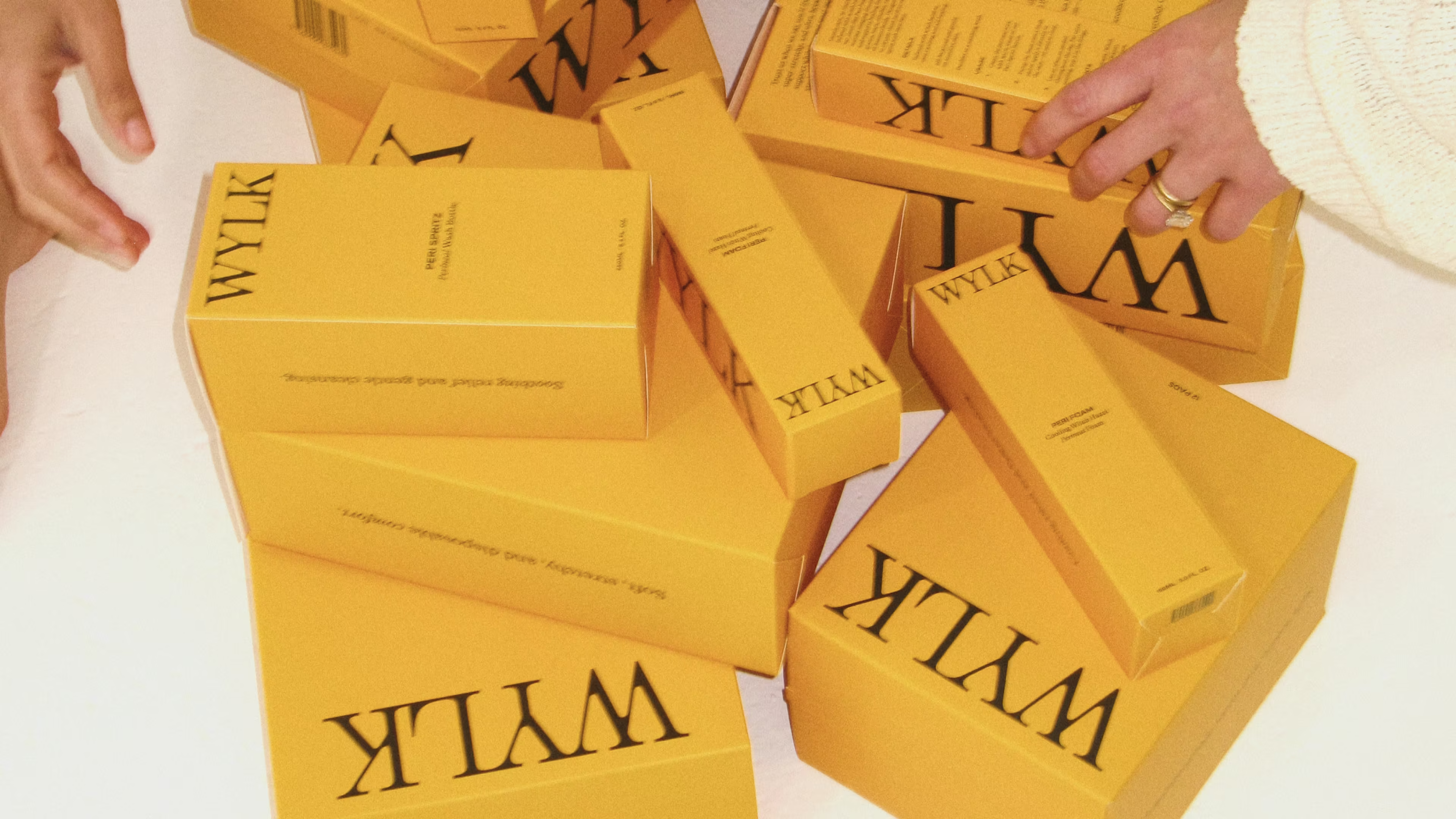
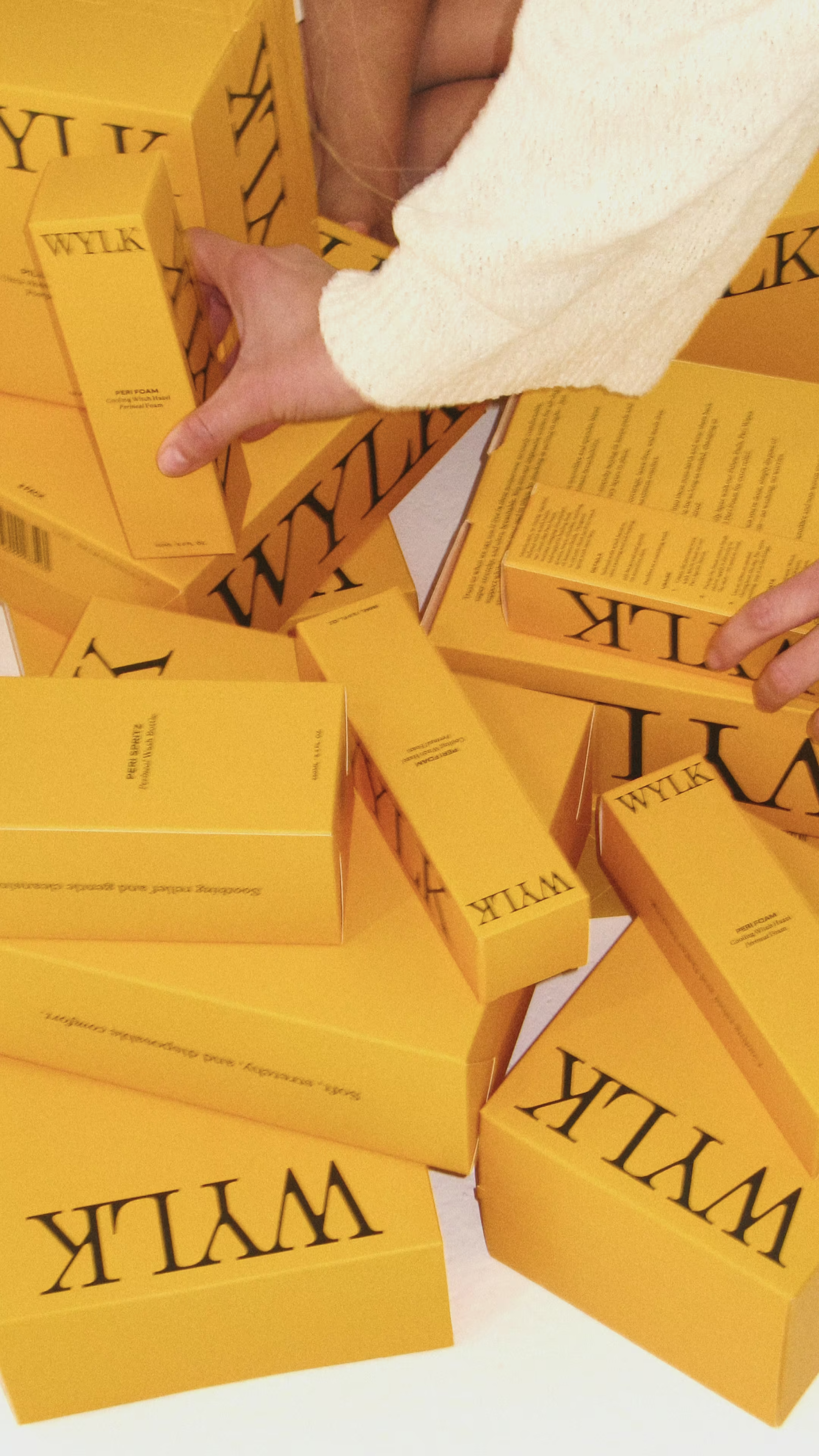
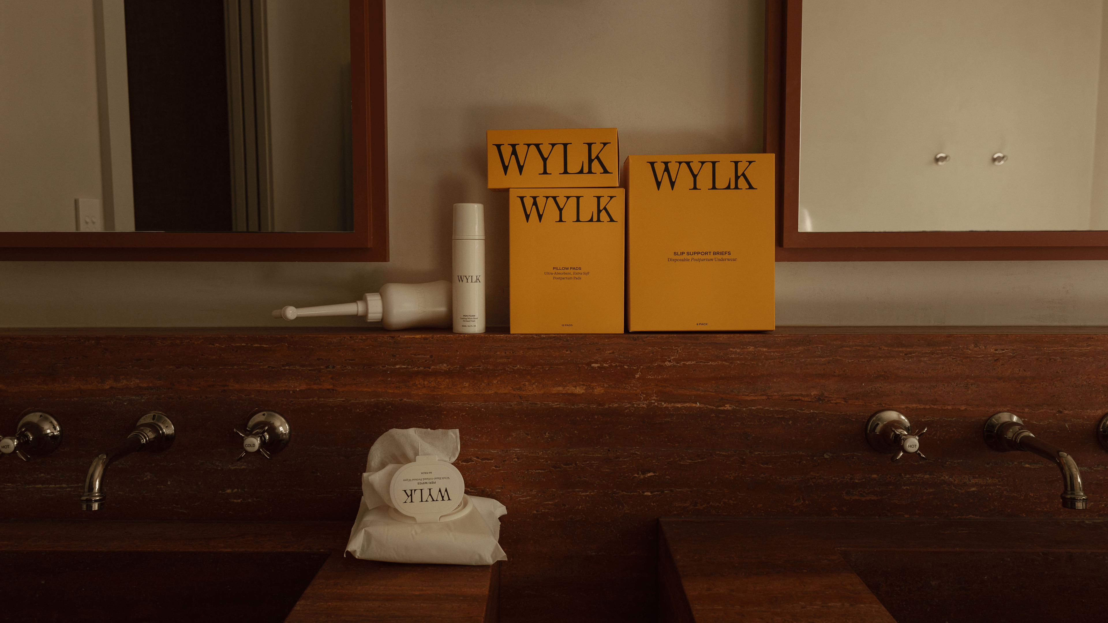
Where competitors whispered, WYLK proudly announced itself. Where the category defaulted to soft pinks and clinical whites, WYLK would be visible and completely unapologetic. Products worth displaying. A brand worth talking about. An experience that finally put the mother at the centre.
Photography by Iris and Me
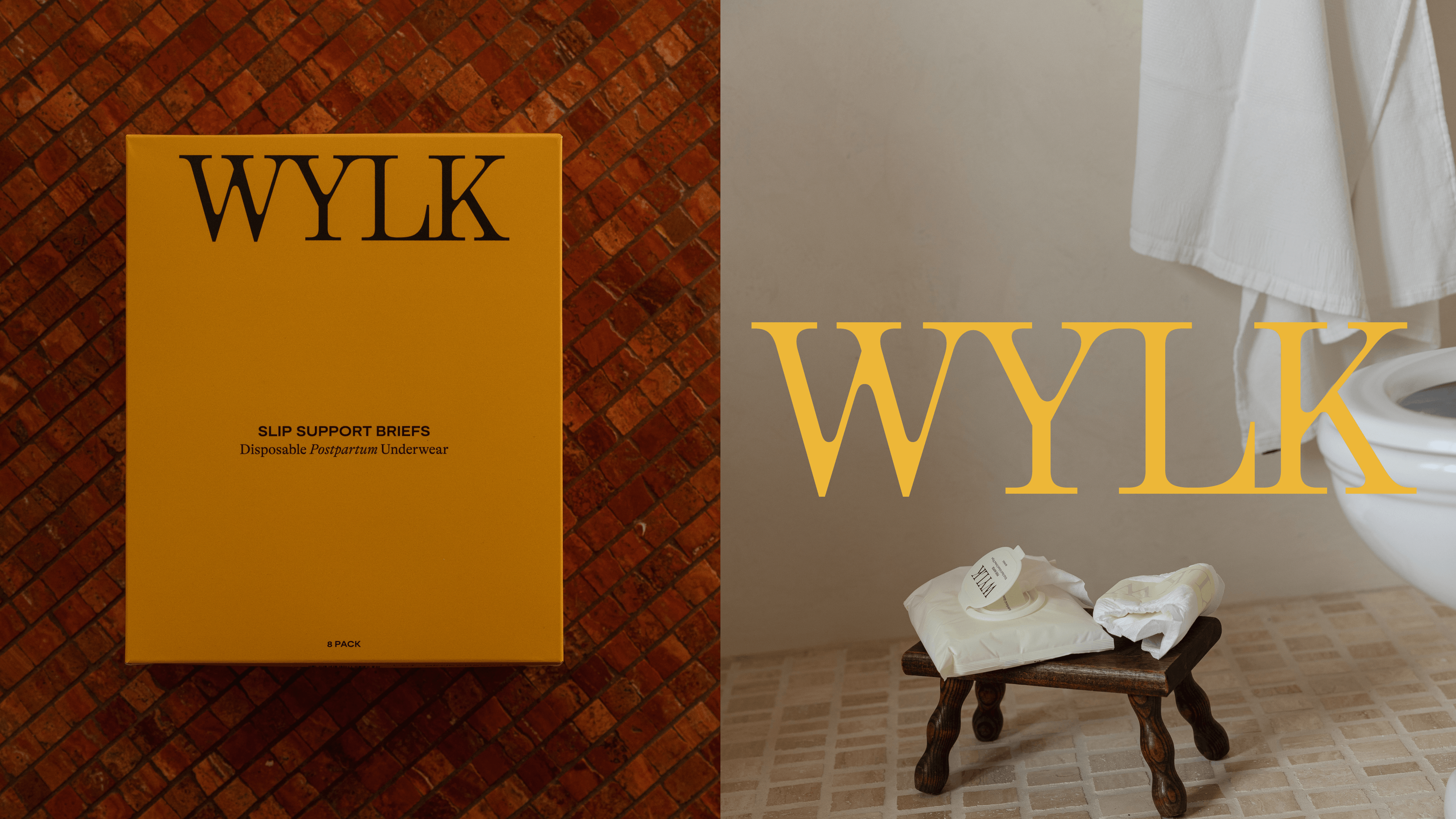
THE IDENTITY
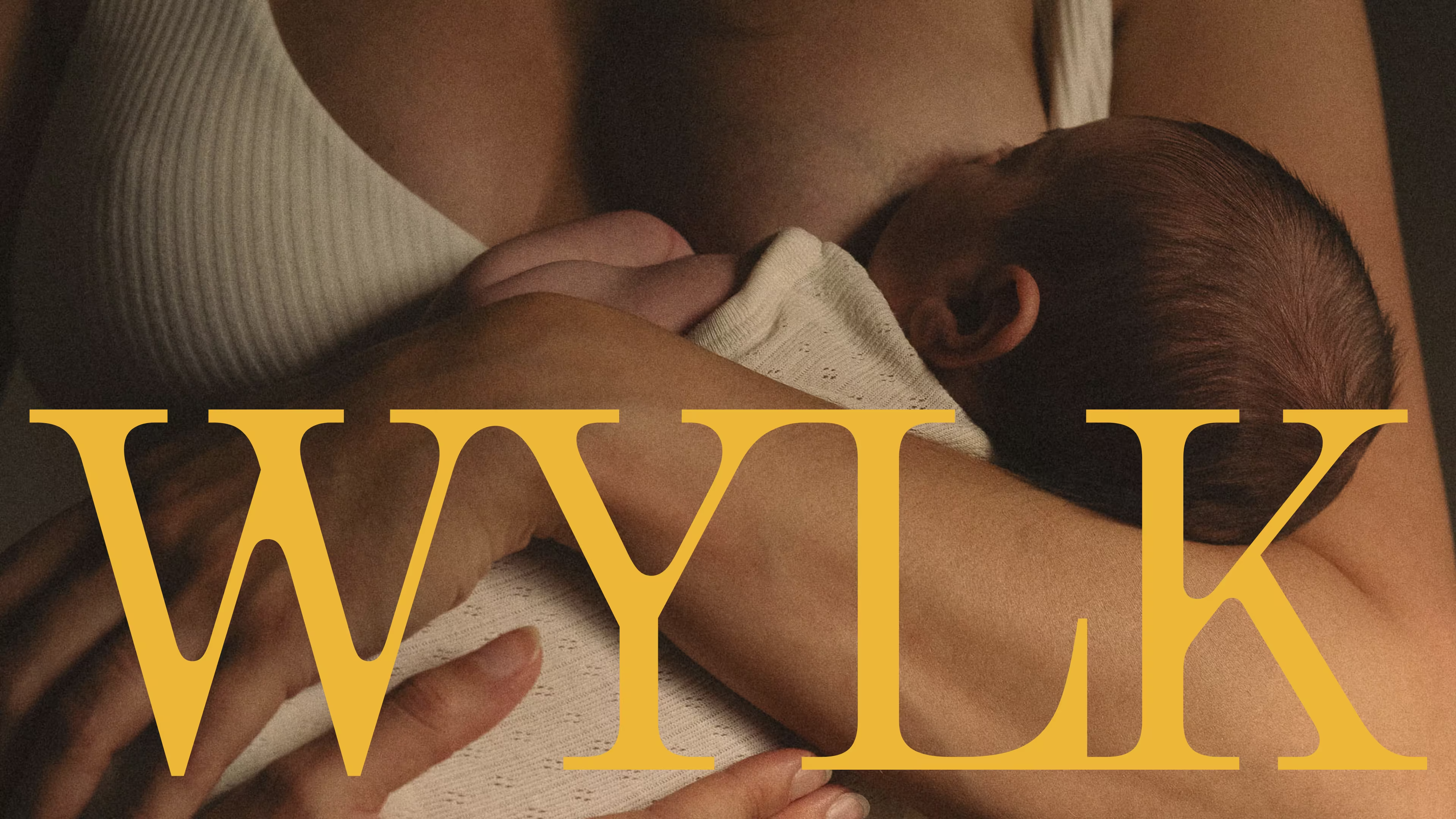
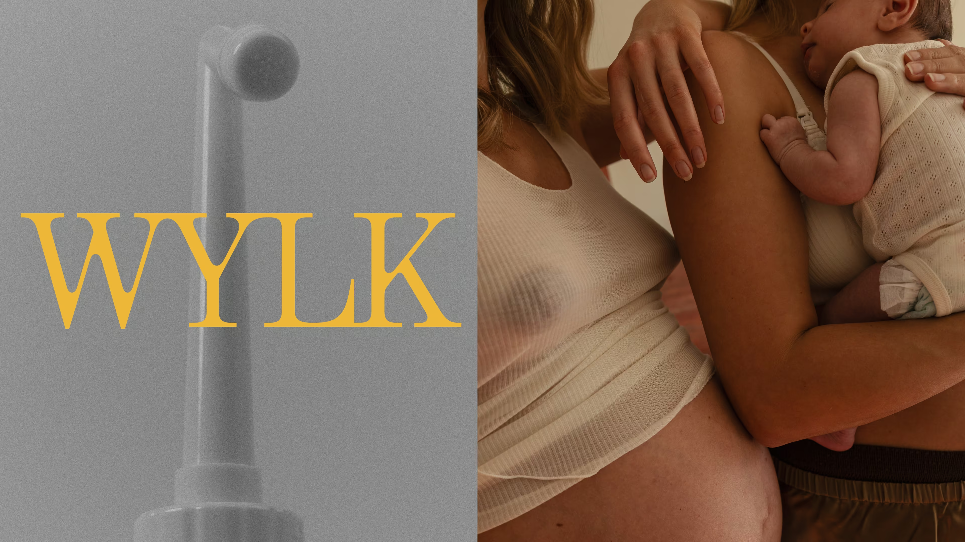
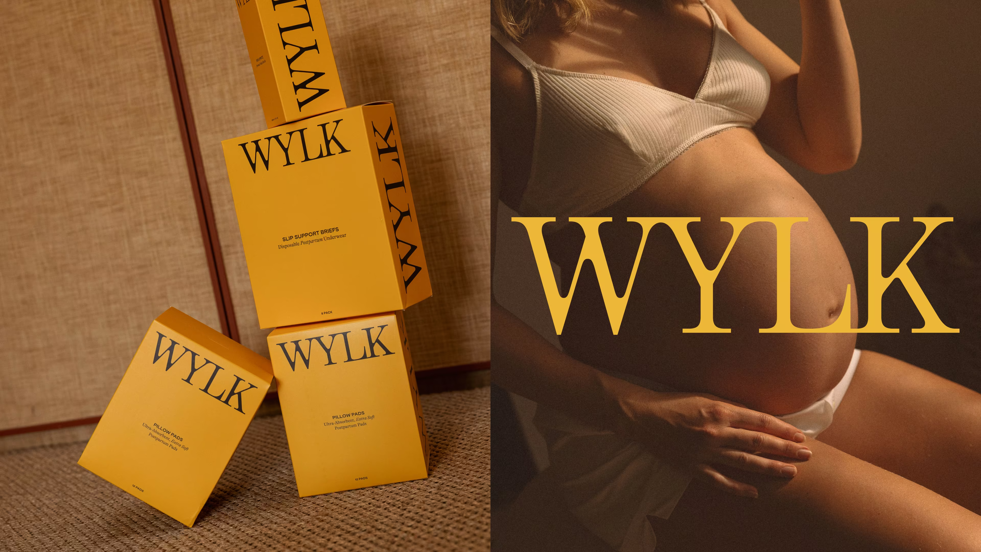
The visual language was built to do one thing: make these women the main character.
The logo draws from editorial magazine mastheads, customised with exaggerated ink bleeds: echoing the changing form of the female body through pregnancy and birth.
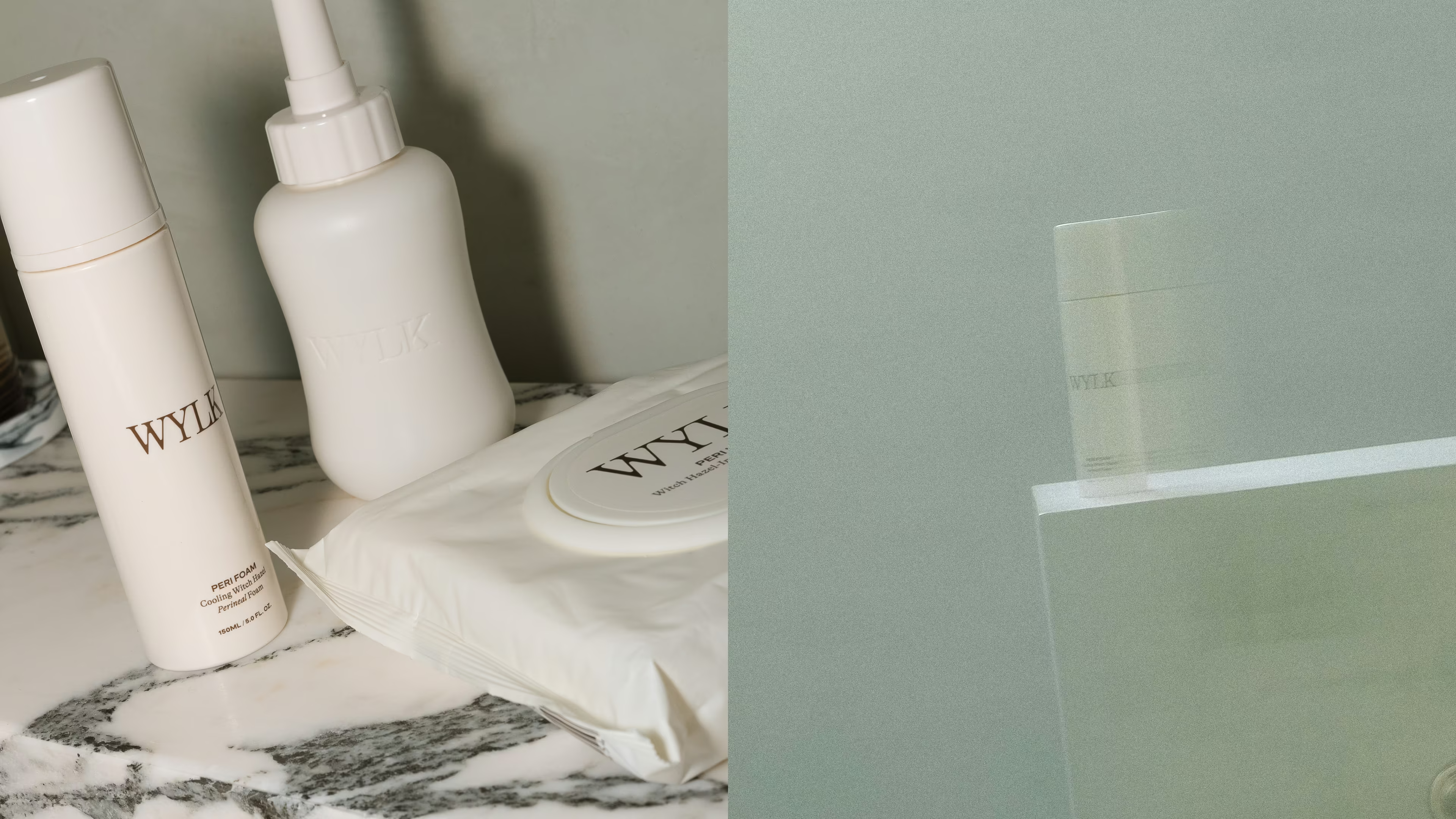
We chose marigold as the brand colour as a deliberate rejection of the pinks and purples that dominate female wellness. Joyful without being soft. But also refusing to ask for permission.
The art direction was the most important piece of the project. Women were never photographed during this time of their lives, and we weren't just making them visible, but immortalised. Artistic crops, high contrast flash mixed with soft light. The bodies were celebrated as artforms.
THE EFFECT
WYLK is now a product of its own category. The brand has the kind of visual identity that travels: screenshot-able, shareable and immediately recognisable.
That outcome didn't come from giving the client what she asked for. It came from a moment of honesty late in the process and a founder brave enough to act on it. The brand that launched wasn't the safe choice. It was the right one.
But don't hear it from us. Hear what Sam had to say.
“Imogen is an absolute gem. From day one, she understood the heart of WYLK and brought the brand and packaging together in a way that feels both refined and deeply intentional. The yellow is bold yet soft, it makes the brand stand out instantly while still feeling calm and considered. I couldn’t be more thankful for her talent and care she poured into every detail.”
– Samantha Brown, Founder, WYLK
.avif)
.avif)
.avif)
.avif)
.avif)
.avif)