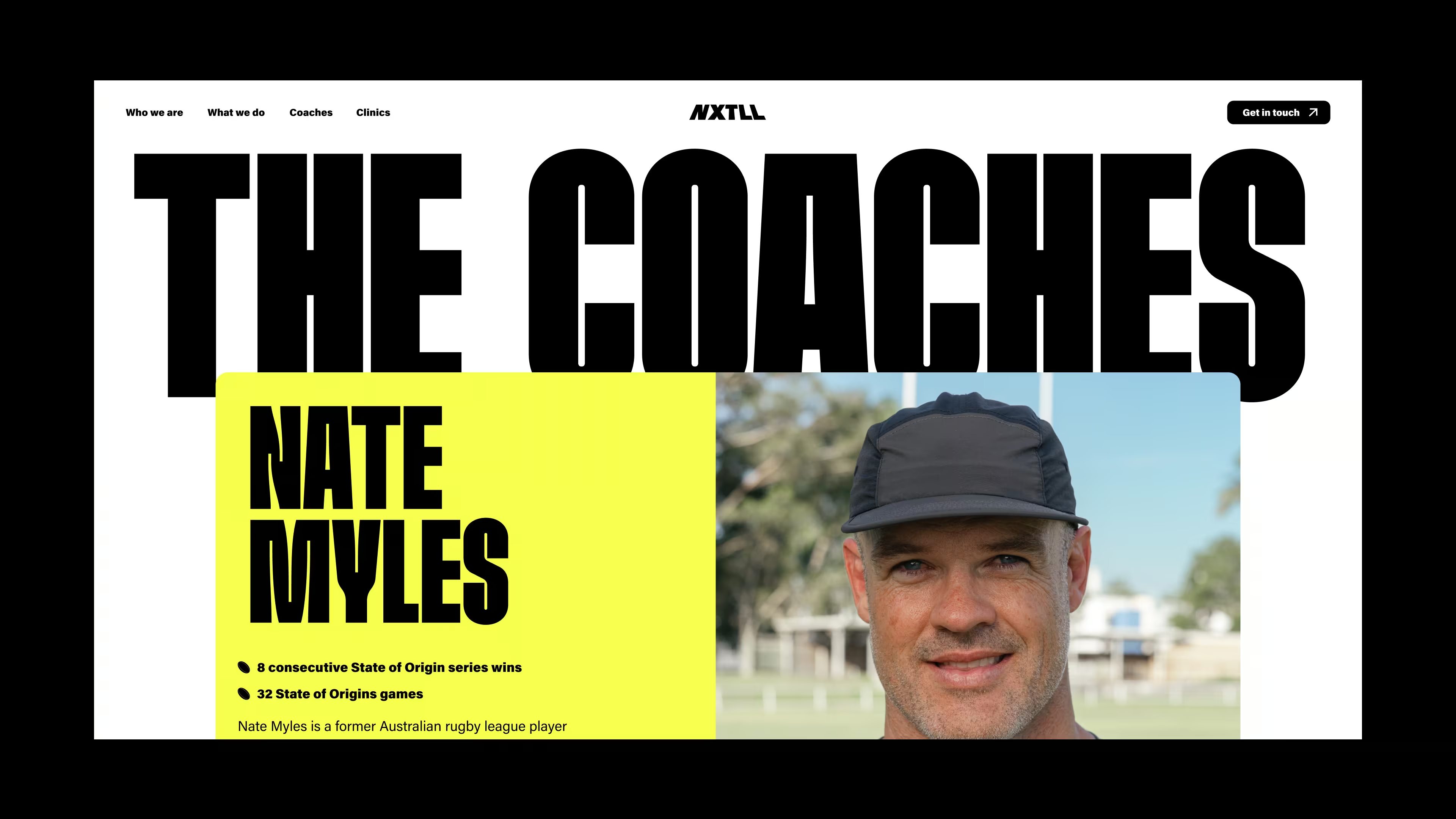
Founded by some of the NRL's most recognised names, NXTLL was built on a simple belief: when kids enjoy the process, they commit to it. Fun isn't the opposite of excellence. It's what brings them back, keeps them engaged, and builds the kind of belonging that actually lasts.
The category already had plenty of performance-first sports brands – serious, achievement-oriented and built for parents who wanted their child in the cool club. NXTLL needed to be something different. Not a camp. A brand. One kids were proud to rep.
The initial brief pointed toward a high-cool sports brand – Nike-adjacent, streetwear-informed, built for teenagers on the edge of adulthood. The references were sharp. The direction looked good. Then strategy got in the way of the obvious answer.
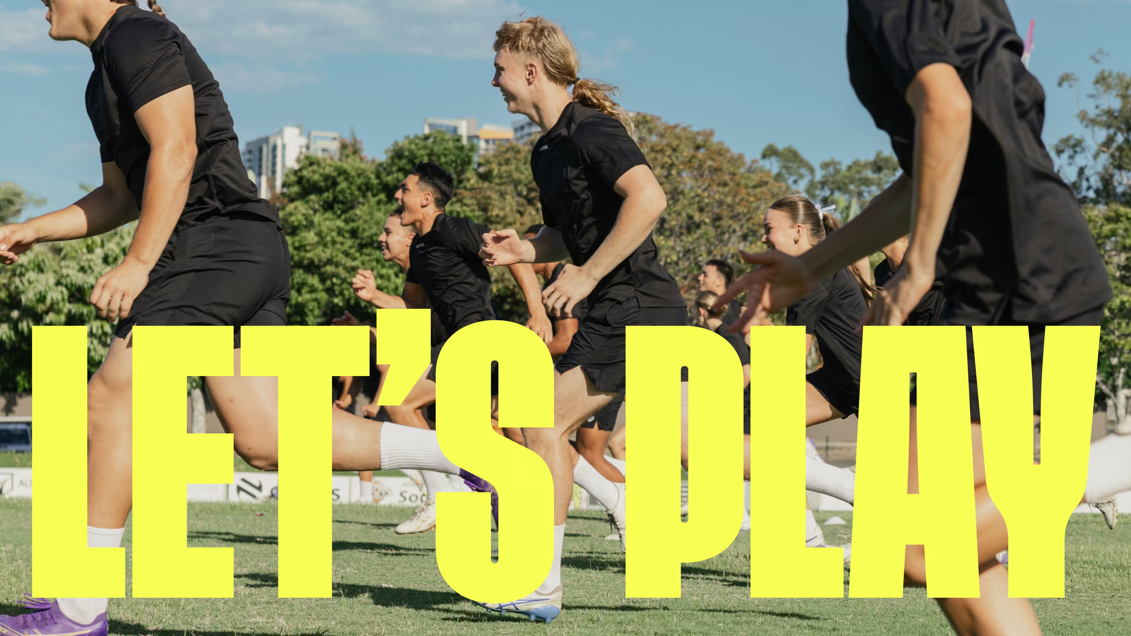
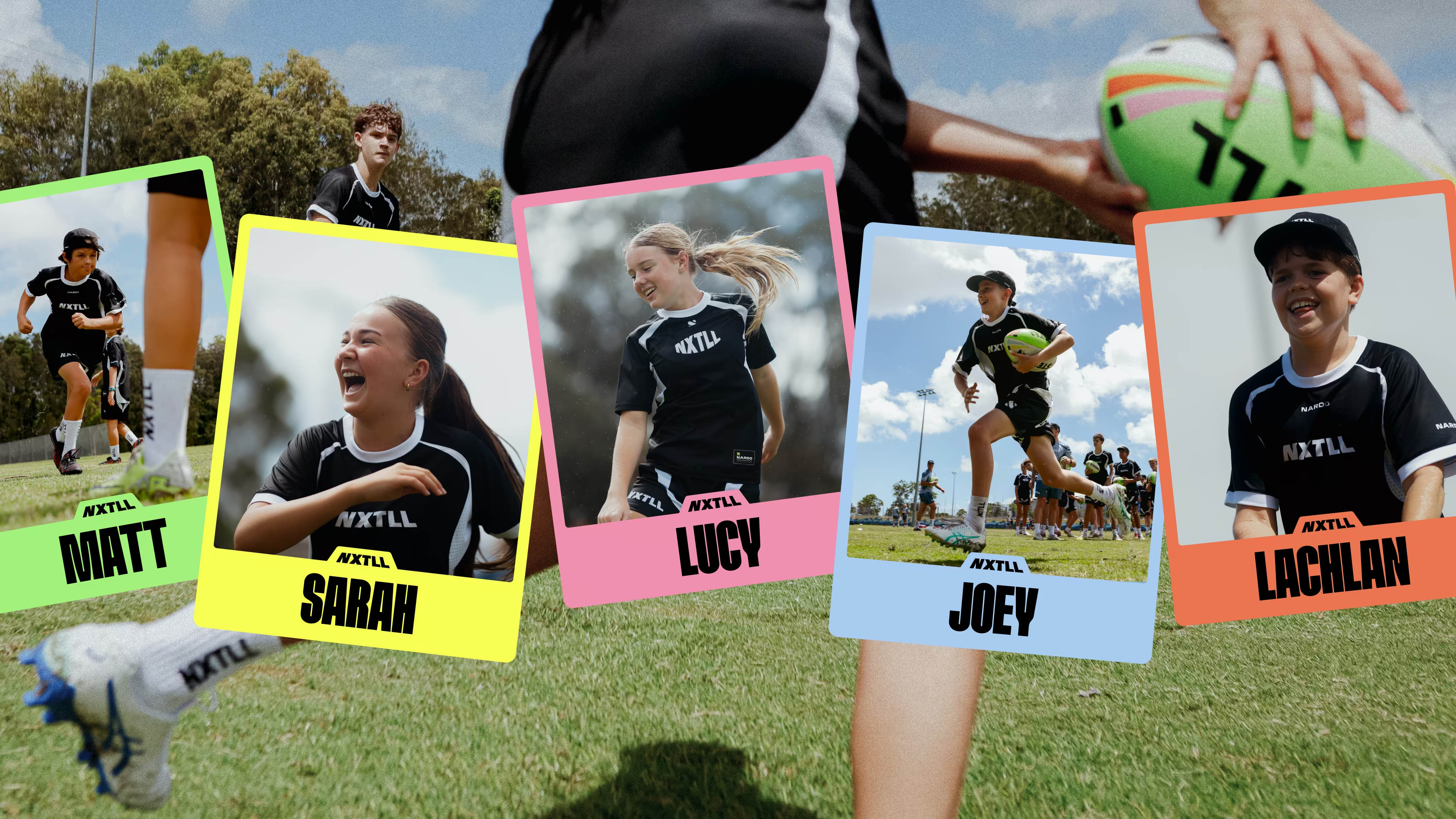
The real audience wasn't teens chasing cool. It was kids aged 10 to 17 who wanted to belong somewhere, have fun and feel like they were good enough to be there. A brand performing cool at them would do exactly what NXTLL was trying to undo – create distance, not connection.
The pivot was decisive: design for the kids, not the parents. Not aspirational in the adult sense, but genuinely theirs. Inclusive, energetic and built around joy as a performance principle.
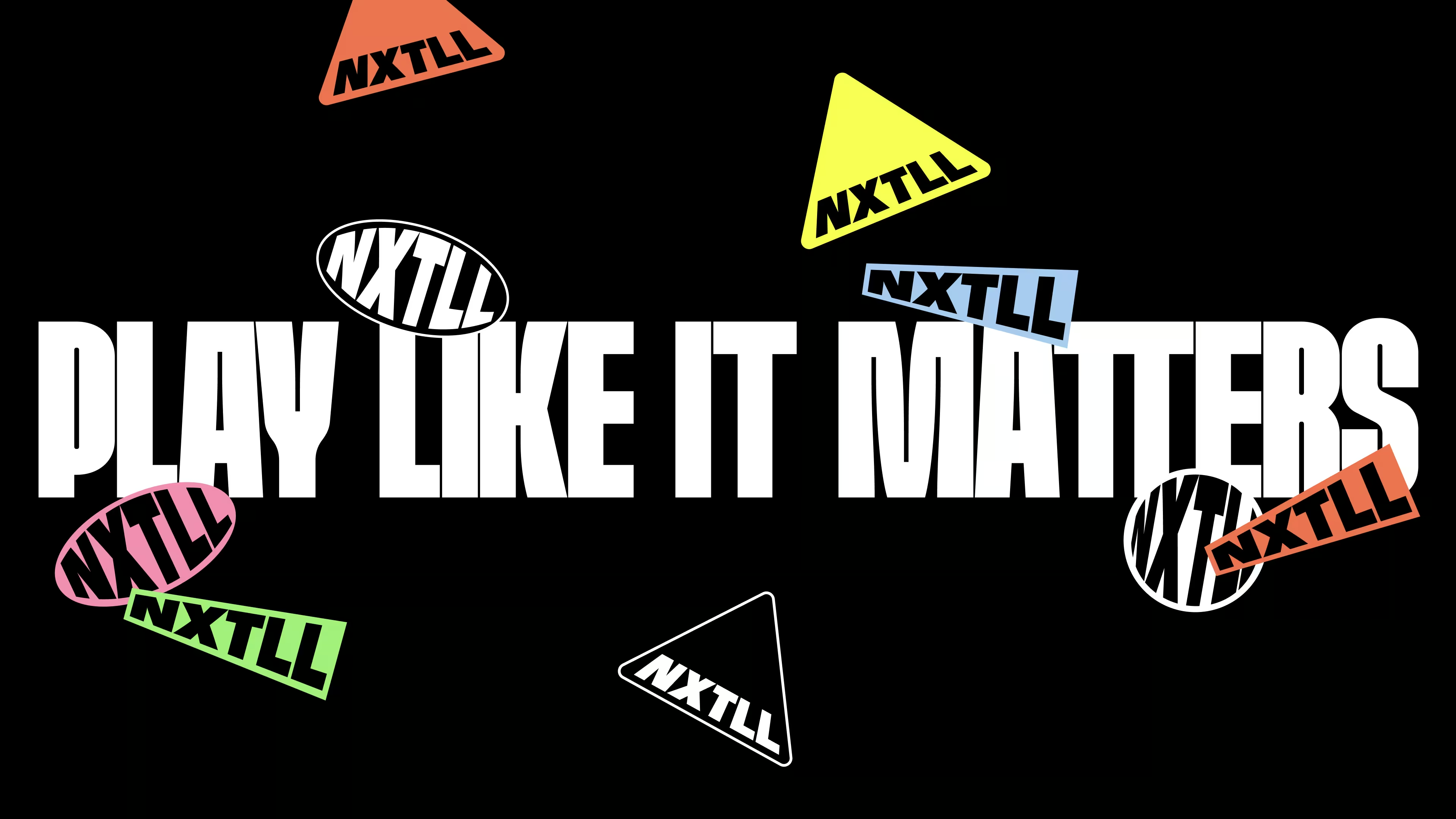
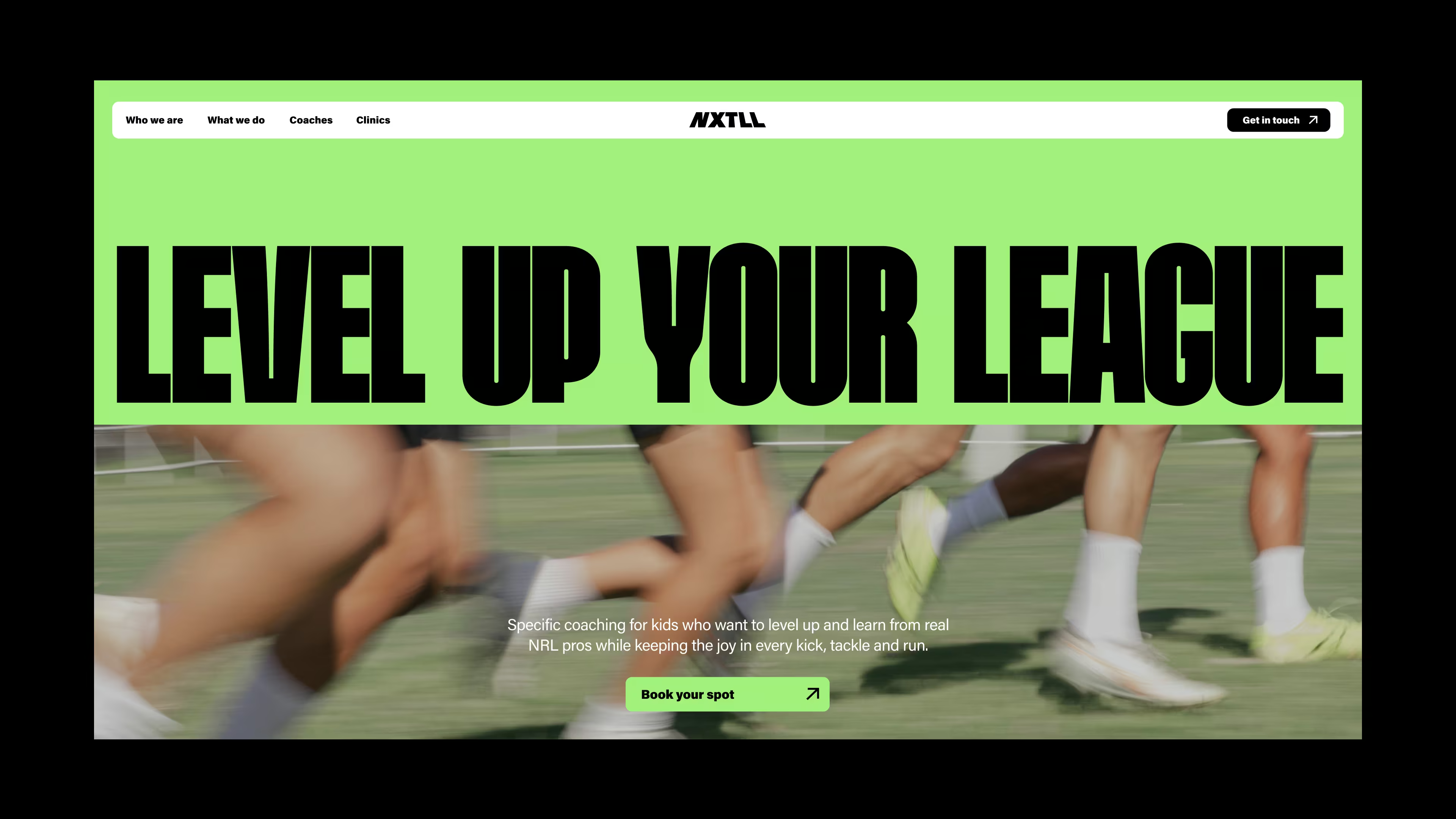
THE IDENTITY
Loud. Kinetic. Unapologetically fun.
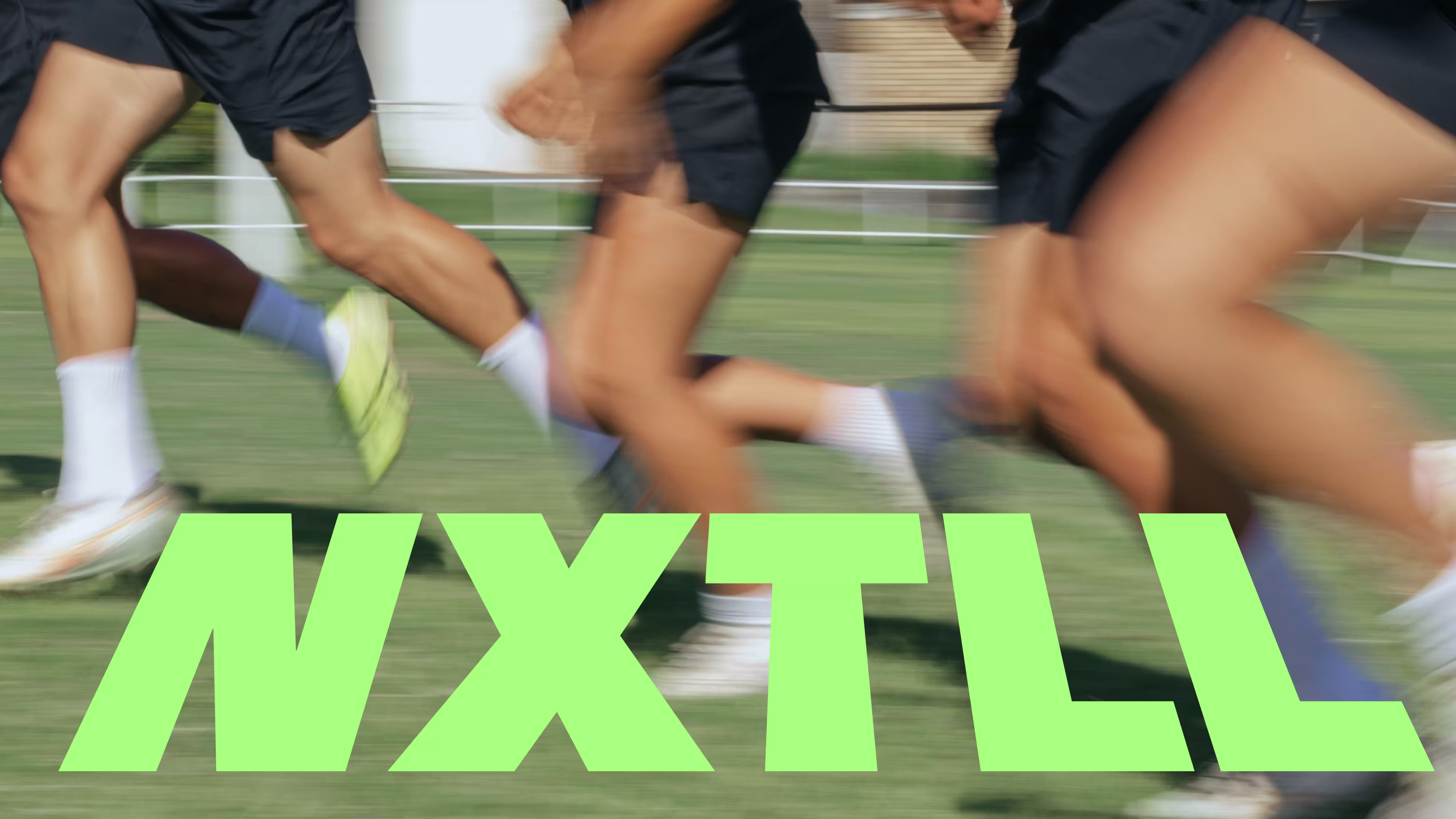
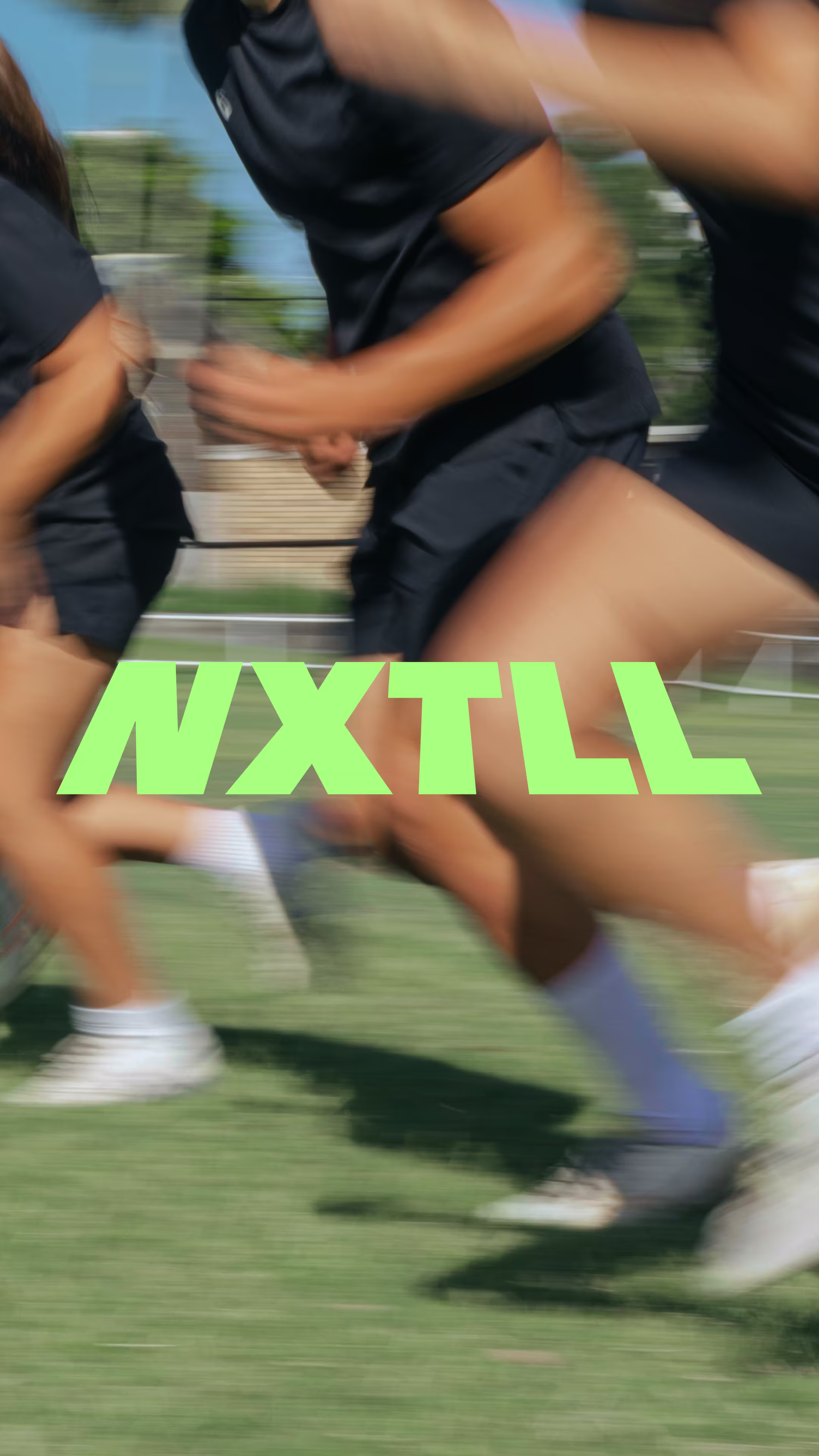
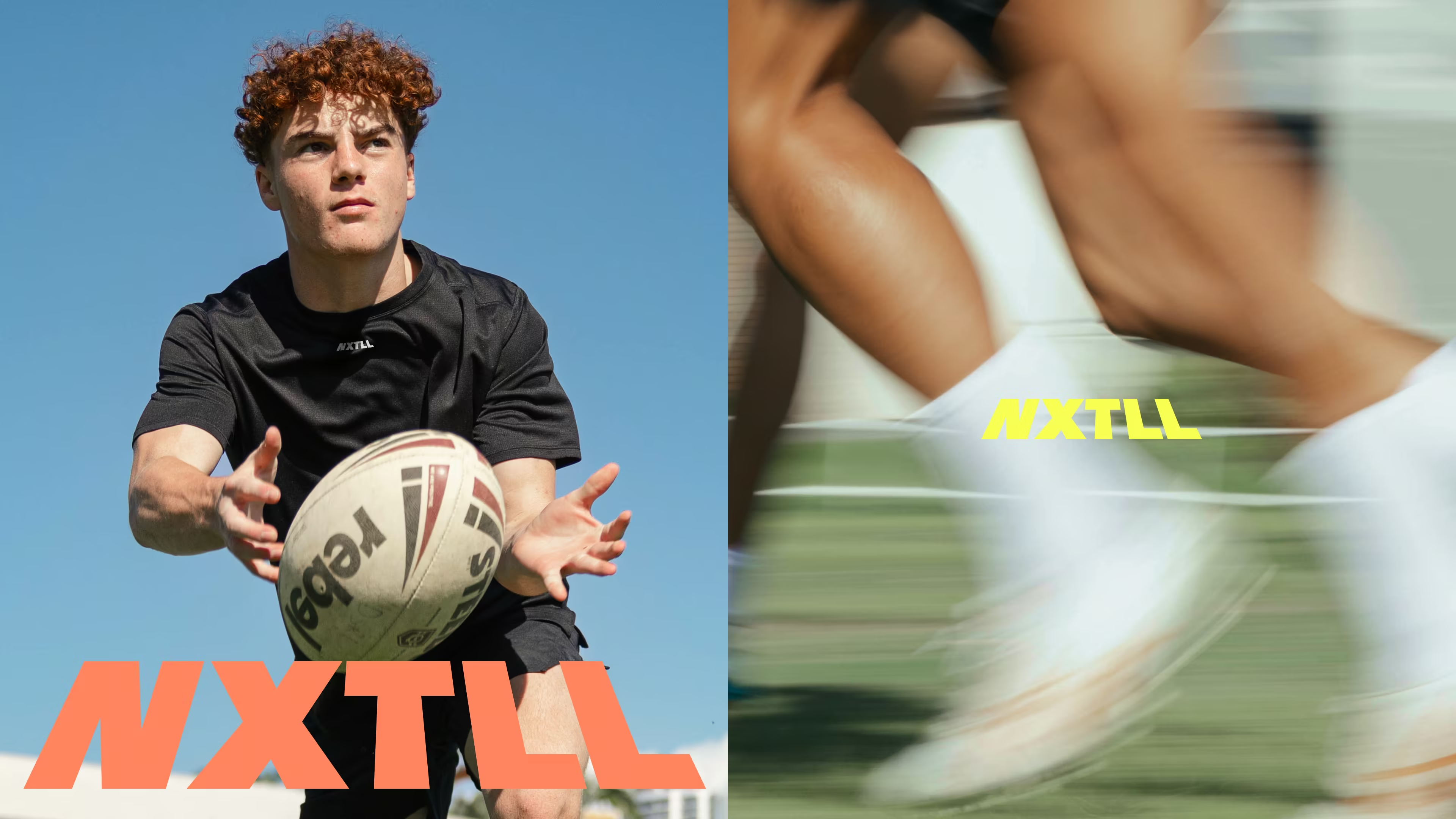
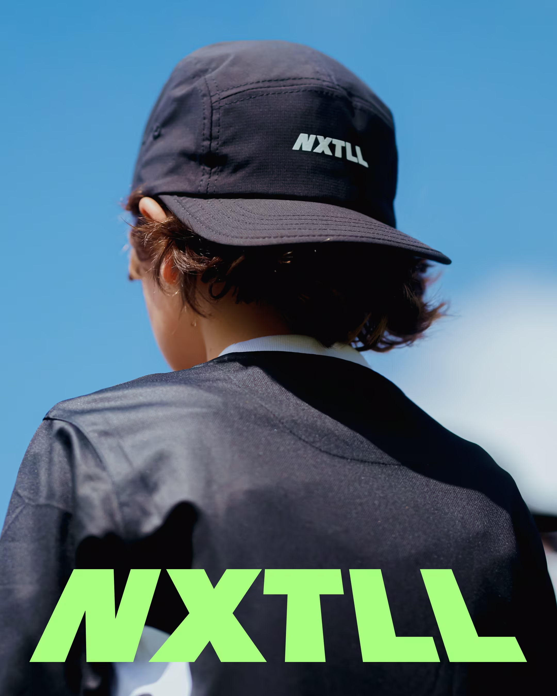
The typeface draws from the bold numerals found on the back of a football jersey. Sporting heritage without nostalgia, instantly recognisable to any kid who's ever worn a number. The colour palette runs hot. Nothing retreats. Everything competes for attention and earns it.
The logo came from a specific moment: watching the NRL Grand Final and noticing how field markings appear slanted from ground level. Standing at the try line, looking out toward the opposition, that angle is something every player knows. The NXTLL wordmark captures exactly that perspective: the moment before you step on the field, the fight-or-flight second when it's up to you to run. A logo that isn't just a name. It's a stance.

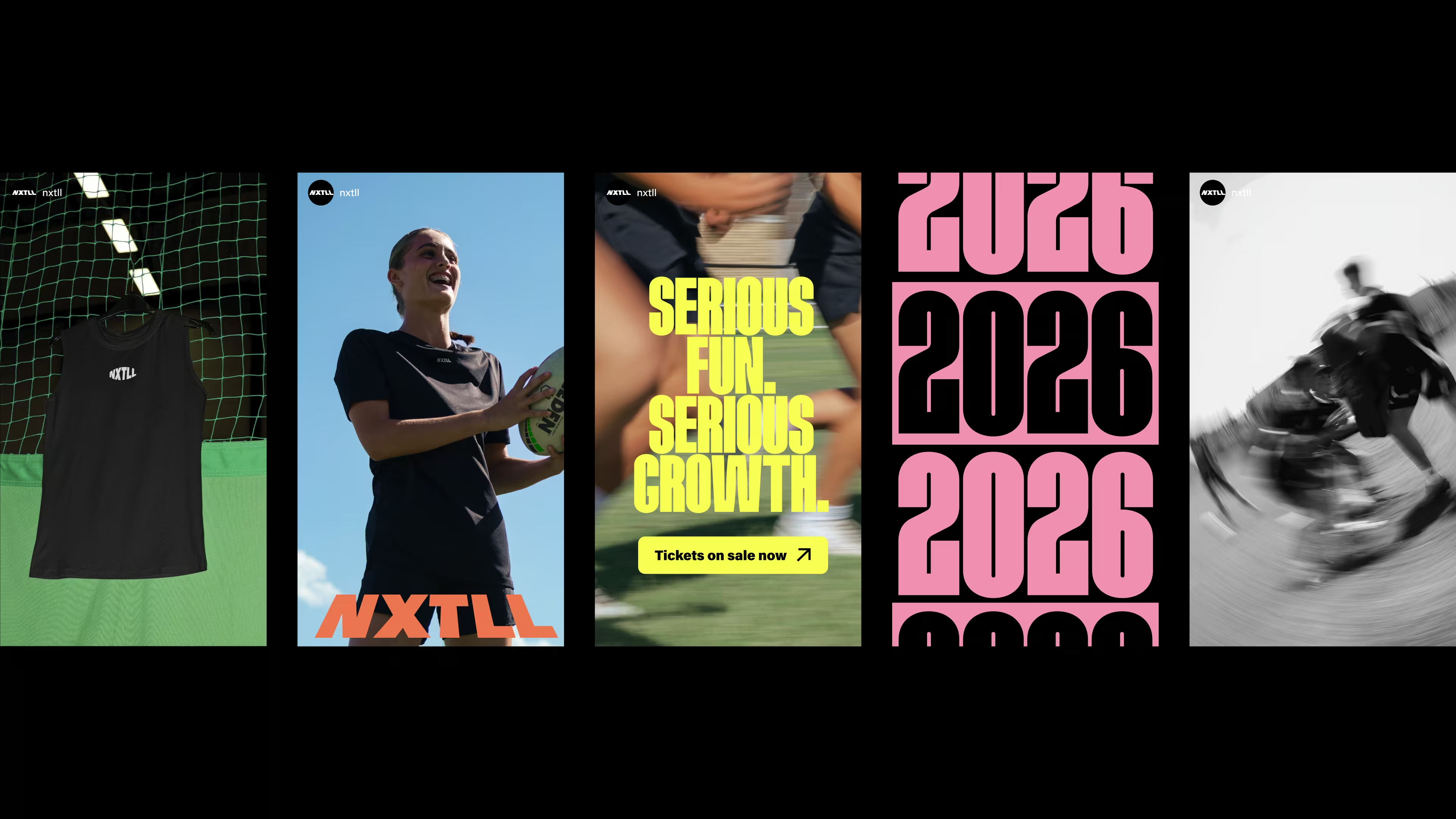
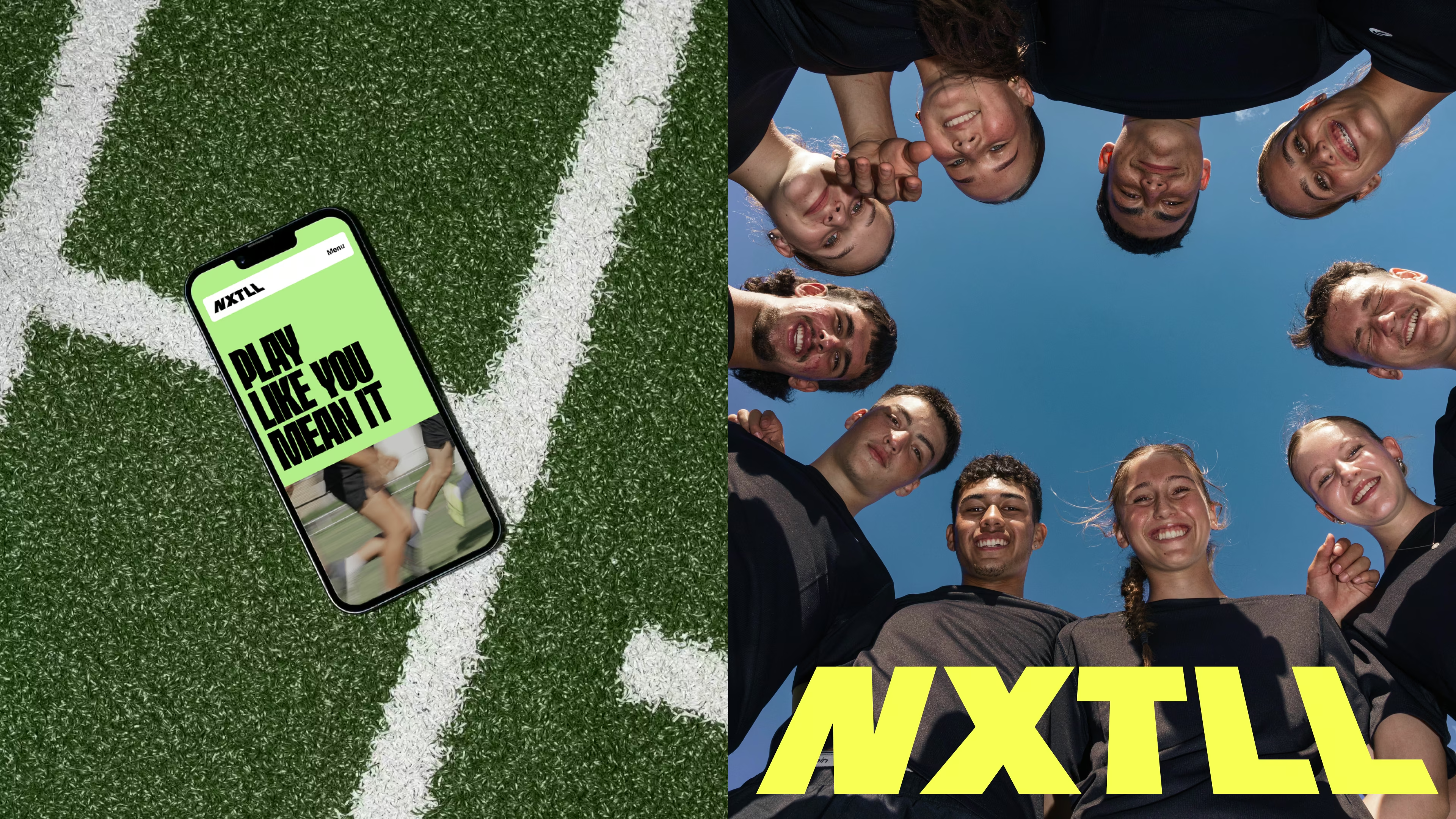
THE WEBSITE
The dual audience required a dual strategy. Visuals were built entirely for the kids: playful, loud, and never condescending. Copy was written for the parents doing the actual sign-up: clear on credentials, clear on safety, clear on what their child would get out of it.
Every headline, every piece of body copy, every call to action was written as part of a full tone of voice system developed for NXTLL. The voice is direct, energetic, and earns trust without performing seriousness.
The site doesn't try to do too much. It establishes credibility fast, then gets out of the way and lets kids want to be there.
THE EFFECT
The camps sold out overnight. The merch followed. NRL partnerships and major sports sponsors came on board.
But the result that matters most: the kids don't want to leave.
That's what happens when a brand actually speaks to its audience instead of past them. NXTLL didn't position itself as the cool sports brand. It became the one kids actually connected with – because belonging, not status, was the whole point.
But don't hear it from us. Hear what Tessa had to say.
“Working with Imogen was such a cool experience from start to finish. The process was smooth, thoughtful, and genuinely collaborative. She really listened to our ideas, understood the bigger vision, and then pushed us in the best way to think bigger and go further.
Together, we didn’t just create a brand we created a world. One we can now bring to the kids, build culture around, and invite them into something they genuinely want to be part of. The work captured the purpose behind NXTLL and gave the brand the freedom and confidence to grow.
We loved working with Imogen and couldn’t recommend her more to anyone building something meaningful with real depth.”
– Tessa James, Co-founder, NXTLL
.avif)
.avif)
.avif)
.avif)
.avif)
.avif)