

Founded more than a decade ago by Dylan Salotti, Divitis was built on straight answers and real relationships. Salotti's background as a tradie-turned-mortgage broker shaped a business grounded in clarity, not jargon. Clients came for plain English, reassurance and the confidence of speaking to someone who would explain things properly.
As the business grew, the brand failed to keep pace. Visually dated and inconsistent, it no longer reflected the credibility Divitis had earned or the level of trust required when handling people's finances.
The strategic decision was to step away from boutique expression and toward a more commercial, future-facing position. A brand that could carry authority without losing warmth.
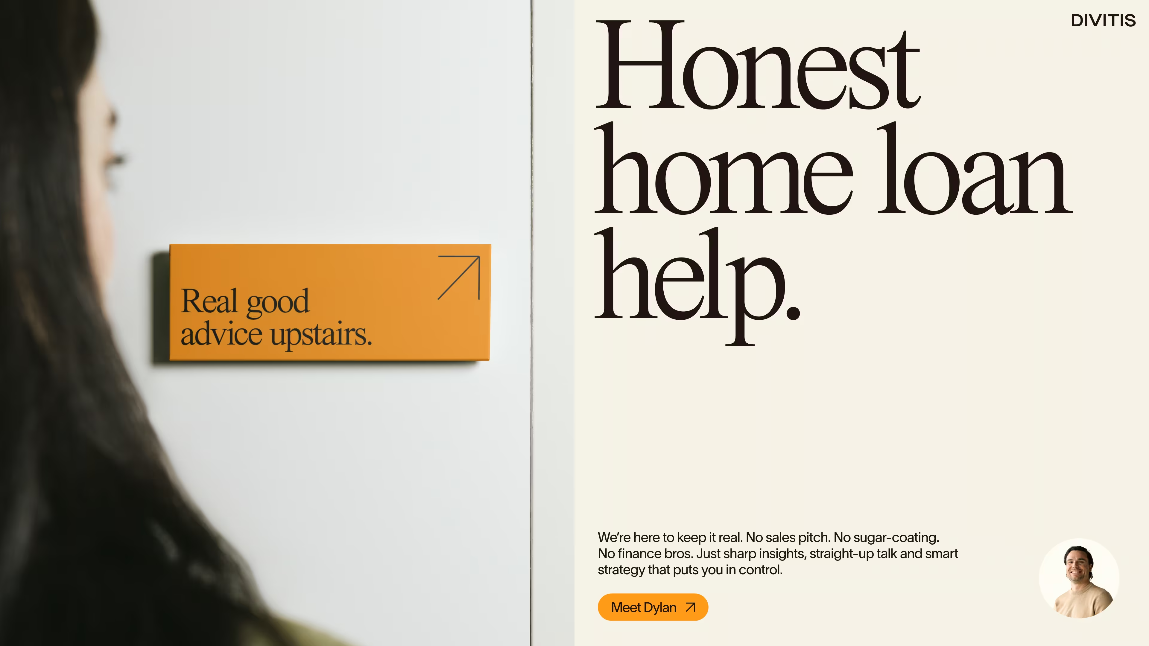
So we let the language lead. Rather than using expressive design to carry meaning, the brand was deliberately restrained. This created space for direct communication and signalled that Divitis was more concerned with helping its clients than with its own presence.
THE IDENTITY
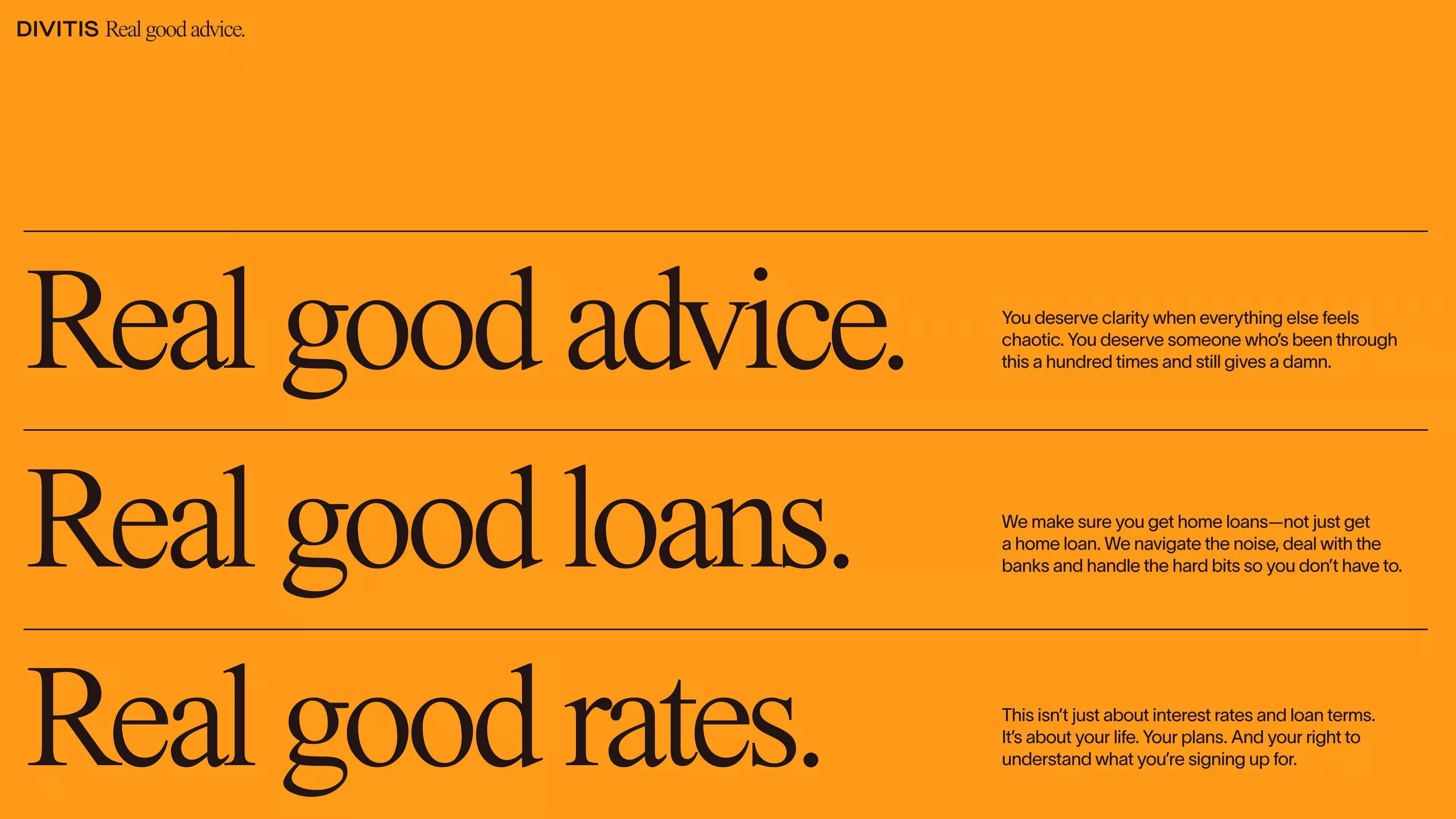
The visual identity was built around restraint and composure.
A modern version of Times New Roman was chosen deliberately: not as nostalgia, but as a refusal to perform. As a default typeface, it steps back so the message can move forward.
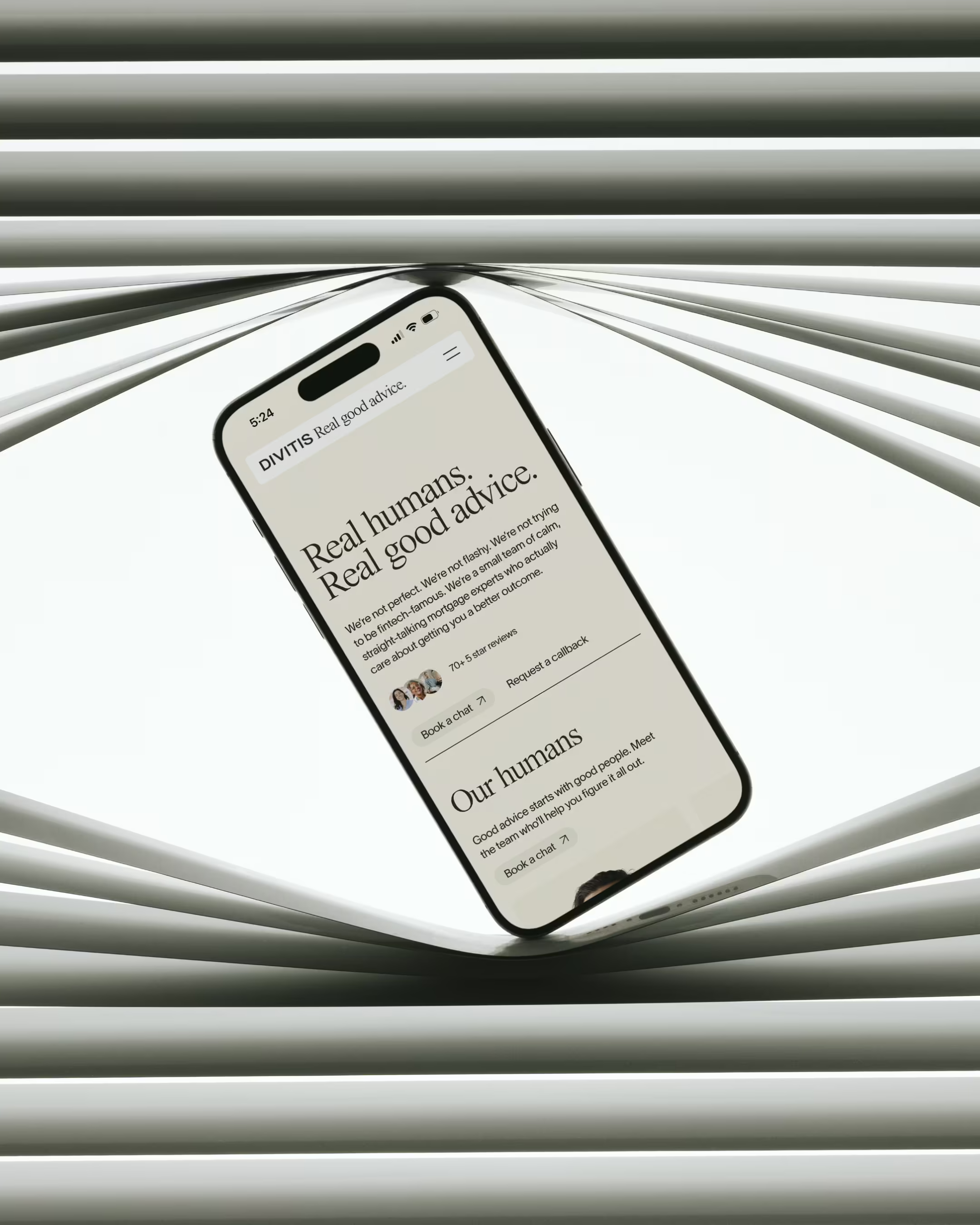
The logo adopts a traditional corporate lock-up, pairing the wordmark with the tagline "Real good advice". The structure resists contemporary convention. The promise matters enough to sit alongside the name, making the brand's position clear at every point of contact.
This restraint carries through to tone of voice. Clear, direct, grounded in plain English. The language feels conversational without sacrificing credibility. Identity and tone operate as a single system: one that steps aside so honesty and advice can do the work.


THE WEBSITE
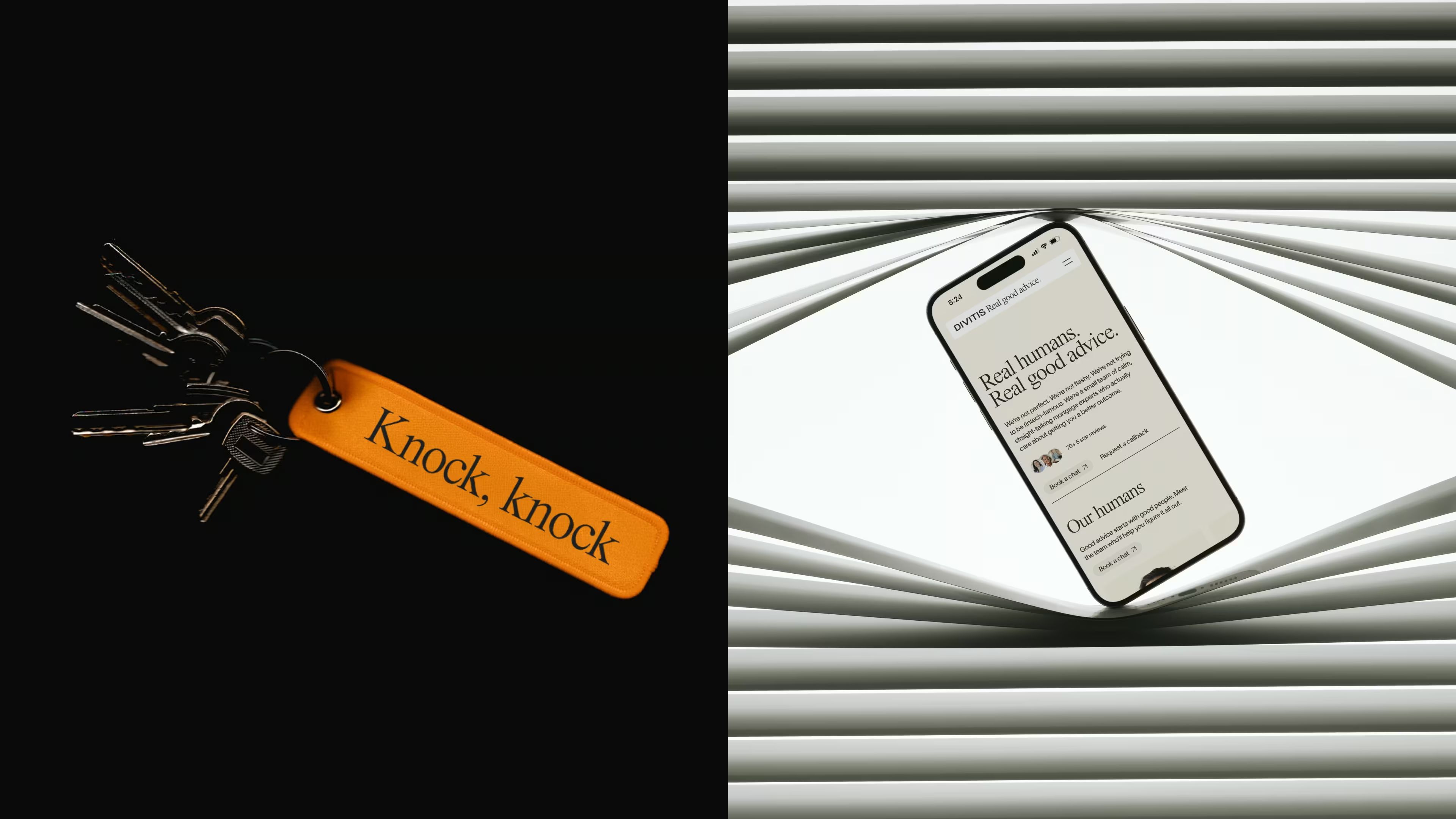
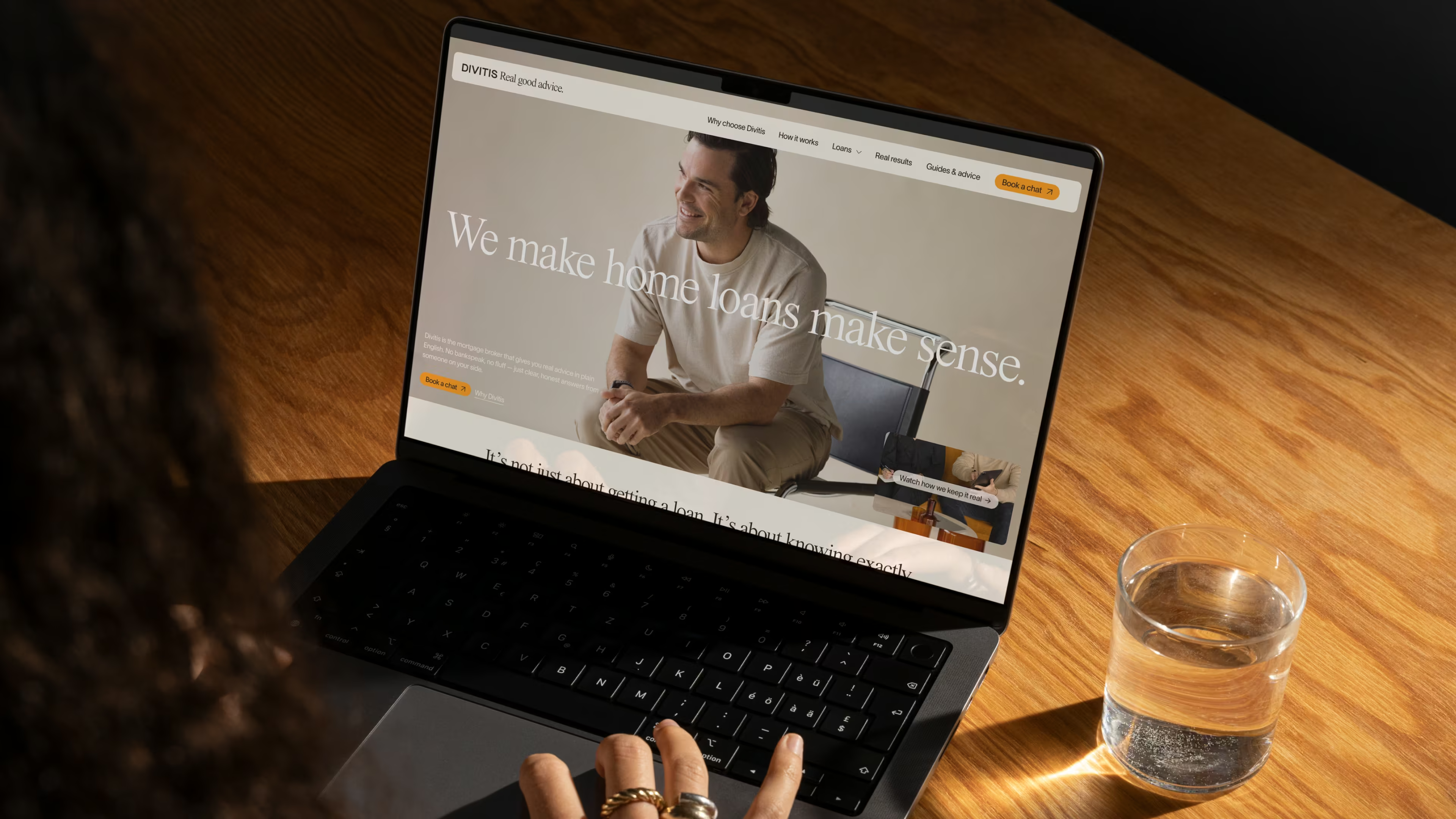
The previous site was visually cluttered and content-heavy, undermining the very clarity the brand was built on. The new approach prioritised calm, legibility and flow.
Content was layered rather than stacked. Accordions allowed depth without overwhelm. Five-star reviews were brought to the surface early, establishing trust before a word of copy was read. A dedicated mortgage myths page and the reframing of the blog as Guides & Advice reinforced the brand's core commitment: useful information over noise.
No excessive animation. No distraction. Just clear, considered content designed to help people move forward with confidence.

THE EFFECT
The refreshed brand now reflects the reality of Divitis: credible without being distant, consistent without losing its humanity. In a category increasingly shaped by automation and abstraction, Divitis differentiates through presence: clear, honest, unmistakably human.
Its strength lies in restraint. The brand succeeds not by amplifying itself, but by backing the business so completely that language, clarity and service are free to do the work.
But don't hear it from us. Here's what Dylan had to say.
“Working with Imogen and James on our rebrand and website was a great experience from start to finish. From the first conversation they were genuine, thorough and really focused on understanding who we are as a business and what we’re trying to build.What separated them was how deeply they understood the business and our value proposition. When they came back with the manuscript it was obvious they’d really listened — in some cases they even articulated who we are better than I could have myself.Imogen’s brand design was also a standout. She took the essence of our old logo and reshaped it into something new and bold, while still paying respect to where we came from through the colours and previous brand elements. The end result is something we think genuinely stands out amongst our competitors.We couldn’t be happier with the brand and website that came out of the process. Couldn’t recommend them highly enough. ”
– Dylan Salotti, Founder and Managing Director, Divitis Finance




.avif)
.avif)
.avif)
.avif)
.avif)
.avif)