GSA Planning has spent over two decades shaping some of NSW's most significant urban developments. From major city strategies to residential proposals, planning reports and court representation, George Karavanas and his team is well known in the industry for their rigour and consistent results. The brand, however, didn't reflect any of it.
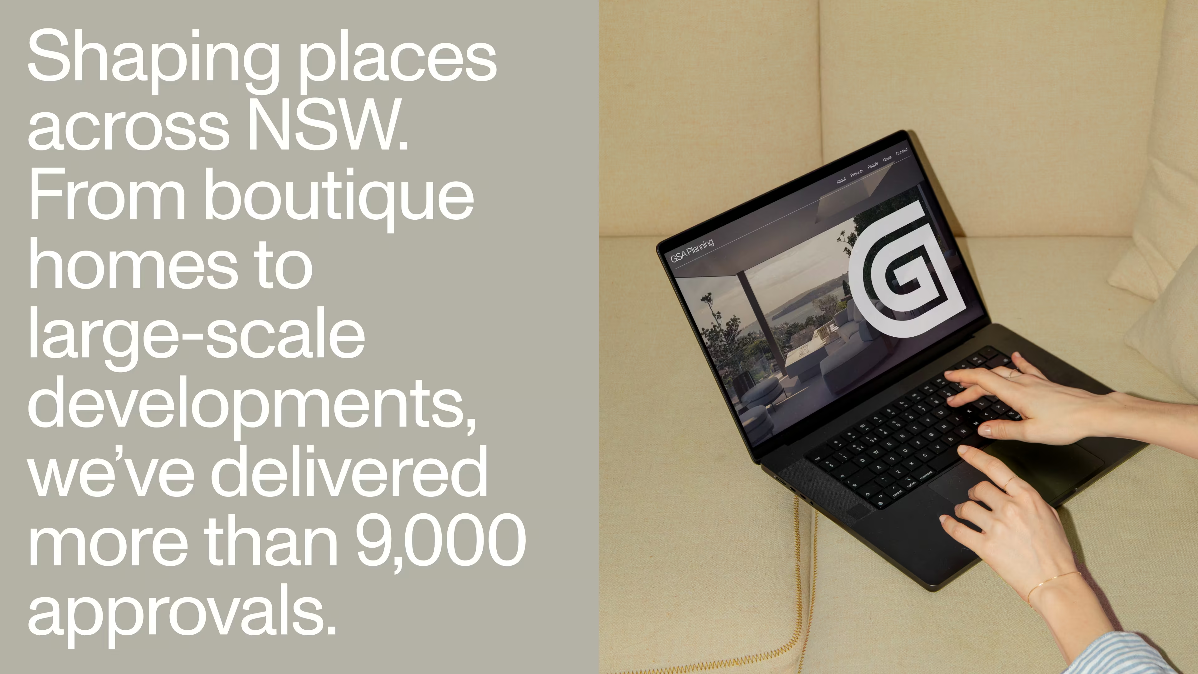
The existing identity undersold the dedication of the team and the quality of the work they produce. With over 9,000 projects already tallied, they weren't looking more work, but they were looking for something that accurately represented their well-earned reputation.
Town planning is the invisible work. GSA can't take the credit for the physical work of architects or developers – instead, they make the vision buildable: navigating the policies, processes and complexities that turn abstract visions into tangible realities.
The rebrand was about making that role legible. Not chasing scale or broad recognition, but attracting the right clients: ones who value thinking, seek out expertise and want a firm that challenges as much as it delivers. A brand that the industry would respect and the internal team would be proud to stand behind.
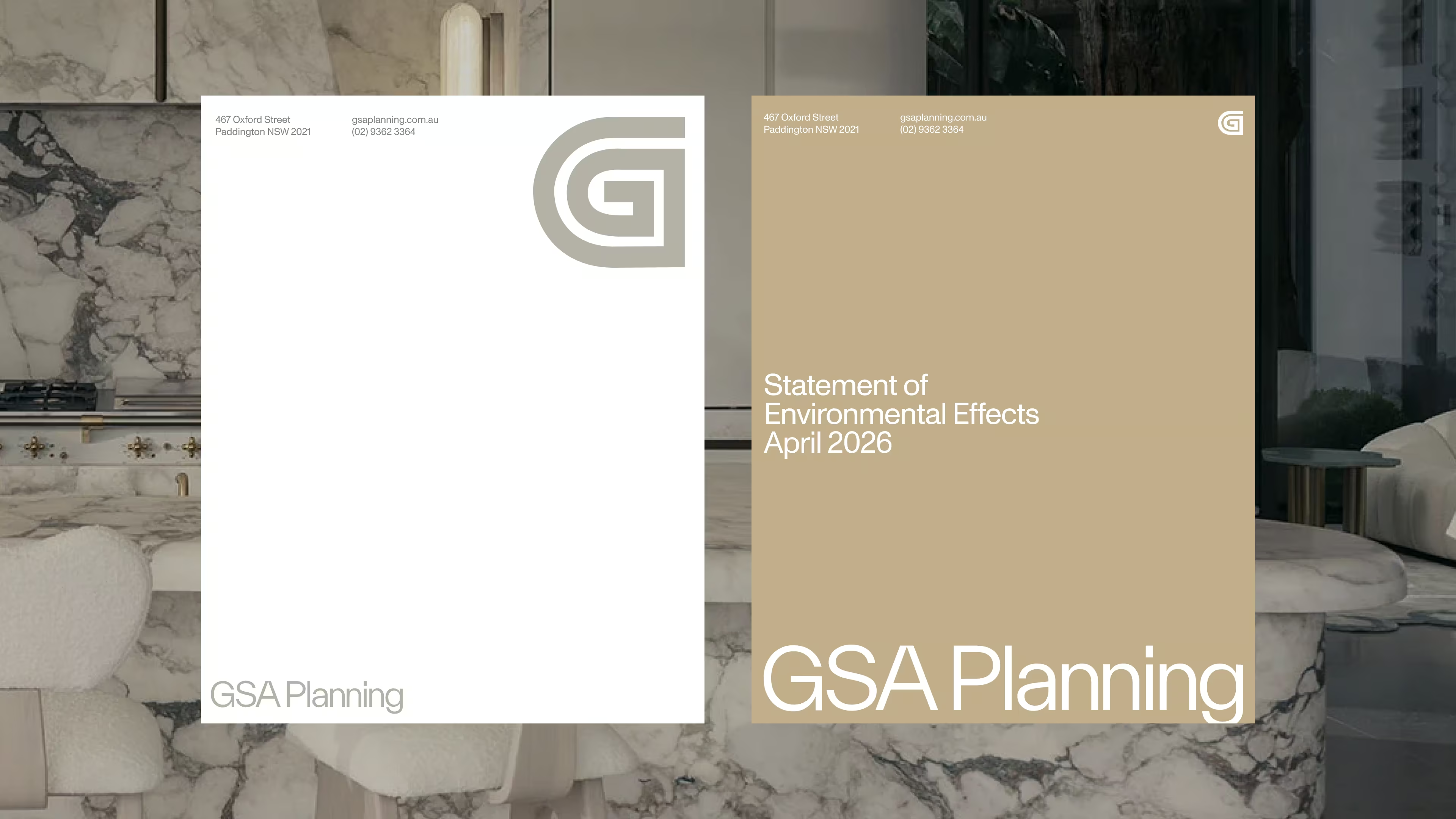
THE IDENTITY
The visual language is architectural in spirit: measured, layered, intentional. Typography is contemporary but restrained. Layouts behave like plans, and colours drawn from the built world: concrete, wood grain, shadow and sand.
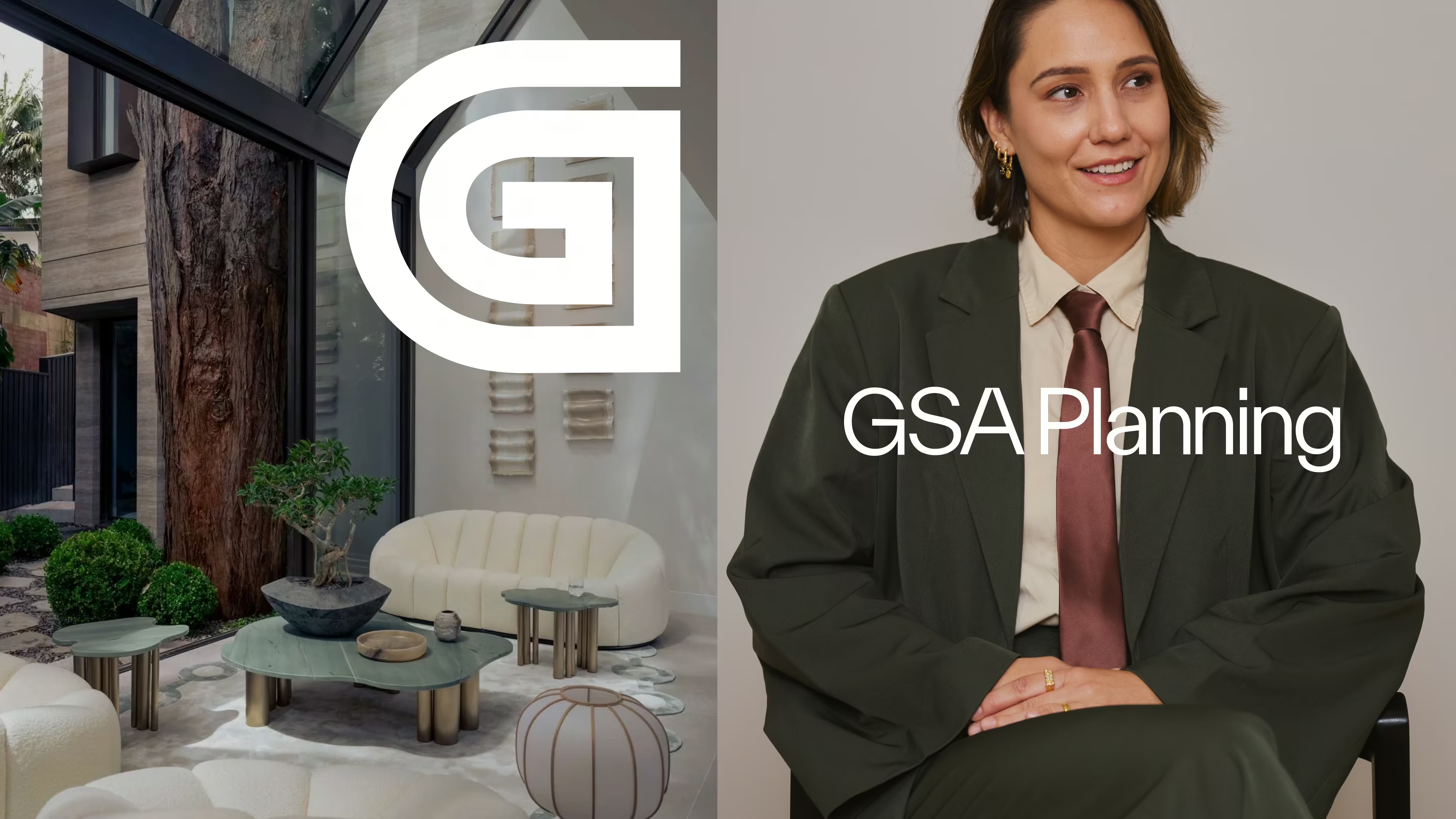
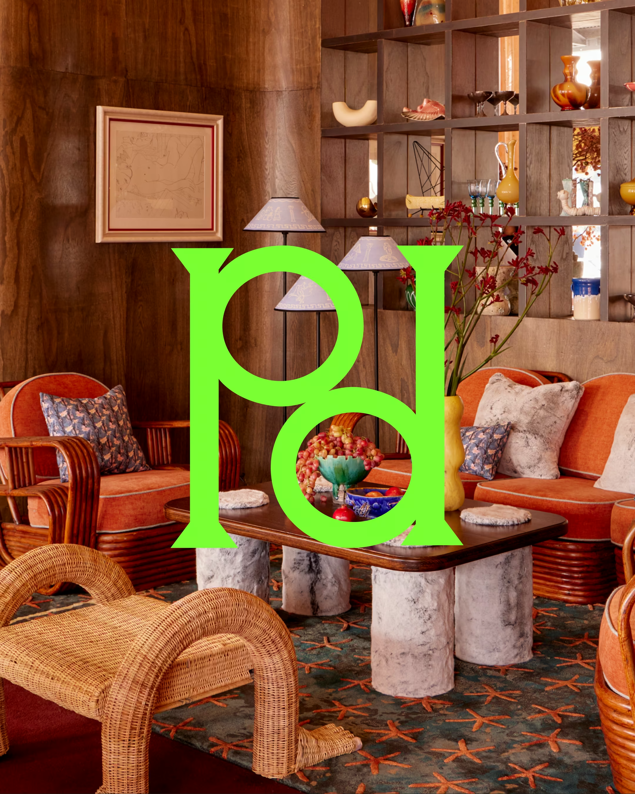
At the centre is a brandmark that carries both heritage and vision. The abstract 'G' is drawn to from Grecian columns (a subtle nod to George's Greek background) but it also reads as a city grid, a planning map, a network of connected places. At the center is GSA: at the intersection of regulation, design and ambition. The planners who don't just understand place, but shape how people live in it.

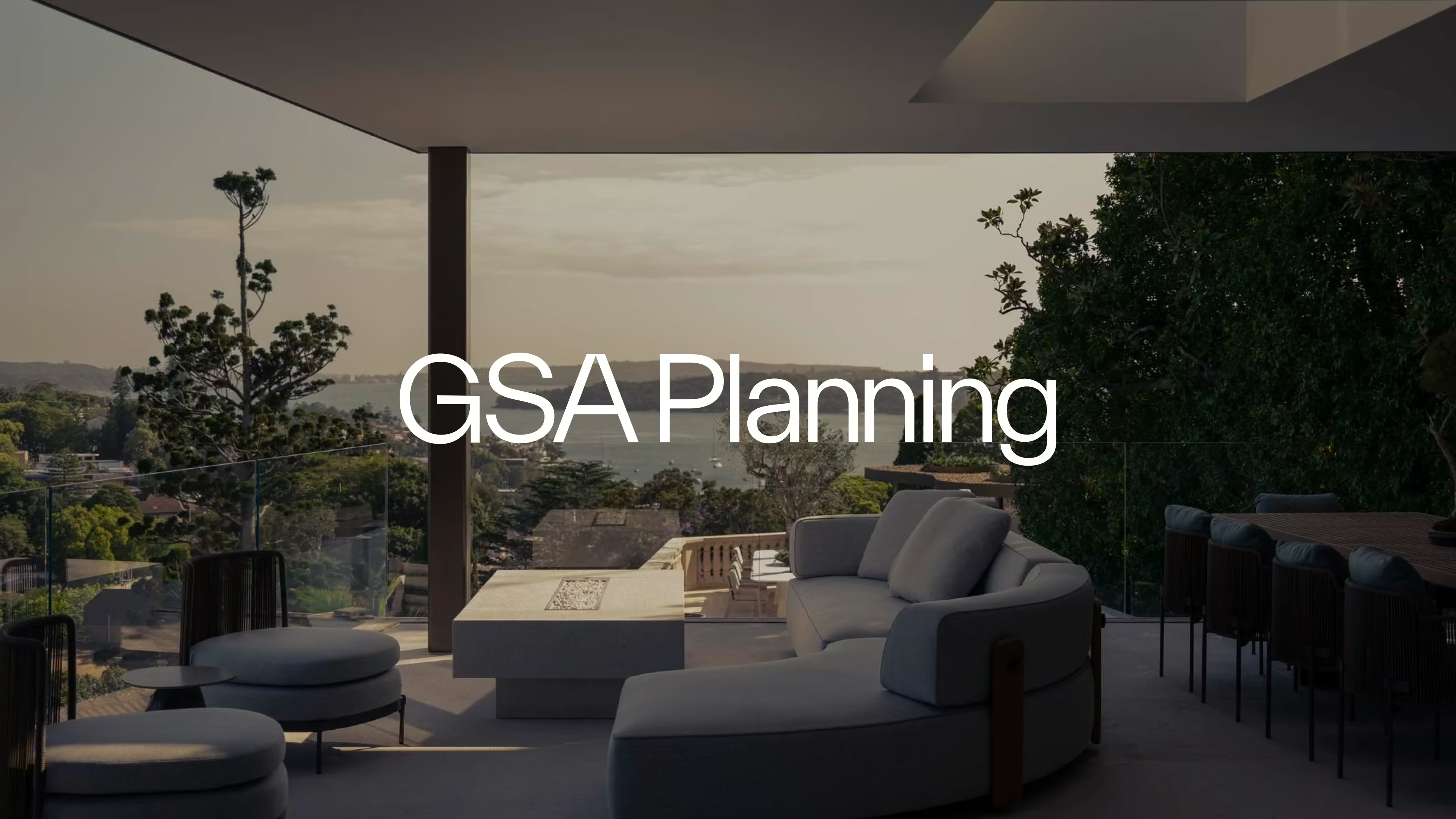
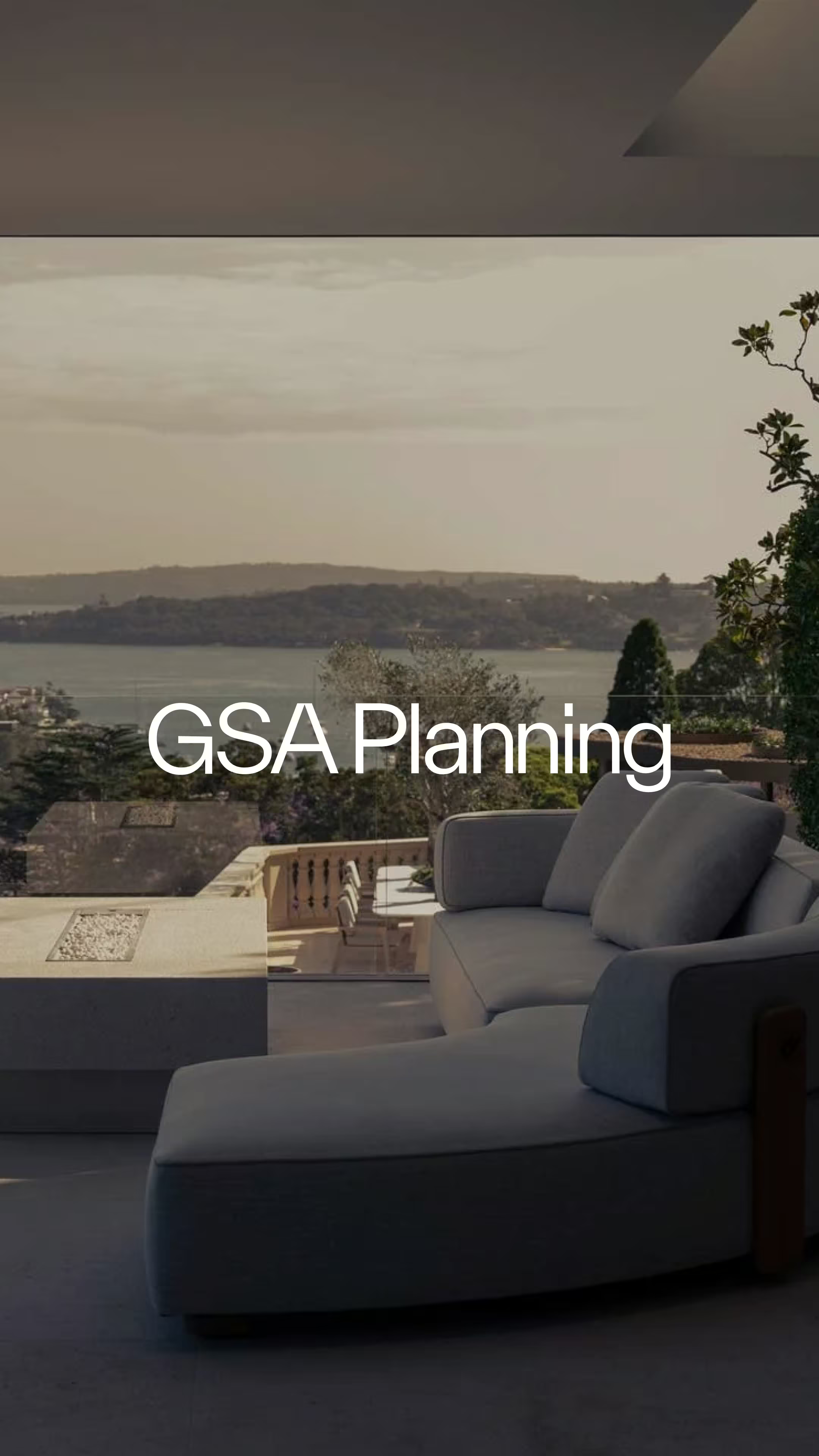
THE WEBSITE
For the website, the strategy was volume. Where other planning firms show a small amount of projects, with borrowed imagery from an architect's portfolio, we wanted, instead, for the sheer volume of projects to do the talking.
Projects are displayed as a long, filterable accordion – sortable by council, location, year, expertise and project type. The depth of the filtering system communicates breadth before a single project is opened. The sheer scroll of it communicates something no case study page can: these people are busy and they have been for a long time.
The rest of the website doesn't overexplain itself. Language is clear and informative, and custom functionalities allow users to go deeper if desired. With word of mouth being their leading sales driver, the website didn't exist to convince: instead, it was built to show immediate trust and capability.
THE EFFECT
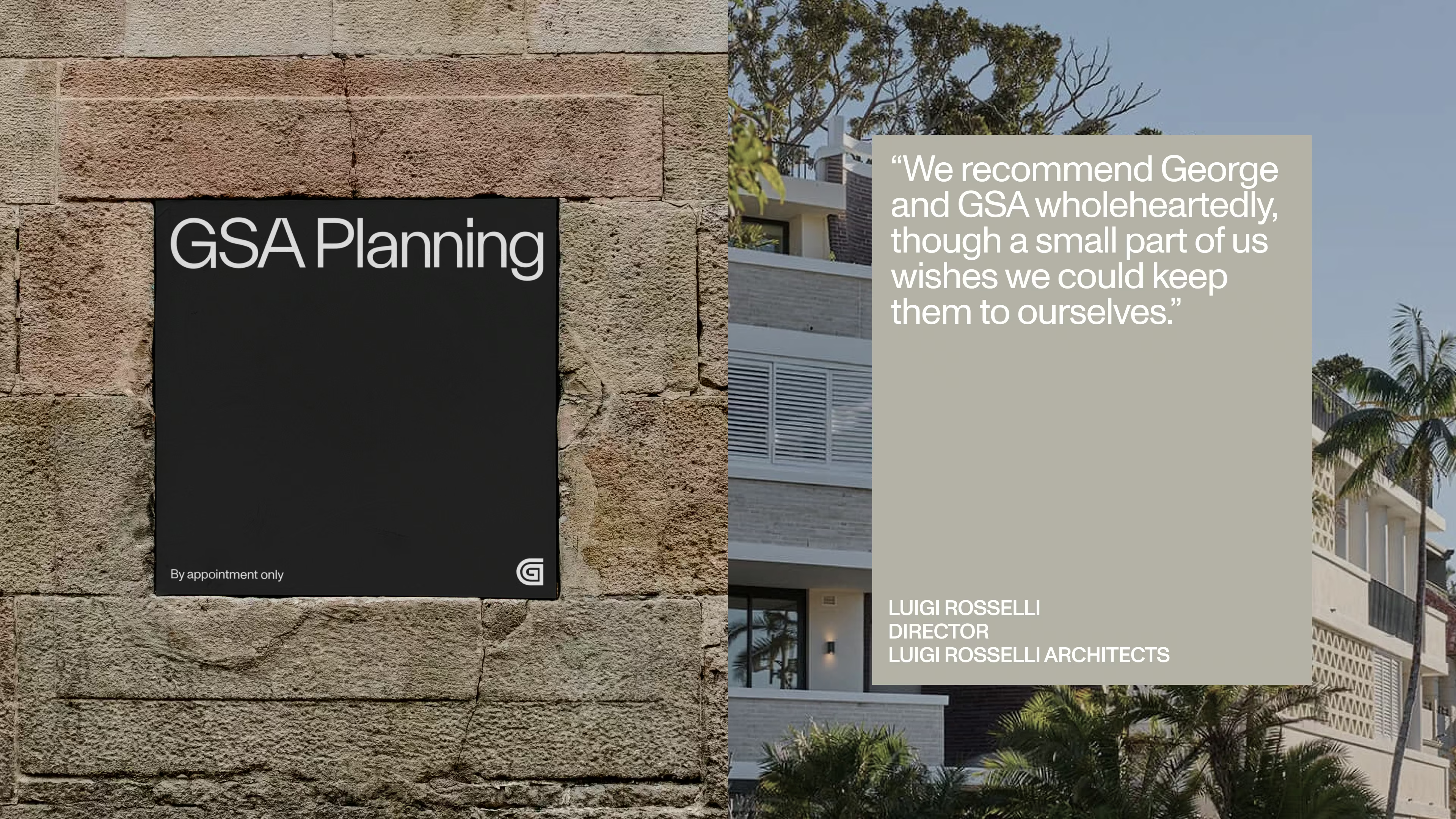
The industry noticed immediately. The response has been consistent: sleek, considered, exactly right for a firm of this calibre.
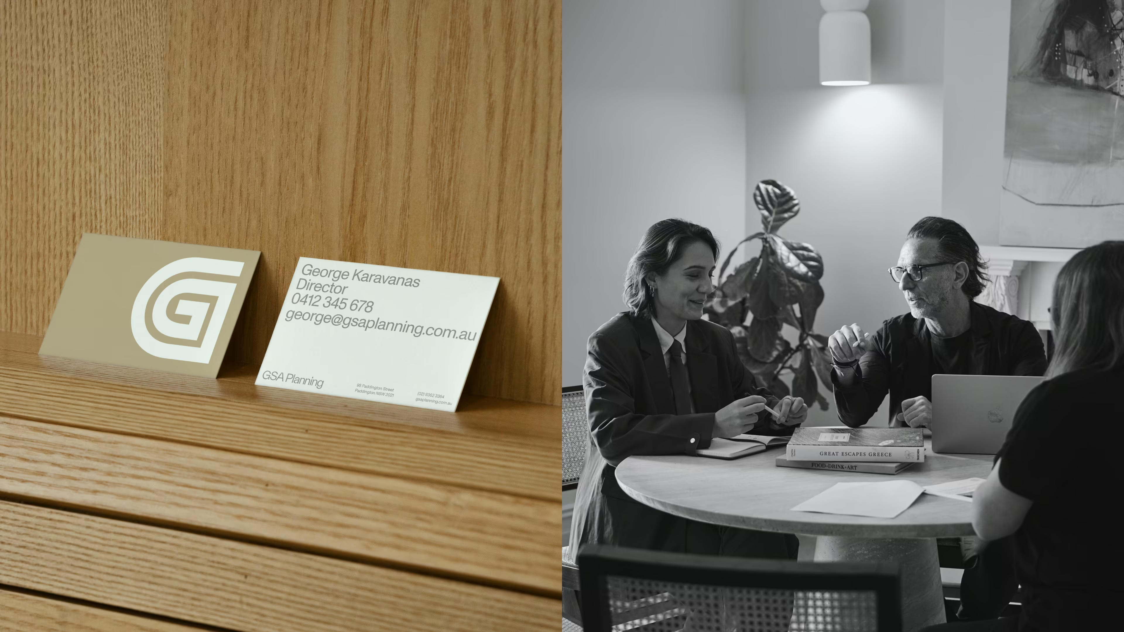
Internally, the effect has been just as significant. Their newly converted Victorian terrace office waslined it with signage. Business cards got handed over with confidence. George even wrapped his car. For a team that didn't need the appraisal, it was wonderful to witness how proud they became of their workplace.
But don't listen to us. Hear what Shivangli had to say:
“Working with Imogen on our rebrand and new website was such a positive experience. The process felt collaborative, clear and genuinely exciting from start to finish. We felt completely supported at every stage. Imogen made complex decisions feel simple and guided us with confidence and clarity.
Imogen’s expertise went far beyond design. She brought strategic insight, refined our ideas, and elevated our brand in a way we couldn’t have done on our own. At every step of the way, we were so impressed by Imogen’s creativity and understanding of what we wanted. The final result feels aligned, polished, and truly representative of who we are. The feedback from our clients since launching has been amazing, and the results speak for themselves.
We would highly recommend Imogen to any founder or business wanting a thoughtful, strategic brand transformation. Not just a logo and website, but a seamless, well-guided experience with beautiful creative execution.”
– Shivangli Prasad, GSA Planning


.avif)
.avif)
.avif)
.avif)
.avif)
.avif)