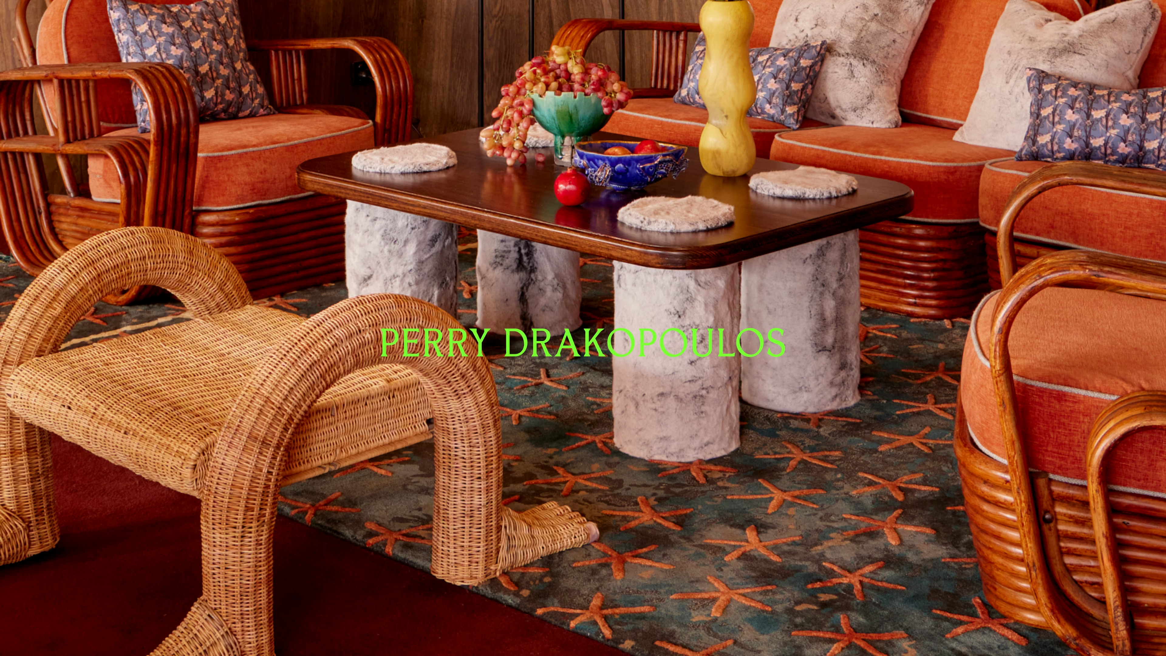
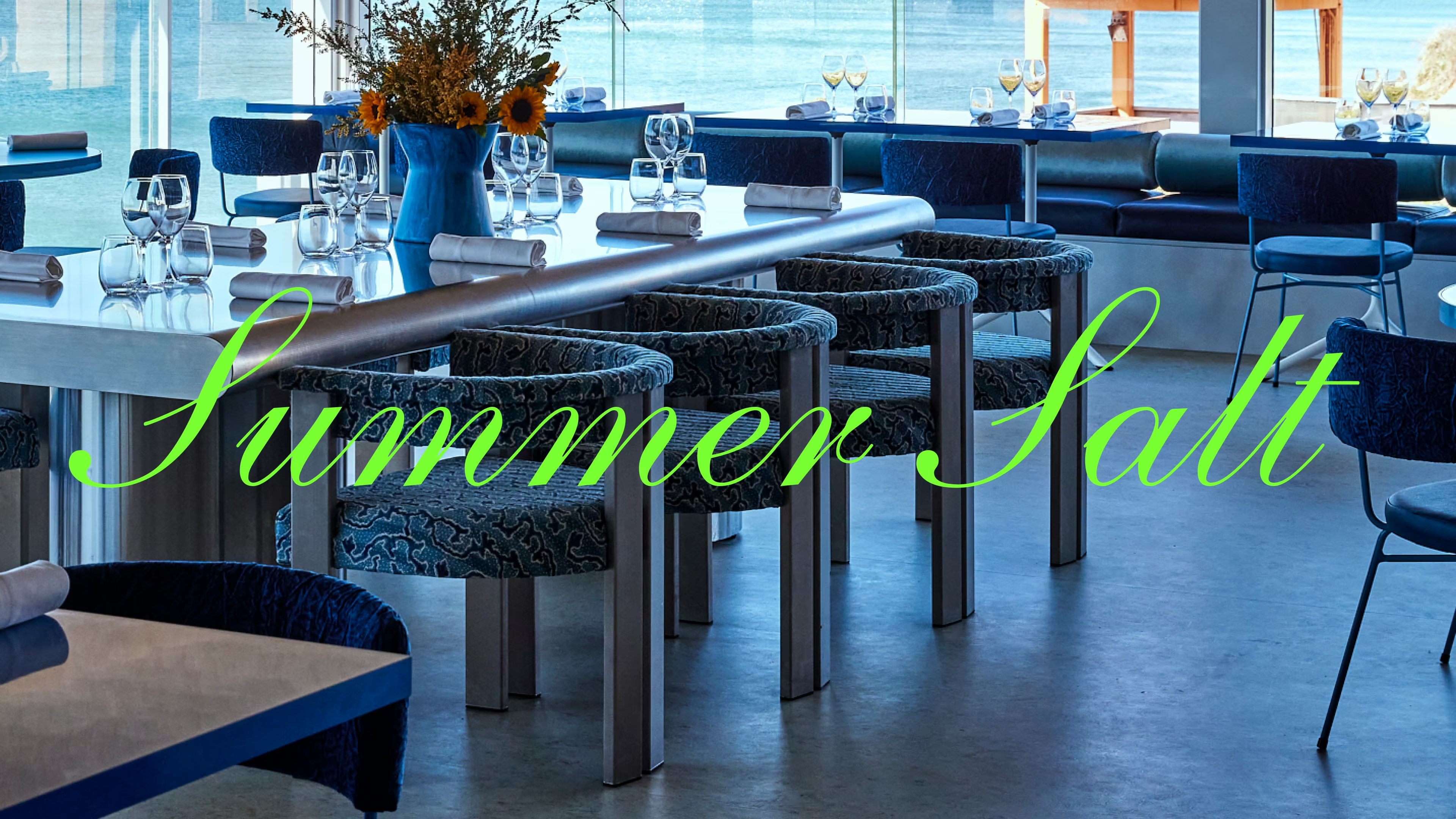
Perry Drakopoulos has been the creative force behind some of Sydney's most talked-about interiors. Directing the rebrand of Sydney Restaurant Group (SRG) from the inside, he has reshaped some of Sydney's most iconic venues. His work is bold, eclectic and deeply personal: His Greek references colliding spectacularly with modern culture, with unexpected combinations that somehow land exactly right. Now stepping out on his own, Perry needed a brand that could hold all of that without flattening it.
Most interior design studios lead with polish. Refined portfolios, restrained palettes a studied minimalism that signals taste by removing personality. Perry's practice is the opposite. His instinct is to add – texture, reference, feeling, contradiction – and arrive somewhere surprising.
The strategic decision was to lean into that completely. Not a studio brand. A creative identity: part scrapbook, part visual diary. Something tactile and sensory that communicated design as a feeling practice, not a finishing service. Where other designers perform certainty, Perry would show his workings.

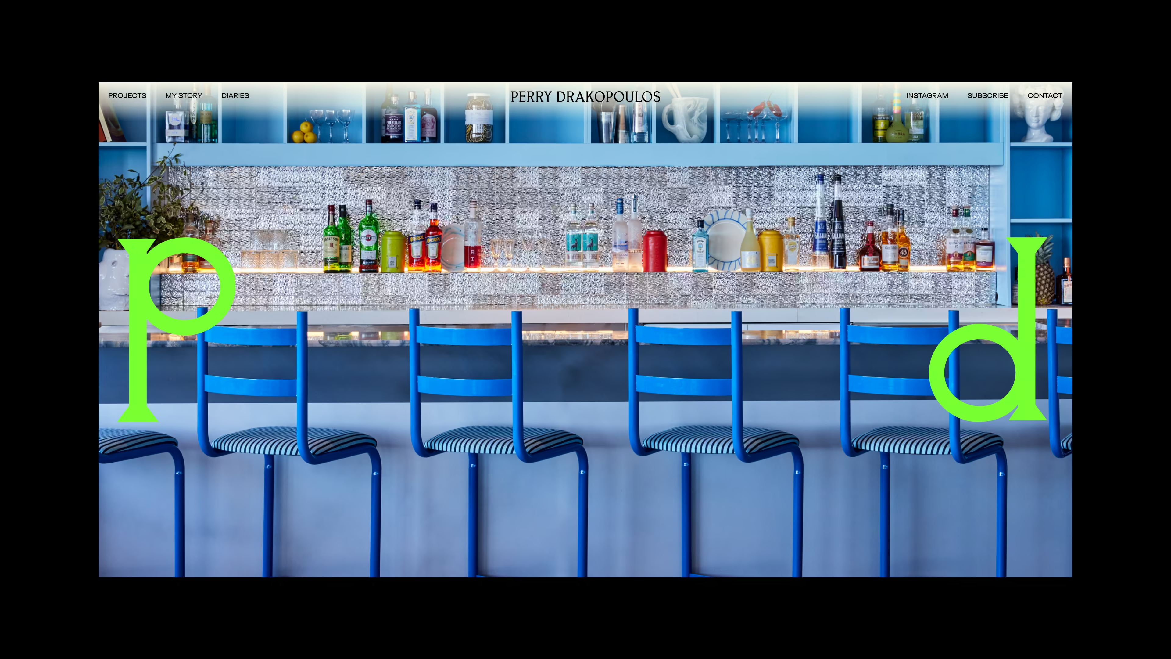
THE IDENTITY
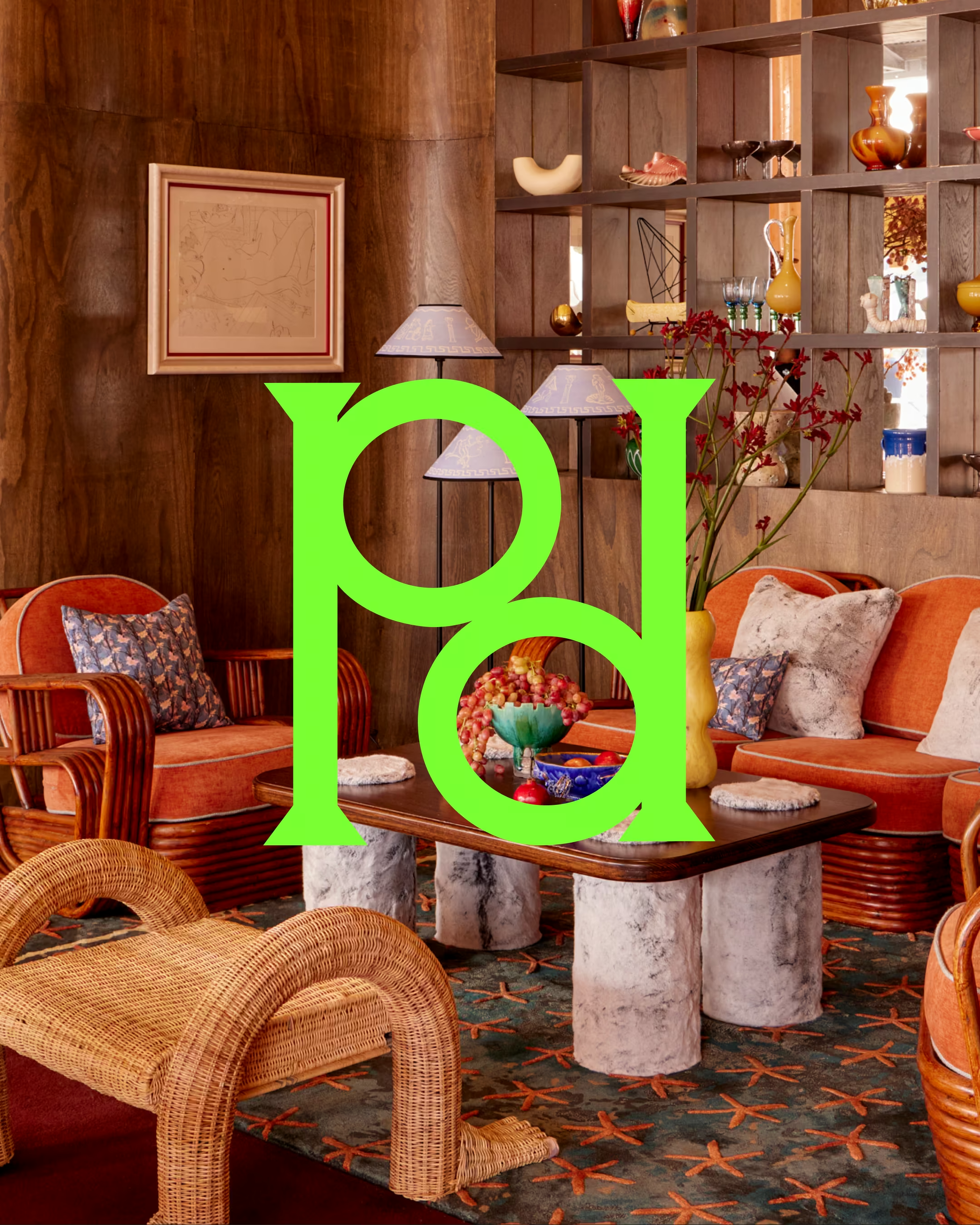
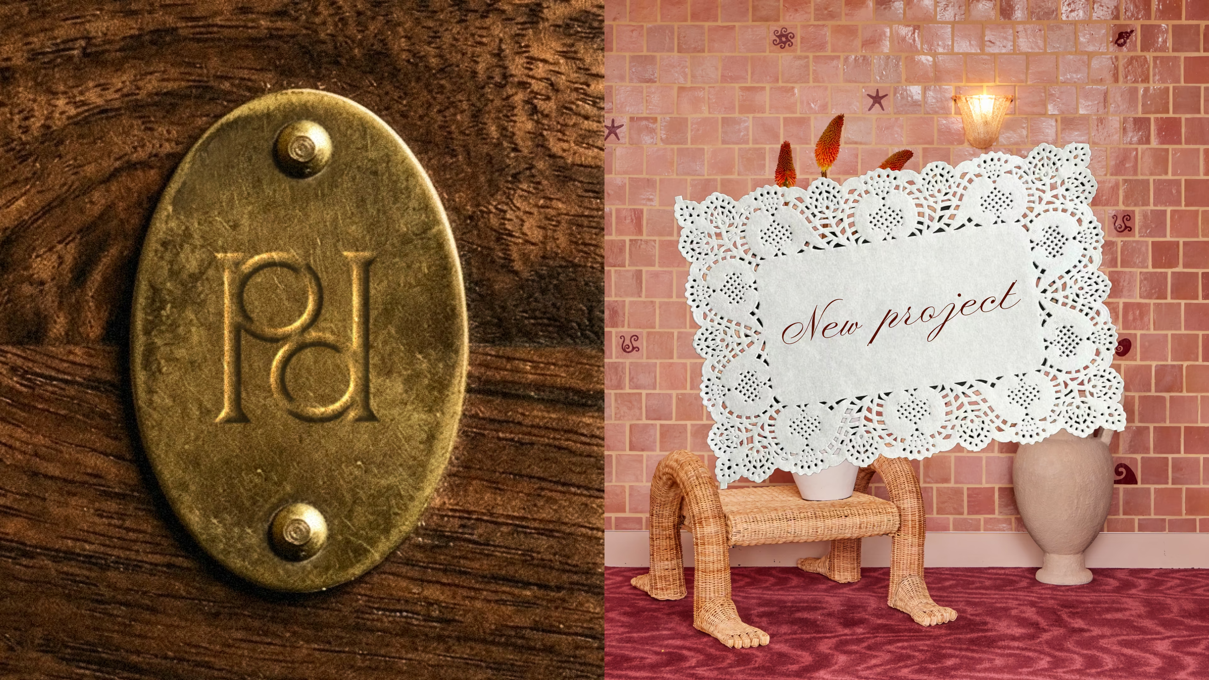
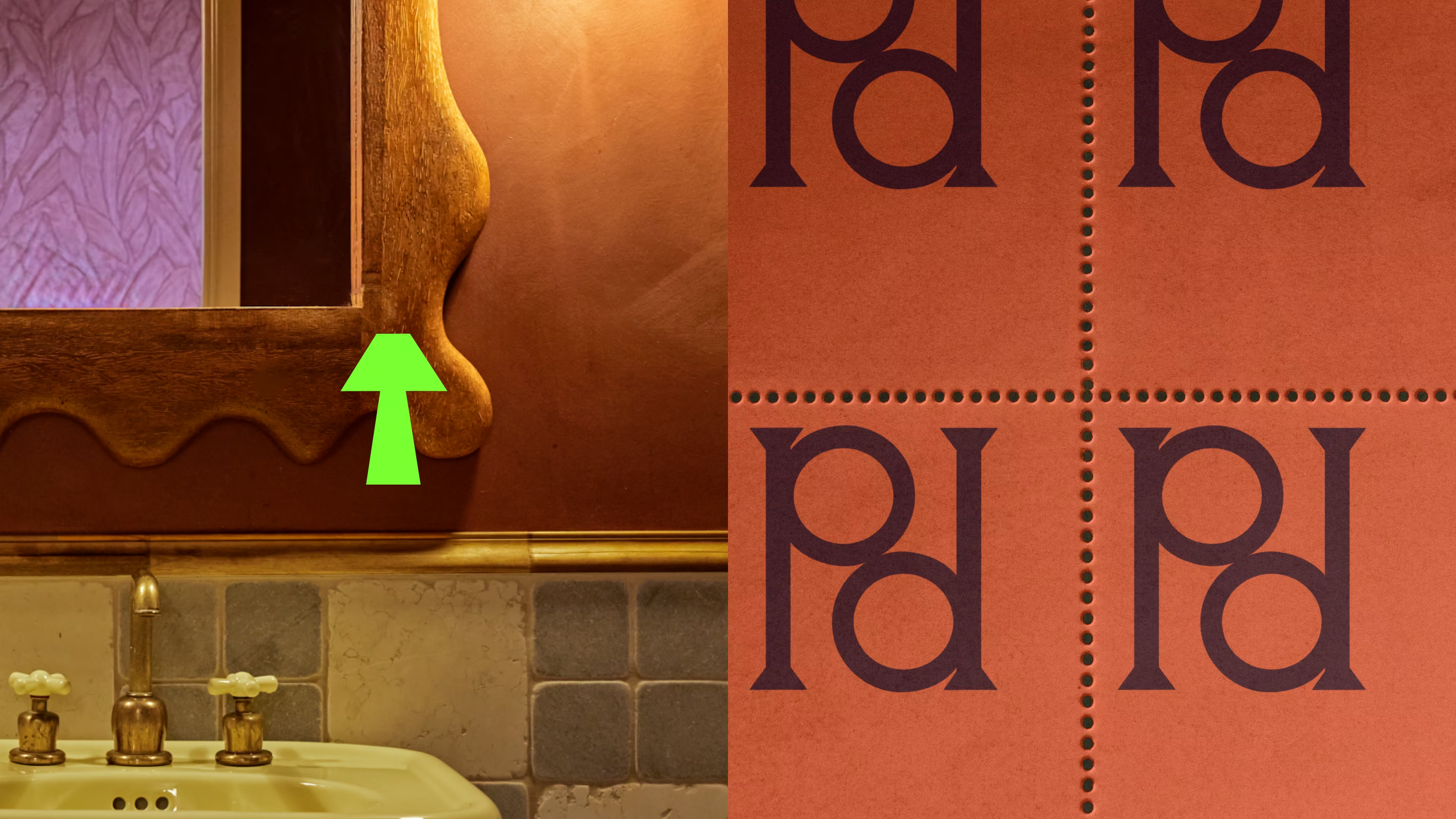
The brand was built around a crafted monogram comprising of two P's reflected back at each other. With an essence of something vintage and handmade, it's the kind of mark that was made to be pressed on an antique.
Against that, everything else pushes. Neon green. Rich orange. Deep burgundy. Accents that jump off imagery that's already loud. The and elegant script typeface isrendered in hyper-saturated green, a combination that has no business working as well as it does. Like Perry himself.
THE WEBSITE
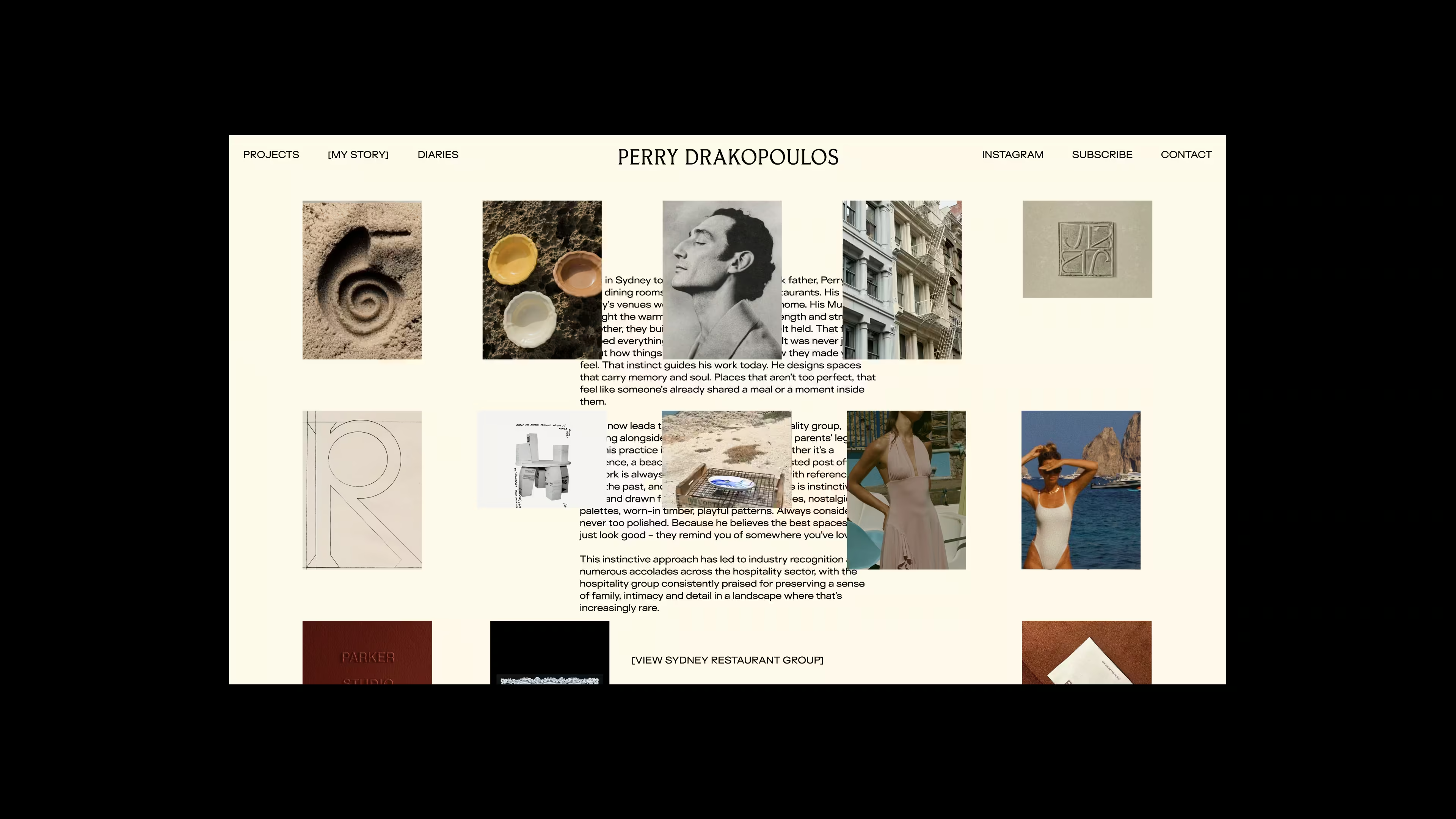
Perry's interiors are bold, chromatic and densely layered, which meant the standard interior designer approach of stacking full-bleed images would have been visual chaos. Instead, margins were pulled in across the board, giving each image room to breathe and the viewer space to actually look. The site is embedded with personal anecdeotes. Most notably, his preference to use [square brackets] in all his email communications turned into the inspiration for the website's hover feature.
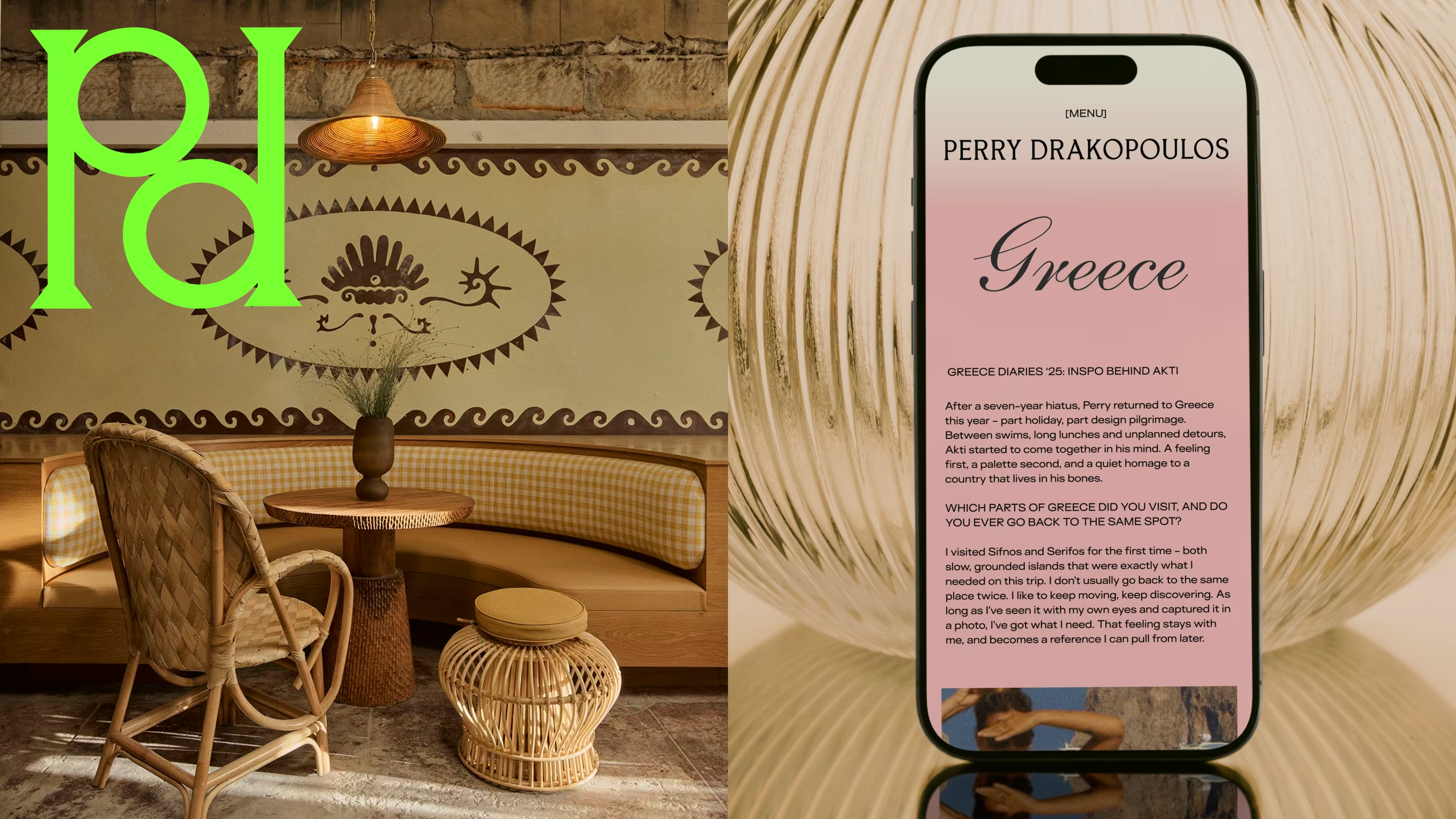
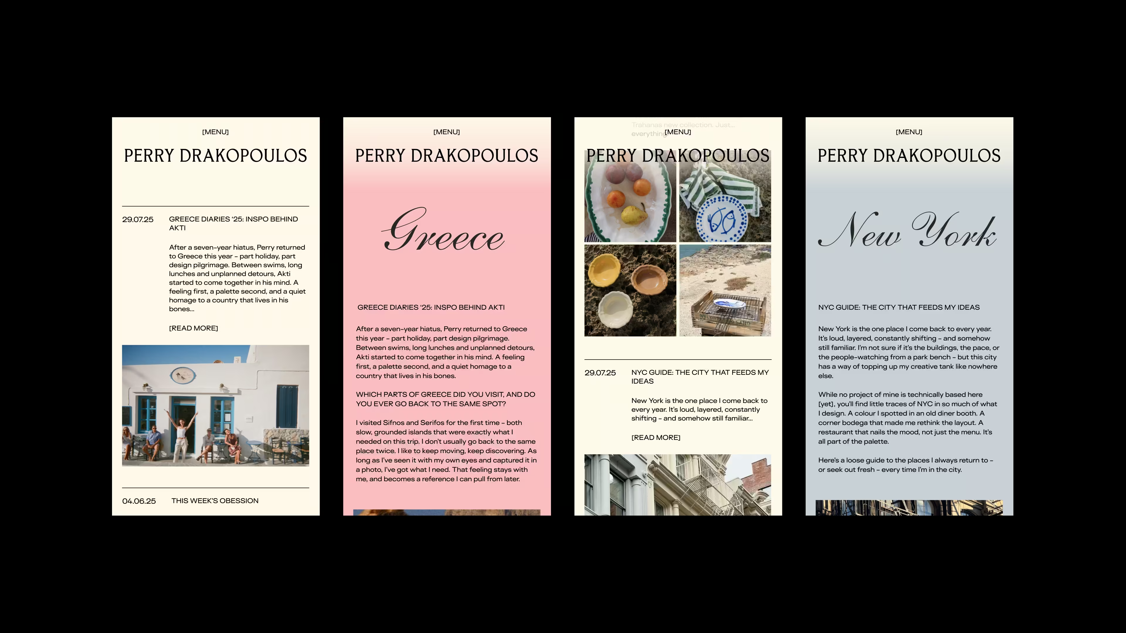
The blog was rebranded as the Diaries – running feed closer to a curated social scroll than a formal editorial archive. Perry could add a project, a stray thought, a photograph from a trip back to Greece, a piece of design that caught his eye. Less a publication, more a window into how he thinks. Each diary entry carries its own custom colour – chosen by Perry at the time of writing, whatever suited the mood of the piece. No two entries look the same. The site doesn't just show his work. It shows his mind.
THE EFFECT
The result is a brand that functions exactly as Perry does. Unpredictable in the details, coherent in its point of view. Eccentric enough to be memorable. Considered enough to be trusted.
For a designer stepping out on his own, that's not a small thing. It's the whole argument.
But don't hear it from us. Hear what Tessa had to say.
“Working with Imogen was such a cool experience from start to finish. The process was smooth, thoughtful, and genuinely collaborative. She really listened to our ideas, understood the bigger vision, and then pushed us in the best way to think bigger and go further.
Super professional, thoughtful and easy to collaborate with from start to finish.”
– Perry Drakopolous, Director, Sydney Restaurant Group and Founder, Perry Drakopoulos


.avif)
.avif)
.avif)
.avif)
.avif)
.avif)